Nope - we're not digging up mummies in pyramids and analyzing the gender - this blog is about population pyramid charts and "digging into data"! But since the title might have lured in some pyramid fans, here's a picture of my friend Angela posing beside a pyramid - pretty cool, eh?!? :)

Speaking of pyramids, I recently saw this graph on dadaviz.com, that was in the style of a population pyramid chart. The chart was attention-grabbing, and the data seemed to be interesting (haven't you ever wondered which parts of the human body were larger & smaller on males & females?), so I stopped to admire it for a while.
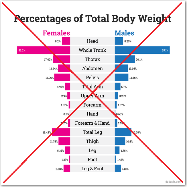
But once I studied the chart, I started noticing some problems. The main one being that, unlike population pyramids where the bars are ordered sequentially by age groups, the bars in this body part chart weren't in a definitive order. They were ordered generally from head-to-toe, but the ordering was somewhat arbitrary, and some body parts were included in more than one bar (such as 'Leg' and 'Leg & Foot'). Also, whereas the age groups (bars) in a population pyramid each represent the same number of years, the body parts aren't really comparable. So, basically, most of the visual cues that we know-and-love about a population pyramid chart, are probably causing us to misinterpret this body part chart.
Therefore I found the body part source data (on ExRx.net) and created my own chart using SAS. The thing I was most interested in was comparing the male & female values - and it's much easier to do that if they are represented alongside each other (rather than on opposite sides of a population pyramid). I contemplated using a paired bar chart, but decided to go with an overlaid line chart instead (one line for the male parts, and one line for the female parts). Here's what I came up with:
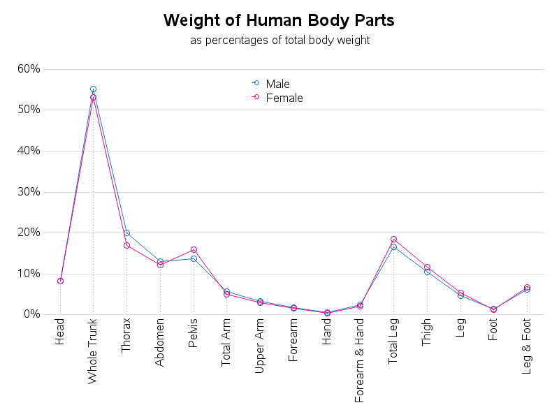
So, according to this data, women have larger pelvis & leg, and guys have larger thorax & trunk ... and we both have about the same size head. Sound about right?


2 Comments
Hi Rob.
I do agree that pyramid bar charts were not the best way to display results here. But maybe a few things could also improve your solution : 1/ rotate the graph, having body parts on the Y axis, so that the values are written horizontally, which is easier to read ; 2/ instead of connecting the dots with a line chart, which emphazises a trend (no trend here since, as you mentionned, the order of body parts is questionnable), just draw simple dots.
I think that would be even clearer, IMHO.
Best regards.
Olivier
Interesting ideas - perhaps you could put together an example, and post the results! :)
One benefit of using the lines is that when the lines cross, then you know when the male body parts went from being larger, to being smaller (such as thorax, abdomen, and pelvis). Also, I think it's valuable to see where the lines are farther apart, versus where they're close together. Of course, there might be a better way to show these things :)