Have you ever been bitten by a mosquito? What are the odds it carried the West Nile virus? ... Perhaps a lot higher than you thought!
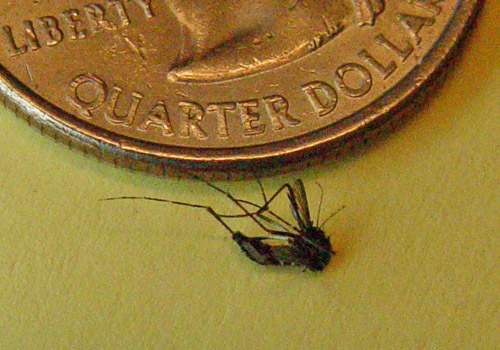
Here's a picture of a mosquito that kept 'bugging' me around my computer desk at home - good riddance, I say!
The West Nile virus used to only occur in Africa, but in 1999 it reached New York City, and has spread across the globe in recent years. ... Which made it an interesting and useful topic for a recent contest on kaggle.com! (note that you might need to register for a kaggle account to see the contest details)
The contest focused on the city of Chicago, where mosquitos carrying West Nile virus have been found since 2002. One of their contest data sets contained the data from mosquito traps located around the city. They provided some visualizations and starter-code to help people get started, and here is one of their example maps showing the locations of mosquito traps, shaded by the number of mosquitos found in them:
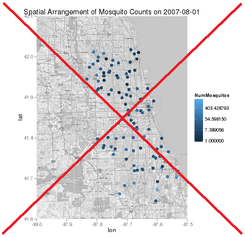
There were several things I didn't quite like about the map. They didn't claim this example to be great (and they might have even intentionally made it somewhat 'lacking' in order to give users some easy improvements to add).
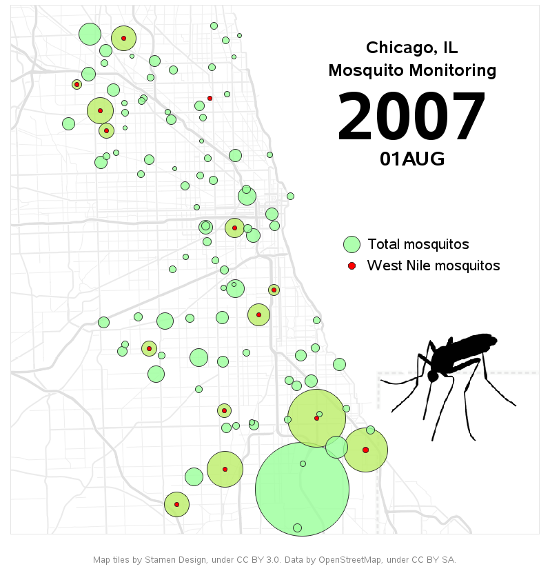
So I set about creating my own map, using SAS. I wanted the background map to be much less busy, and I found some map tiles at maps.stamen.com that showed the level of details I was interested in. Here's an example of one map tile of the Chicago area:

The map detail still stood out a little too much for my taste, so I overlaid a transparent white polygon over top of the map tiles, to make them even lighter. I converted the longitude/latitude coordinates of the mosquito traps to the tile map X/Y coordinate system of the map tiles, and annotated markers at the locations of the traps. I made the size of the markers proportional to the total number of mosquitos found, and I overlaid a 2nd (red) marker to represent the number of mosquitos carrying the West Nile virus. Here's a snapshot of the data from August 1, 2007.
And since they had several years of data, I combined it all into a gif animation (basically by changing 1 line of my SAS code). Click here to see the gif animation (note that it is 5MB in size, therefore if you're on a slow network connection it might take some time to download).
There are several things I might improve about this map, such as grouping it into consistent time increments (maybe weekly totals?) that would guarantee each trap's mosquito count represented a consistent number of days.
What other enhancements and additions would you recommend?

2 Comments
Rob,
I really want to be able to do things like this! The SAS code is incredibly helpful but I've run into some obstacle and have a few questions. Is this the best place to post them or should I contact you directly?
Thanks,
You can send them directly to me - if I can't answer them, I'll let you know where else you might can post them for a broader audience.