I guess most of us have a morbid curiosity about how we're going to die ... which is probably why Francis Boscoe's Causes of Death map went viral (no pun intended, of course!). This blog post shows how to create such a map...
But first, to lighten up the mood a bit for this somewhat dark blog topic, here's a picture of a medical skeleton I recently bought at the Raleigh flea market, and have been repairing/restoring - I've nicknamed him Fast Eddie (bonus points if you know where I got the name!)

And now, on to the death map ...
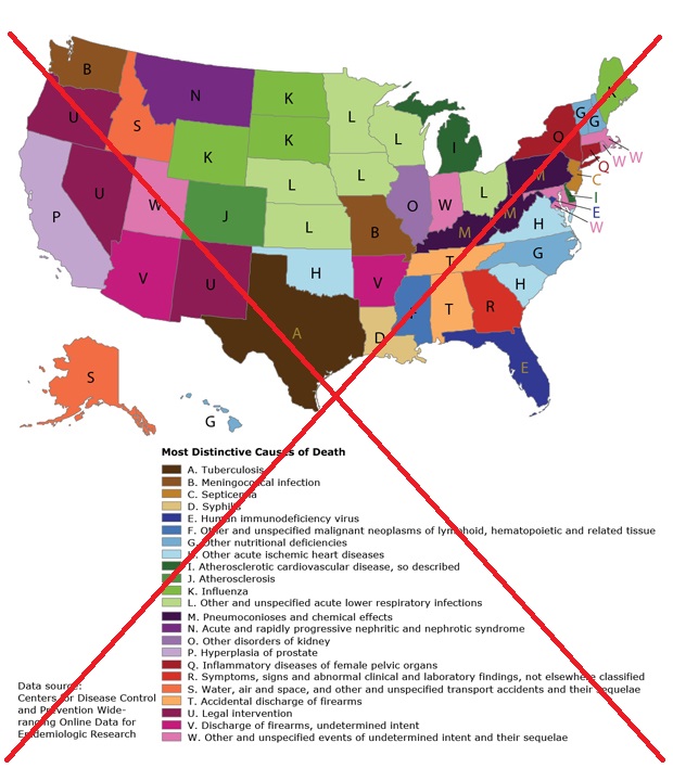
Below is a snapshot of Francis' death map. The map has a lot of colors in the legend. And since people would have a difficult time matching the colors in the map to the colors in the legend, he also uses letters of the alphabet. The letters confused me a little at first, but once I realized what they were for, it made sense.
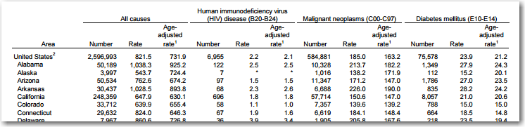
But, as with most maps, I wanted to try my hand at creating my own version, doing things a little differently. The first step was finding the data. Rather than using the 2001-2010 data, I thought it would be more interesting to just use the most recent data I could find (which was year 2013). The data was on the CDC website, in a pdf file (which is a bit difficult to use directly - ugh!) Here's what the pdf data looked like:
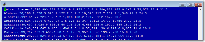
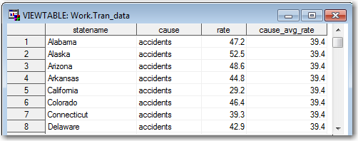
I copy-n-pasted the data into text files, and here's what they looked like:
I wrote some code to import the 5 text files into SAS, and then merged them (horizontally) with a data step.
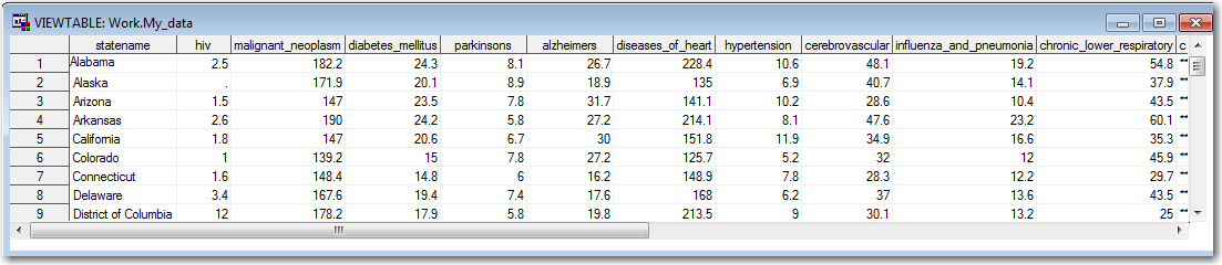
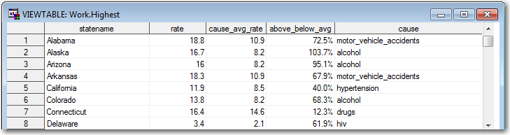
I then transposed the data, split it into 2 datasets (one for the individual states, and one for the US average), and then joined them together again so that each state/cause pair also had a variable for the US average for that cause.
I calculated the % above or below average using the following equation: above_below_avg = (rate/cause_avg_rate)-1, and then for each state I selected the cause of death with the highest rate above average. Here's a glimpse of the final data:
As you can see, data preparation plays a *big* role in creating maps and graphs!
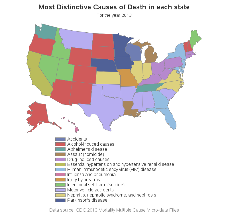
And now, what you've been waiting for - my map! Mine has fewer causes of death in the legend, and therefore I felt I didn't need to include the alphabet letters in the legend and on the map (which gives it a much cleaner look). And also, if you click the image below, you can see the interactive version of my map - it provides hover-text over each state so you can see the actual data values, and you can click the states to see more information on that cause of death. Similarly, the legend color-chips have hover-text and drill-down.
So, for those of you who live in the US, how did your state do? Did any of these numbers surprise you?


2 Comments
I'm super impressed to see our work talked about in your blog. One of your blog readers had contacted us to get the SAS code, and had mentioned about the blog. It is an honor.
I just wanted to throw out there that 2013 mortality data is available in CDC Wonder Web (http://wonder.cdc.gov/mortSQL.html) which can be used instead of dealing with pdf format.
I am really interested in finding out how you converted the table into the maps. Did you use SAS graph to draw the entire map with the capabilities of hover-text and drill-down? It looks really neat!
Hey - thanks for the comment!
Yes, I used SAS for everything (preparing the data, creating the map, and the hover/drilldowns).
Here's the complete SAS code - feel free to re-use/adapt/etc if you want!
http://robslink.com/SAS/democd79/mortality_us_2013.sas