Election fever has hit the United Kingdom as the days count down to 7th May 2015. This is likely to be one of the most uncertain elections in recent memory, with nearly 10 parties struggling for votes across England, Scotland, Wales and Northern Ireland. Results night will be tense, with the different TV channels competing for the most engaging visualisation and graphics. Gone are the days of the simple 'swingometer' which showed the shift between the most traditionally popular Conservative and Labour parties.
In my earlier blog, I looked at ways analytics could be used to forecast results. But what is the best way to display them? My esteemed colleague, Robert Allison, is working on how best to do this and will share his results in his forthcoming blog (stay tuned). However, for a starter for 10, here is how you could produce a map using SAS.
Luckily, the Ordnance Survey provide open source data for electoral boundaries in the UK, in the form of 'shape' (SHP) and response (DBF) files. You can download it here. It's a simple matter for SAS to read in this data.
PROC IMPORT out= work.westminster_const_region datafile= " … westminster_const_region.dbf" dbms=DBF replace;
getdeleted=no;
run;
PROC MAPIMPORT datafile=" … westminster_const_region.shp" out=work.westminster_const_region_map contents;
id polygon_id;
run;
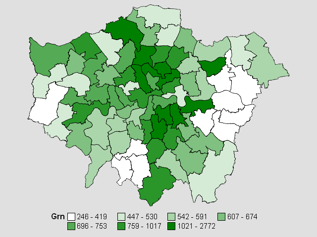 You can combine this with open source results data available on sites including Electoral Calculus to plot results to your heart's content. I created a dataset called 'combined' and plotted the Green Party's results in 2010 in the London region. In this 'choropleth' map, the greener the area, the more votes the Green Party got in 2010. To do this, I had to create a 'colour ramp' ranging from very green to white using PROC TEMPLATE.
PROC TEMPLATE;
define style styles.green;
parent=styles.default;
style twocolorramp / startcolor=white endcolor=green;
style graphdata1 from graphdata1 / color=white;
style graphdata2 from graphdata2 / color=green;
end;
run;
Finally, I can plot the results using PROC GMAP.
ods html style=styles.green;
PROC GMAP map=westminster_const_region_map data=combined;
id polygon_id;
choro grn;
where region='London';
run; quit;
In the meantime, if you’re keen to find out more about government data and how analytics is shaping the future of our political thinking, check out our research with Civil Service World on Big Data in the public sector.