This blog post discusses the use of a black background in a graph. But before we get started, I invite you to have a listen to one of my favorite songs - "Paint it Black" by the Rolling Stones. Perhaps this song subliminally persuaded people to use black backgrounds in their graphs? (just one of my conspiracy theories!)
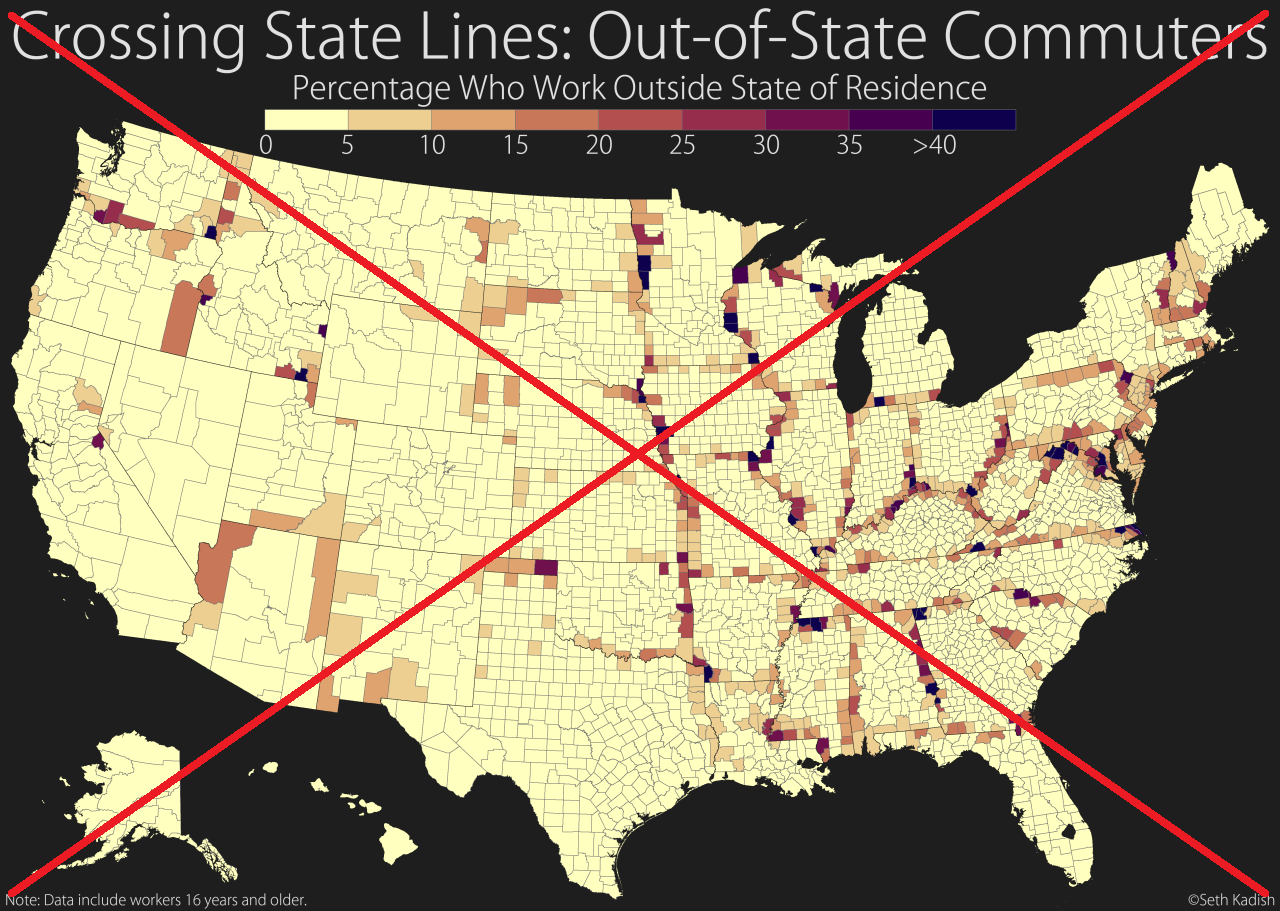
A twitter post recently took me to a tumblr blog about a map that Seth Kadish had created (see below). The coloring of the counties in the map represented the percent of the workers in that county who commute to another state to work. As expected, counties closer to the state borders generally have more of their workers commute to another state.
Here's a screen capture of his map (below). As you can see, it's very difficult to see the map against the black background:

Hahaha - ok, that's not actually it, but see the real thing below! Or you can click this link to have a look at his map! It's visually captivating (it certainly caught my attention), but once I started really trying to understand the data, I found that it was somewhat lacking in that area. The main problem is that the black background is visually very similar to the color representing the maximum commuting values. And therefore, it is very difficult to tell the two apart. For example, that round dark area in southern Florida might at first look like a county with a very high commuting value ... but it is actually a 'hole' in the map for Lake Okeechobee (showing the black background behind the map). It's very difficult to tell whether the dark area in the map are counties with high values, or holes/lakes/bays/etc in the map.
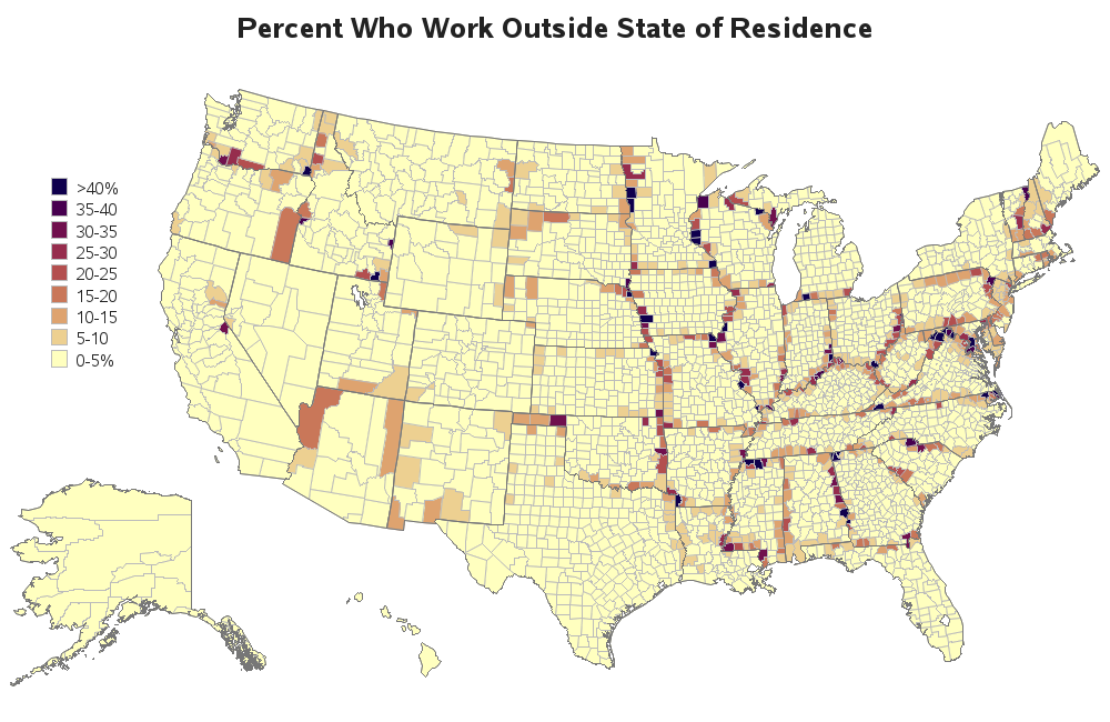
So, naturally, I downloaded the data (table S0801) from the Census website, imported the CSV file into SAS, and plotted it on my own map ... with a white background. Now the dark/black counties stand out more, and you can easily tell the difference in the map background and the data). And if you click the thumbnail below, you will even see that my SAS version has html hover-text for each of the counties.
Technical Discussion:
Why do people use black backgrounds behind graphs? What are some of the arguments for and against? I'm no expert in this area, and have not done any controlled experiments or surveys, but here are my personal thoughts...
For Black Backgrounds:
One argument for black backgrounds is that it looks better than white when projected on a screen during a presentation. In my experience, this could be true, especially if bright/vibrant colors are used along with the black background. But this probably depends on what kind of presentation you're giving, and who your audience is.
Along those same lines, sometimes you might use a black background in a graph in order to make it stand out from all the typical (white background) graphs. For example, when creating a 'headline' graph that's meant to catch people's attention, rather than being used for nitty-gritty analytics. Even then, I would guesstimate that less than 1 out of 20 of my fancy presentation graphs have a black background.
Another argument is that with some display devices (maybe some CRTs and maybe some LED screens), it consumes less energy to display 'black' pixels. Therefore using a black background could save energy, which could be an advantage in mobile devices. I did some web searches on this topic, and couldn't find any definitive studies in this area. At the very least, from what I gather, this is not the general case (especially with displays that use a 'backlight'), and should probably not be a factor for your graphics design.
Against Black Backgrounds:
Many people find graphs with black backgrounds annoying, and difficult to read. For example, how did you like the black background in the text items above? :-)
It has also been my personal experience, that when using dark background and light text in a graph, I have to make the text bolder/thicker in order to be readable. And if you resize/shrink the graph, sometimes the text becomes un-readable. This problem seldom comes up when using dark text on a white background.
When you use a black background, this makes it very 'expensive' to print. Whereas white backgrounds would use no ink to print on white paper, black backgrounds use a lot of ink to print.
My personal opinion is that black backgrounds are occasionally good when you want a certain artistic effect, but should not be used for graphs in general. Or in layman's terms ... black backgrounds are for velvet paintings.
WANT MORE GREAT INSIGHTS MONTHLY? | SUBSCRIBE TO THE SAS LEARNING REPORT


8 Comments
Hey Robert how did u get this SAS Code link? Is this yours?
Yes, mine.
Pingback: Graphs: Comparing R, Excel, Tableau, SPSS, Matlab, JS, Python, and SAS - SAS Learning Post
For this color map, there are at least two principles of color communication effectiveness that pertain. With the black background, the color of the darkest color sample in the legend is difficult to discern. (In general, foreground and background colors for a graph or printed matter need to have sufficient contrast.) The other problem for this map, regardless of what background is used, is that some of the geographic unit areas are so small that the precise color is hard to determine. (In general, for color to be easily distinguishable, text must be thick enough, lines must be thick enough, plot markers must be large enough, legend color samples must be thick enough, and geographic unit areas must be big enough.) For more on color communication effectiveness, see, e.g., my most recent web-present paper http://www.lexjansen.com/mwsug/2010/solutions/MWSUG-2010-169.pdf
or request my forthcoming latest edition, available via email now,
prior to a forthcoming conference on 24 June.
Le_Roy_Bessler@wi.rr.com
Visual Data Insights™
Bessler Consulting and Research
I'm curious about the data for the graph. Do those percentages include tele-commuting or only physical commutes?
Here's the Census FactFinder info page on the variable...
http://factfinder.census.gov/faces/affhelp/jsf/pages/metadata.xhtml?lang=en&type=category&id=category.en./ACS/ACS/13_5YR/S0801.SUBJECT.VC20&srcid=table.en.ACS_13_5YR_S0801
I agree, black dresses are only for special occasions. Is the code for this available?
Thanks,
Brian
Here's a link to the sas code: http://www.robslink.com/SAS/democd77/out_of_state_commute_info.htm