After the legalization of recreational marijuana use in Colorado in 2012, it has been a much more frequent news topic than before - even from a data analysis perspective...
I was recently looking for 'interesting' data to analyze with SAS, and I noticed some articles about the increasing potency of marijuana in recent years. I followed the data 'upstream' and found an interesting report from the Drug Enforcement Administration (DEA). And on p. 27 they showed the following graph:
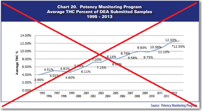
Their graph tells an interesting story about how the amount of THC in marijuana has more than doubled in recent years. But the graph is somewhat painful to look at, and difficult to read. Here are a few of the problems that jump out at me:
- It's difficult to know exactly what point along the line the pointlabels refer to.
- There are 27 %-signs in the graph, which seems an excessive use of ink & space.
- The y-axis needlessly shows 2 decimal places.
- The x-axis has staggered year labels.
- The year labels are staggered in the opposite up/down from the line pointlabels.
- The graph doesn't mention marijuana (you have to read the article to intuit that).
Well, of course it might be considered rude to point out flaws in a graph, without going to the effort to produce an improved version ... So here's my SAS version! I think it's a lot cleaner, and easier to read.
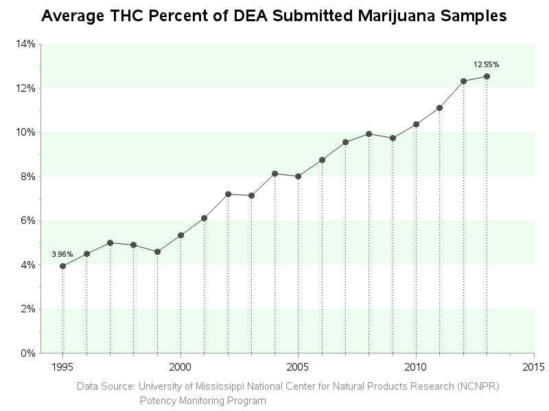
Which of my changes do you like, and which do you not like? What other changes would you recommend?

10 Comments
Robert . . .
A few years back, I read Michael Pollan's book "Botany of Desire" that uses four plants to highlight the impact plant domestication has had on human history and on the plants themselves. His similar article in New York Times Magazine tells some of the story behind these THC numbers and why it's not the marijuana the hippie generation remembers!
http://michaelpollan.com/articles-archive/how-pot-has-grown/
Christina
Dropping the percents annotated at the intermediate years is in the spirit of what I have long called "Sparse Annotation". For a trend line, usually the only y values of great interest are the starting point, ending point, any intermediate minimum or maximum, or, for the case of a trend without any intermediate min or max, instead an intermediate point where there is a permanent significant change, if any, in the general slope. In this case, there is no intermediate minimum, maximum, or change in the general slope of the trend.
The only changes I'd recommend to your graph are: dropping the years beyond 2013, and changing to two-digit years. The data values are four-digit years, but the displayed values can be two-digits. Exact year would be evident for each data point, without any need to "interpolate".
Thanks for the suggestions - I typically avoid using 2-digit years (remembering Y2K), but that would allow all the year labels to fit in this case.
Your graph "Tracking the increase in marijuana's THC content" is so much clearer than the one in the DEA report. The visual trend upwards is much more quickly understood, and the problem appears more relevant. Those points are lost in the original one. I want to send it to every educator, parent, student, politician, and medical practitioner I know! Thank you for identifying the problems in the original. It's inspiring to see the benefits from a SAS make-over. I hope you will post the code.
Thanks for the great feedback Jody - glad you liked the graph!
Here is a link to the SAS code: http://www.robslink.com/SAS/democd76/marijuana_potency_info.htm
Hi Robert,
For any of your future blogs can you please try the WIND MAPS : http://hint.fm/wind/gallery/ ?
Thanks.
The wind maps are pretty neat, aren't they!
Yes absolutely.
If the variance for each year was available, it would be interesting to see that on the graph. I assume that not only has the potency gone up, but the variance has deceased.
Yep - that would be interesting. (But all I've got access to is the pre-summarized data, unfortunately.)