The Wall Street Journal recently published some graphs about seven infectious diseases, and I tried using SAS to improve the graphs ... it's a veritable infectious disease (graph) bake-off!
Let's start with Measles ... here's a screen-capture of WSJ's measles graph:
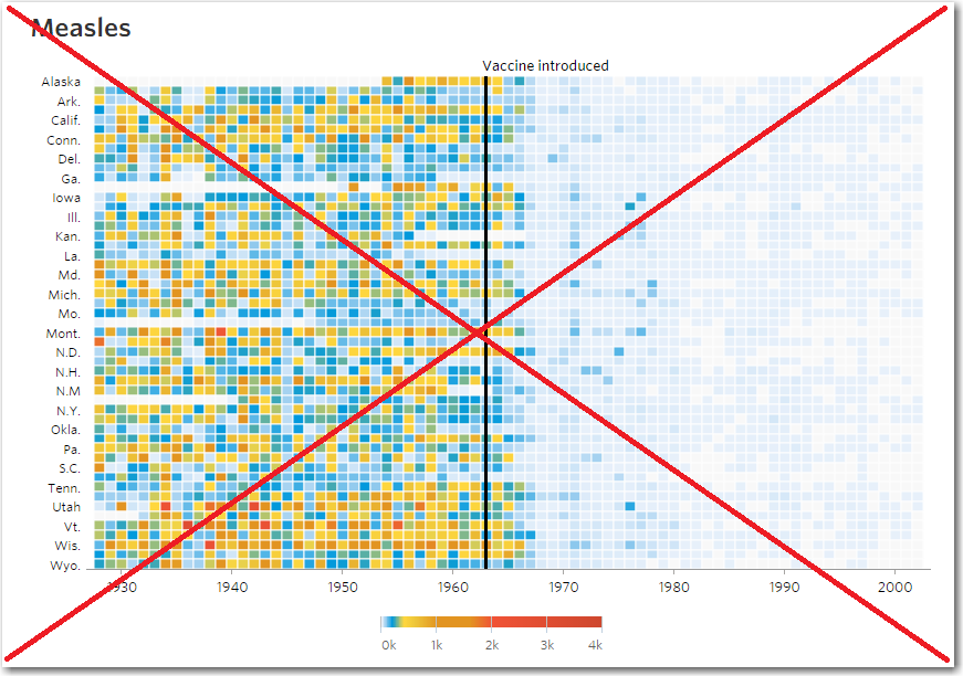
In general, their graph is eye-catching, and I learned a lot (in general) about the data by looking at it. But upon studying the graph a little deeper, I noticed several problems:
- It is difficult to distinguish zero values (very light blue) from missing-data (light gray).
- There was not enough room for all the state values along the left edge, so they just left out about 1/2 of the state labels.
- When you hover your mouse over the colored blocks to see the hover-text, the box turns light blue - which could mislead you to think that is the data-color of the box.
- Although it is explained in the introductory paragraph, the graphs themselves don't mention that the unit of measurement is cases per 100k people per year.
- They don't keep their graphical unit polygons square, but rather stretch them out to fill the entire page - this makes it difficult to know how many years the graph spans.
- It is sometimes difficult to quickly determine which color represents more/less disease cases, using the semi ~rainbow color scale (especially in the yellow/green/blue end of the scale).
Therefore I set about creating my own SAS version of the graphic, to see if I could do a better job. I located the data on the Tycho website, downloaded the csv files, and imported them into SAS datasets. I then created a rectangular polygon for each block in the graphic, so I could plot them using Proc Gmap. I assigned custom color bins, so I could control exactly which ranges of values were mapped to which gradient shade of my color (I used shades of a single color, rather than multiple/rainbow colors), and used a hash-pattern for the missing values. Here's my measles graph:
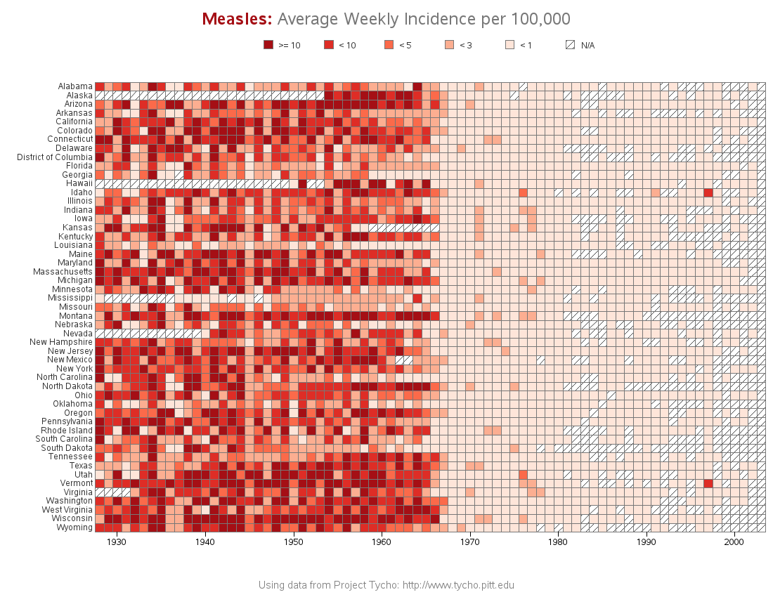
In addition to the visual aspects of the graph, I also made a slight change to the way the data is summarized. The Tycho data was provided as weekly number of cases per 100k people, and (it appears) WSJ summed those weekly numbers to get the annual number they plotted. But the data contains a lot of 'missing' values, and the Tycho faq page specifically mentions that 'missing' values are different from a value of zero ...
"The '-' value indicates that there is no data for that particular week, disease, and location. The '0' value indicates a report of zero cases or deaths for that particular week, disease, and location."
If you have 11 weeks with 'missing' data (such as Alabama in 1932), and you simply sum the other 41 weeks that do have data, and call that the annual rate ... I'm thinking that probably under-reports the true annual value somewhat(?) Therefore, in hopes of getting a more valid value to plot, I calculate the weekly average (rather than the yearly sum).
Here are links to my plots for all 7 diseases: Measles, Hepatitis A, Mumps, Pertussis, Polio, Rubella, and Smallpox.
So, now for the big question ... have you ever had any of these diseases?

21 Comments
Pingback: Data Viz News [82] | Visualoop
Pingback: Remaking a measles data visualization
Another big problem with the original graph, which you did not mention but was one of your many improvements is that the states were not listed alphabetically by name, instead they are listed in the alphabetical order of their postal codes. Compounded with the issue of not listing every state, that was awful design!
Ahh yes - a good thing to point out!
Does robslink.com even exist anymore?
I have been trying for about 2 weeks to get to the website and I am getting time-outs.
Certainly! - I am able to get to it from every computer I've tried.
Perhaps your site/network-admins are blocking it?
Or perhaps you'll have to clear out your browser cache?
The states are ordered alphabetically. Would some other order or grouping be more informative? How about making the width of the rows proportional to the populations of the states?
Xan Gregg made several variations (including changing the order) - you might like to take a look at his blog:
https://community.jmp.com/blogs/theplotthickens/2015/02/23/measles-heat-map-remakes
What happened in 1945?
I'm not sure - that would have been around the end of WWII, so perhaps it had something to do with that?
Nicely done. I was just wondering why the legend goes across from largest to smallest values. I think that it's easier to read if the lowest values are on the left side of the legend. I've used your code for data from our atmospheric pollutant monitoring network.
Thanks.
Bill.
Good question! While I would usually show the legend smallest-to-largest, I did it the other way this time to match the order/trend in the chart. My thought is that it will make it easier for the person reading the chart to look from the color in the chart to the color in the legend easily/quickly. (I tried it both ways, and it was difficult to choose which way to go - there would be benefits with either way.)
Pingback: Visualizing the eradication of smallpox
Great plots!
But you forgot(?) to include one very important feature of the original: the line showing the introduction of the vaccine.
And: your "Fifty shades of Red" is a great improvement of the original color scheme!
50 shades of red - how timely, eh?!? :)
That perhaps gives me an idea for my next blog post! ;)
And good point about marking when the vaccines started ... I'm still undecided on that. Some of the diseases (such as Smallpox and Whooping Cough) had the vaccines introduced before the data in the plot, making it difficult to show. And the question is still in my mind - was it the availability of the vaccine, or when the vaccine came into widespread use, or when it became required(?) that made the difference? Since I'm not sure of the answer to those questions, I'm still contemplating how to handle that aspect of the graph. (I'm open to suggestions from some disease experts!)
I am not a disease expert but I wonder if there would be away to have a bar on the bottom showing percent vaccinated in the USA, or even just a timeline regarding the vaccination introduction? Perhaps very simplified?
http://www.historyofvaccines.org/content/timelines/measles has information.
I love the plot.
Hmm ... that might be interesting.
Nicely done. I believe I had the measles. Does that make me eligle to get a look at the code?
Thanks,
Brian
Thank you, good sir! And here is your link to the code:
http://www.robslink.com/SAS/democd76/diseases_info.htm
Cool work, Robert! Has anyone created the same visualization for autism cases yet? ;-)
Autism would be interesting to plot! ... But it would probably be difficult to get concrete data (I suspect it's more difficult to diagnose than Measles!)