I'm ramping up my visualization skills in preparation for the next big election, and I invite you to do the same! Let's start by plotting some county-level election data on a map...
To get you into the spirit of elections, here's a picture of my friend Sara's dad, when he was running for office. Does this say Classic (Southern) American Politician, or what?!? You can't help but like this candidate! :-)

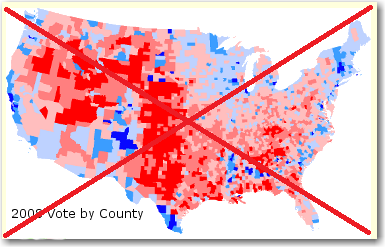
I'm not a very 'political' person, but as a huge 'data' person I'm drawn to the visualizations of the election results. Especially the maps. Therefore when I found some interesting election maps on John Mack's page, I decided to try my hand at creating some similar maps with SAS.
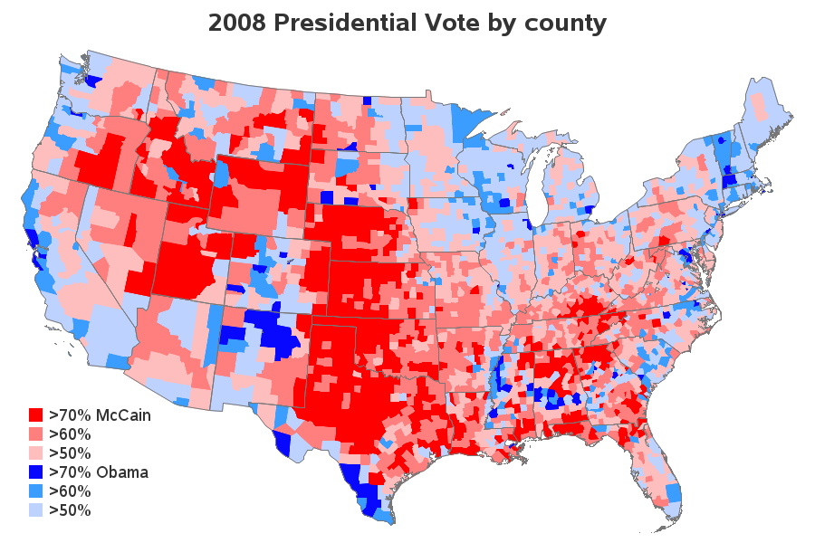
This first map shows the presidential election results, by county. There's not a color legend, but one would assume the red counties were won by the Republican candidate, and the blue counties were won by the Democratic candidate - the darker the color, the larger the margin of the win. Reading the text on the page, it appears they used the log-ratio as the variable to plot. Although that is an easy way to plot the data, most people would have a difficult time relating to log-ratio numbers (which probably explains why the map has no color-legend).
Creating the same map using SAS would not be difficult - just calculate the log-ratio with 1 line in a data step, assign 6 gradient colors in pattern statements, and tell Proc Gmap to use levels=6. But I decided to take a different approach. I calculated the % votes for McCain, and the % votes for Obama, and then used if-statements to put each county into a 'bucket' based on those values. I then explained in the color legend exactly which % values were in each bucket. This way people viewing the map know exactly what each color represents. I added state outlines to the county map, which I think is very useful. I also added html hover-text for each county, if you click to see the interactive version.
Here's a summarized version of the SAS data step I used to calculate my color buckets used in the map above. It's a little more work than using the log-ratio, but I think it's worth the extra effort so that the results are easy to understand.
data vote08_by_county; set vote08_by_county; total_votes=mccain+obama+other; mccain_percent=mccain/total_votes; obama_percent=obama/total_votes; if mccain gt obama then do; if mccain_percent gt .70 then pct_bucket=1; else if mccain_percent gt .60 then pct_bucket=2; else if mccain_percent gt .50 then pct_bucket=3; end; else if obama gt mccain then do; if obama_percent gt .70 then pct_bucket=4; else if obama_percent gt .60 then pct_bucket=5; else if obama_percent gt .50 then pct_bucket=6; end; run; |
This next map was the one that really caught my attention. It's the same data, but analyzed a little differently such that geographic 'hotspots' for each candidate are more evident.
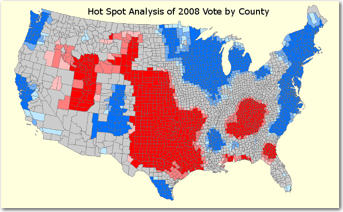
It was not clear from the web page how to implement the method that they used to construct their “Hot Spot Analysis” map - it just described the map as "a Hot Spot Analysis of the log-ratio of Obama to McCain votes, by county". I calculated a log-ratio, and tried binning and shading it several different ways, but never could get anything that looked quite like his map.
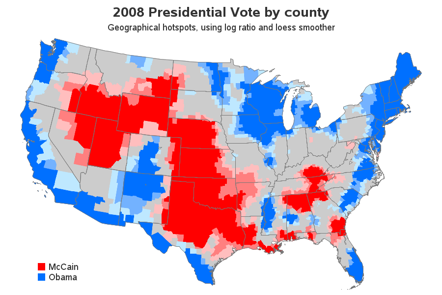
So I finally consulted my friendly neighborhood statistician, Rick Wicklin, and he did a bit of research and came up with his 'best guess' as to a method we could use to create a similar map. We used Proc Loess in SAS to fit a smooth surface to the log-ratio of the county-level data, evaluating the loess model at the projected X/Y centroid of each county. We then used Proc Rank to divide the data into 15 quantiles, and used Pattern statements to create the desired color ramp.
proc loess data=vote08_by_county plots=NONE; model log_ratio = CX CY; output out=Fitted P=Fit; run; proc rank data=Fitted out=Fitted groups=15; var Fit; ranks Fit_Bucket; run; pattern1 v=s c=cxff0000; /* red */ pattern2 v=s c=cxff0000; /* red */ pattern3 v=s c=cxff0000; /* red */ pattern4 v=s c=cxff7f7f; /* light red */ pattern5 v=s c=cxffbebe; /* lighter red */ pattern6 v=s c=graycc; /* gray */ pattern7 v=s c=graycc; /* gray */ pattern8 v=s c=graycc; /* gray */ pattern9 v=s c=graycc; /* gray */ pattern10 v=s c=graycc; /* gray */ pattern11 v=s c=cxbee8ff; /* lighter blue */ pattern12 v=s c=cx73b2ff; /* light blue */ pattern13 v=s c=cx0070ff; /* blue */ pattern14 v=s c=cx0070ff; /* blue */ pattern15 v=s c=cx0070ff; /* blue */ |
The resulting SAS map looks very similar to the original. One important difference is that I show the state outlines rather than the county outlines. I think showing the county outlines is a bit misleading, because the colors you see are not necessarily the way a given county voted (therefore I like to de-emphasize the county aspect of the data by not showing the county outlines). I like the look of this map, but I prefer the first map better for data analysis, because it shows you exactly how each county voted.
And now, since you made it all the way through a blog all full of 'yucky' code and statistics, let me reward you with a few election-related photos provided by some of my friends (David, Sophia, and Claudia)...


3 Comments
Hi Rob, great stuff! I made some modifications to try to run this under SAS 9.2 TS2M3 but it does not seem to work. I am using maps.counties instead of mapsgfk.us_counties and state county vs ID. All seems to work but I get the following error message and warning:
WARNING: Some observations were discarded when charting Fit_Bucket. Only first matching observation was used. Use STATISTIC=
option for summary statistics.
ERROR: The ORDER= entry "0.00" is not a legend value.
The map is all black and I only see the red block for McCain. Is it possible to emulate what you have using SAS 9.2 TS2M3. There are governing reasons beyond my control that forces me to stay at my current SAS release. Sure would love to reproduce what you have in SAS 9.2.
Thanks for sharing this code!
Hopefully you can get a newer version of SAS soon - there are some really great enhancements in newer versions!
But in the meantime, I've created a 9.2 version of these 2 examples for you :)
http://www.robslink.com/SAS/democd76/election_2008_county92.htm
http://www.robslink.com/SAS/democd76/election_2008_county92.sas
http://www.robslink.com/SAS/democd76/election_2008_hotspots92.htm
http://www.robslink.com/SAS/democd76/election_2008_hotspots92.sas
I want to clarify the second example. The example shows how to color counties according to some statistical model that is evaluated (scored) at the centroid of the counties. The graphical idea is independent of the actual model being used. In order to simplify the analysis and enable the user to concentrate on the graphics, the example uses a simple, familiar, loess smoother. A loess model is not a hot spot analysis, so the title of this article refers to Mack's analysis, but not to the SAS analysis.
For information about statistical models for hot spot analysis of spatially correlated clustered data, see this overview from LSU or do an internet search for "Getis-Ord spatial statistics".