Have you ever thought about retiring in another country, where your money might go further? Well here's some quantitative data to help you make an informed decision! ...
First, to get you in the mood, here's a picture of my friend Erik checking out the prices at a pedal-powered food cart in Thailand. Erik and his wife Joy have done more world traveling than any of my other friends, so they probably have good insight into what it might be like to retire in another country.

I recently ran across some interesting information on Numbeo.com. They had combined data from several different sources to come up with several indices that can be used to compare the prices of various things in different countries: Consumer Price Index, Rent Index, Groceries Index, Restaurant Index, and Local Purchasing Power Index. They let you select the data, and plot a map such as the following:
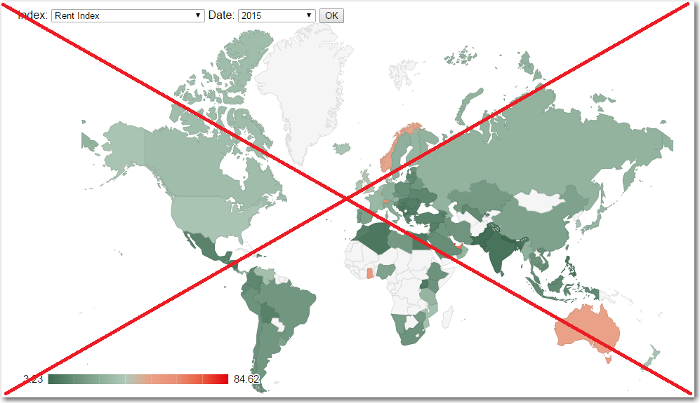
I'm glad they mapped the data (it's much easier to analyze than just a table), but I guess you could say I'm a little picky about my maps. I'm not a big fan of continuous color gradients (it's just too difficult to look at a continuous shade, and determine what value it represents, compare it to other countries, etc). I'm also not a fan of the projection they used (much of the available space is consumed by Greenland and Northern Canada ... which aren't really important in this analysis). So, of course, I decided to try creating my own maps using SAS.
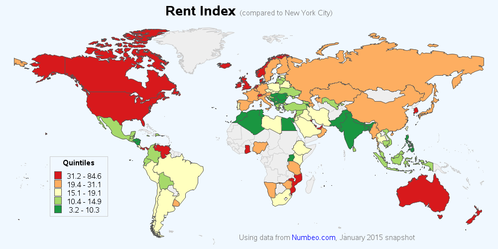
I decided to go with 5 colors, and assign an equal number of countries to each - this way each color represents 1/5 of the countries (quantile binning). I also used a projection that de-emphasizes the extreme northern areas, and allows the other (more populous) areas to make use of more space. Here's the Rent Price Index map, for example (click the image to see all 5 maps):
Technical Details:
I copied the data from the Numbeo.com page and pasted it into an Excel spreadsheet, and then used Proc Import to get the data into a SAS dataset. I used Proc Gmap to draw the map, and the levels=5 option to perform the quantile binning. You can see the complete SAS code here.
So, after reviewing the data, what country would you like to retire to? What are some other factors to consider, in addition to these indices?

4 Comments
some of the mouse over give me country names, but most aren't. Without a map of the world I found it hard to pin point the countries. Can you improve on this?
Ahh! - That was an intentional 'feature' ... but I see how it could also be annoying/confusing! :)
I only set up mouse-over text for the countries that have data (the gray countries, with no data don't have mouse-over text). In my original thinking, this would make it easier for people to see only the countries that were in the data. But I suppose it could also be useful to see the names of the graph countries also (the ones without data).
Since so many factors need to be considered, and what's important to different people varies, would more individualized scoring that includes more criteria be appropriate to create maps that are more specific to individuals or population segments? Criteria include climate, crime rate, life expectancy and economic conditions such as cost of living, social, civic and job opportunities, plus taxes.
Those all sound good to me! :)