I recently saw an interesting infographic (see partial screen-capture below) about the top 10 most annoying airline seatmate behaviors. But the infographic was one of those *long* spread out ones, that you have to scroll forever to see the whole thing. I decided to try to create a more efficient SAS graph to visualize the same data, so you can see all the information in one page, at a glance.
Not everyone is as fortunate as my buddy David (pictured below), who has a pilot license, and does not have to worry about annoying behaviors of random seatmates.

The rest of us non-pilots have to fly on commercial airlines, and the people sitting around us have a variety of behaviors - some good, and some annoying. Expedia's infographic about annoying seatmates was 'cute,' but I had to do so much scrolling to view the 1000x4515 pixel image that by the time I viewed the last few items, I had forgotten what the first few items were!
Therefore I decided to create a no-nonsense SAS graph that allows me to see and compare all the data, in a graph that easily fits on one page without scrolling. I first input the data into a SAS dataset, and then used the following minimal code to produce the default graph. Here's the code and the output:
proc gchart data=my_data; hbar category / type=sum sumvar=percent; run; |
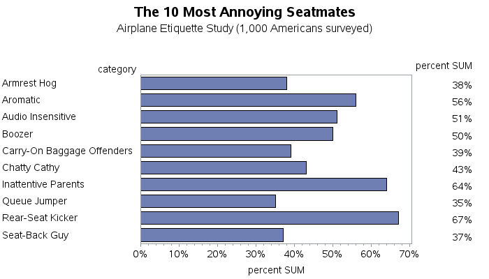
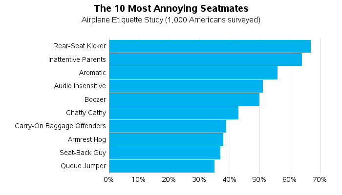
That's a decent graph, and allows me to easily see and compare the 10 items ... but it could be a lot better with a little more work. Using several built-in options, and specifying characteristics in axis statements, I was able to get a graph that was much better looking, and also easier to compare the 10 items:
pattern1 v=s c=cx00B2EE; /* blue color */ axis1 label=none value=(j=right) offset=(4,4); axis2 label=none major=none minor=none style=0; proc gchart data=my_data; hbar category / type=sum sumvar=percent descending nostats maxis=axis1 raxis=axis2 noframe space=0 width=3.7 coutline=white autoref clipref cref=graydd; run; |
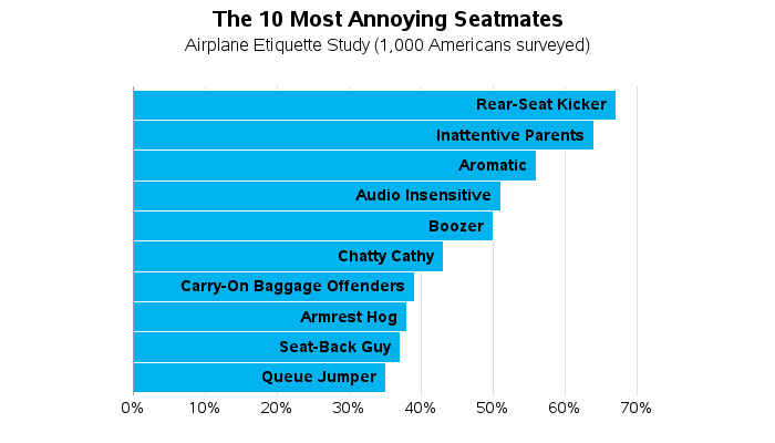
That's a fine graph, but there is always room for improvement! I found myself looking from left-to-right quite a bit, to see the bar text and then the bar height. So I thought, why not print the text inside the bar, so I don't have to look all the way on the left side of the graph? There's no built-in option to do that, but I suppressed the default text labels by using value=none on the axis statement, and then used data-driven annotate to write the text on the bars. Depending on your preference, either of these two graphs might suit your needs.
data my_anno; set my_data; length text $100; xsys='2'; ysys='2'; hsys='3'; when='a'; midpoint=category; x=percent; function='label'; position='<'; style='albany amt/bold'; text=trim(left(category))||'a0a0'x; run; axis1 label=none value=none offset=(4,4); axis2 label=none major=none minor=none style=0; proc gchart data=my_data anno=my_anno; hbar category / type=sum sumvar=percent descending nostats maxis=axis1 raxis=axis2 noframe space=0 width=3.7 coutline=white autoref clipref cref=graydd; run; |
Do you agree with Expedia's "Top 10" list? What's the most annoying behavior you've personally seen on a plane?

12 Comments
For your readers who use ODS graphics, here is a roughly equivalent graph:
The last graph is really nice. I would left justify the annotations though...
~ Victim of Rear-Seat Kicker
It was a tough decision how to justify the test in the bars. People are more used to seeing text left-justified. But in this case I chose right-justified so it would be easier to see the length of the bar & the text without having to move the eyes left/right. It would probably work out ok either way :)
You are right, in this case right justified makes skimming the graph quickly go well. Thanks for the template on doing this.
Robert, nice graph, it uses the bar space well, might as well put text in place of monotone bar color.
Was the origin of the data a output from a proc freq on category?
Thanks for your continued support of SAS via texts and social media.
Thanks for the feedback!
I'm not sure what tool Expedia used to summarize their survey data (SAS, or other). I just read the pre-summarized values, and entered them into a SAS dataset.
Really nice graphs!
The most annoying person I sat next to was from Korea to DFW, and he was chewing and spitting skoal tobacco into a cup the entire flight.
Eiwww!!! :b
The first two often go together! Usually the 'rear-seat kicker' is a child whose 'inattentive parents' are completely oblivious.
Ahh!
The most annoying person I ever encountered, was the guy in a middle seat who thought he was "entitled" to an aisle seat because he "paid so much".
The stewardess was really great, and did not take his BS.
Yeah, there are a lot of other selfish people.
Hmm ... I bet we could summarize many of these categories into a "selfish/entitled" category! :)