There are many ways to use SAS in Health & Life Sciences, and one of my favorite is using it to track the spread of diseases. This post demonstrates how to layer several customized maps to track the recent Ebola outbreak in Africa.
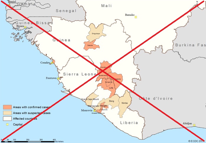
In this blog post, I describe how I created a SAS version of an ebola map that appeared in a recent article on the bigmedicine.ca website. Here's a screen capture of the original map:
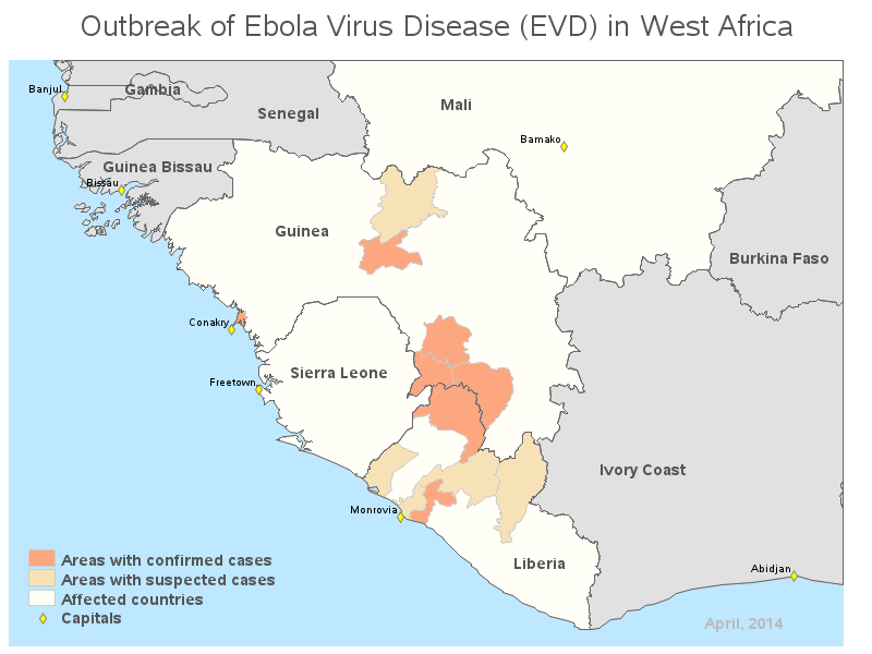
For those of you who are impatient and want to "cut to the chase" here's my final SAS map (looks pretty similar, eh!?!). Click the thumbnail below to see the full size interactive version of my map with html hover-text.
And here are the technical details of how I created this map...
I used the new mapsgfk maps that we started shipping in SAS 9.4 for this example. I started with the mapsgfk.Africa continent map, and used Proc Gproject to chop out just the rectangular area, based on latitude/longitude values, that was in the original article. (This is a technique I learned from Mike Zdeb's wonderful book Maps Made Easy using SAS.)
proc gproject data=mapsgfk.africa out=my_map latlong eastlong degrees project=cylindri latmax=14.0 latmin=0 longmin=-20 longmax=-3.2; id id; run; |
I created some 'map data' so that the affected countries mapped to the light yellow color, and left the other countries gray (using 'cdefault=grayE1').
That was the easy/straightforward part :) Now I need to add the individual country maps for Guinea and Liberia. I was able to use mapsgfk.Guinea as-is, but mapsgfk.Liberia's areas were 1 level more granular than I needed (such as US counties, instead of states), therefore I had to use Proc Gremove to group those lower-level areas into the desired areas. Once I had created these two maps, I combined them with the previous map, layering them such that these two new maps come last in the dataset, so they will show up 'on top'.
We've now got a map with the countries and areas together, but it's difficult to determine exactly which country the smaller areas are a part of. Therefore I take the country borders, and create an annotate dataset to draw a dark outline around each country using the poly/polycont annotate commands. This is an improvement over the original map, by the way!
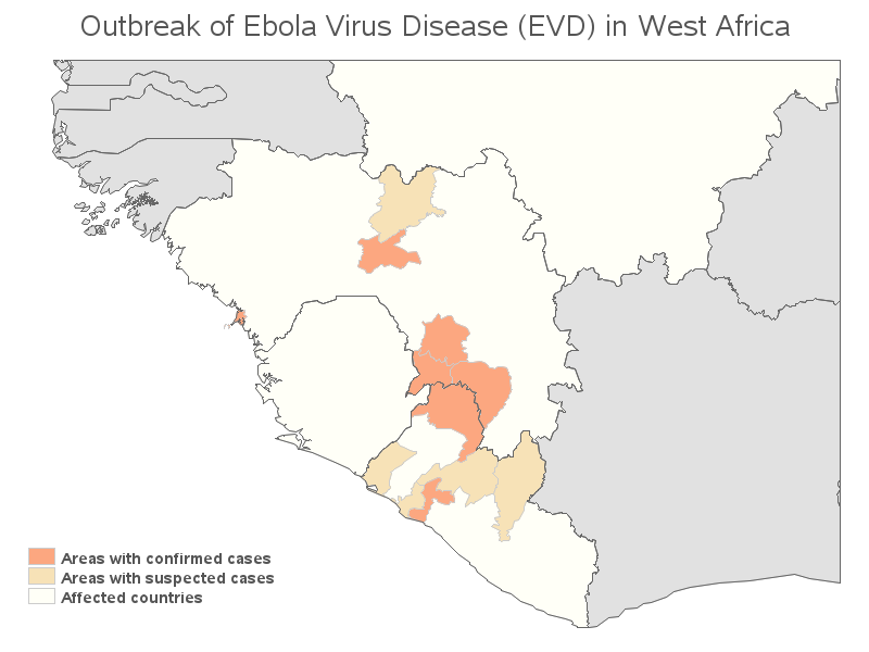
And to finish it off, I annotate country & city names at specific latitude/longitude coordinates, and annotate a blue rectangle behind the map to represent the ocean. I annotate the 'Capitals' marker to the legend, and add the date to the bottom/right. I add html hover-text to all the countries and areas within the countries, using the Gmap html= option, so you can mouse over them and see what the names are (which is another enhancement over the original map). Scroll back to the top of the blog to see the finished map.
As you can see, you can do a lot of customizations in SAS maps, and you can layer maps (and also annotations) to create some really detailed maps to help visualize and analyze your data. Now that you know what's possible, what data do you think it would be interesting to analyze on a map?


5 Comments
Pingback: Tracking Ebola: Using SAS bubble maps | The SAS Training Post
I like the control buttons in your "manual animation" proof-of-concept. An ideal solution would allow the viewer to step through manually, but switch to automatic animation at any point, control the speed of the automatic animation, but stop it at any point, and toggle back into manual stepwise mode. Perhaps an impractical wish.
I like the companion bar chart. It can be somewhere between cumbersome and impossible to hard annotate all of the outbreak points on the map, and hover-text would not permit concurrent comparison of the detail numbers for the displayed week's map.
LeRoy Bessler
Visual Data Insights™
Another Nice Map, Robert. Great tutorial, and useful demo of new mapsgfk maps in V94.
Questions:
What is the little blue area near the coast of Grand Cape Mount, Liberia? (Viewers can use the web-enabled map and its hover-text to identify what is Grand Cape Mount. It's in the western corner of Liberia.)
What is the significance of the date "April, 2014", and why did you not use black text to make it maximally readable?
Suggestion:
It would be interesting to see Maps on the Outbreak of Health
animated map(s) showing the progressive reduction of some major infectious disease(s) due to treatment programs. Identify treatment program(s) and funder(s), as well as the disease(s).
If animation is too much hassle, just before and after pairs would more than suffice.
Thanks.
LeRoy Bessler
Visual Data Insights™
Hi LeRoy - great questions & suggestions!
I annotate a blue background behind the map, therefore anything showing up blue is an "absence of map area" which makes it (probably) water. I checked Google maps just now, and zoomed in on that area, and it appears to be Lake Piso:
https://www.google.com/maps/place/Liberia/@6.7495148,-11.2224793,11z/data=!4m2!3m1!1s0xf09f803d4a9fcc1:0x7fd3286b32d16373?hl=en
The original map didn't have a date, but I felt it was important to put some kind of time-frame on the map. The article was written April 30 - but being that the map probably didn't represent the state of things on that exact day, I opted for a little more vague "April" for my proof-of-concept. If someone is plotting real data that they know the details about, I would encourage them to put as useful & specific of a date as possible.
Yes - a progression of maps (or animation) would be very interesting and useful. I haven't found a good source of that kind of detailed data, but I did set up one proof-of-concept for tracking the flu, where you can click on the date along the bottom of the screen to manually 'animate' the data. I only set up data for a few of the days, but here is that example:
http://robslink.com/SAS/democd61/flu_files/flu_tracker_26nov2012_02dec2012.htm
Robert,
Thanks for another excellent post. This kind of mapping code will come in very handy!
Brian Adams