As you might have guessed, this is a blog post about cold temperatures, and ice!
Sometimes ice is a great thing. Here's a picture of my freezer, for example (don't judge - I'm a bachelor!) ..

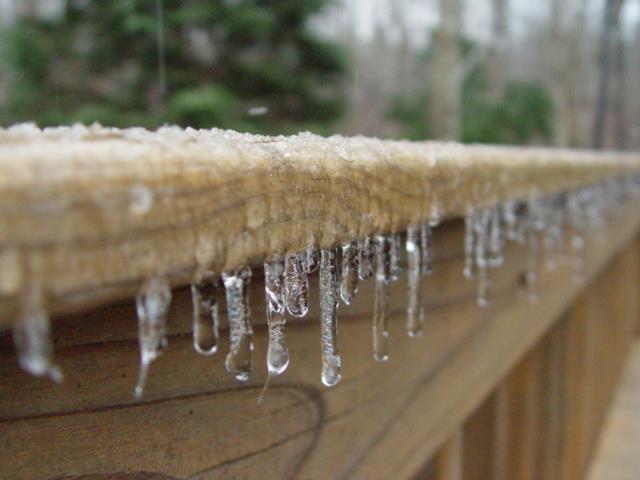
And sometimes ice is a beautiful but dangerous thing, as this picture of my back deck shows:
In my previous blog post, we talked about melting glaciers and rising sea levels. This time, let's visually analyze the temperature, and sea ice at the north and south poles...
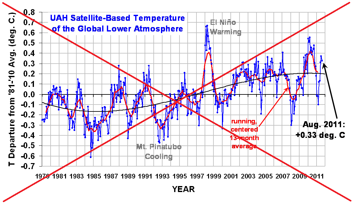
I had seen the following temperature graph that I liked on the Web, and decided to create my own, with the latest data.
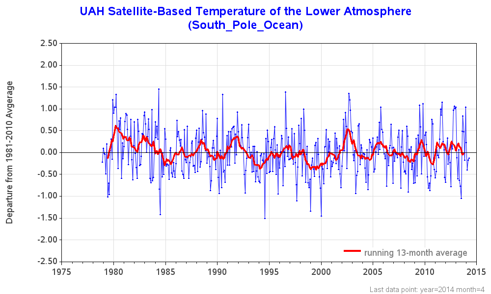
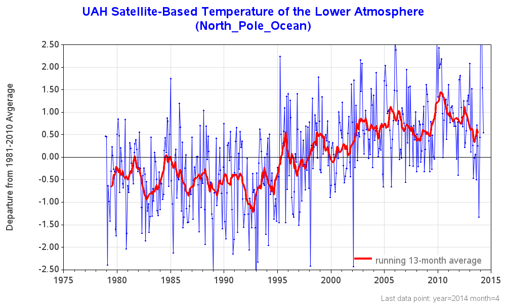
I did some searching, and found that the temperature data was available here, and not just for the global temperature, but also for various areas of the world - both land and ocean. I wrote a SAS job to import the data directly from the Web, and create graphs of all the areas - below are the north and south pole temperature graphs for the ocean. Looks like the south pole ocean temperature is holding fairly steady, whereas the north pole ocean temperature has been increasing lately.
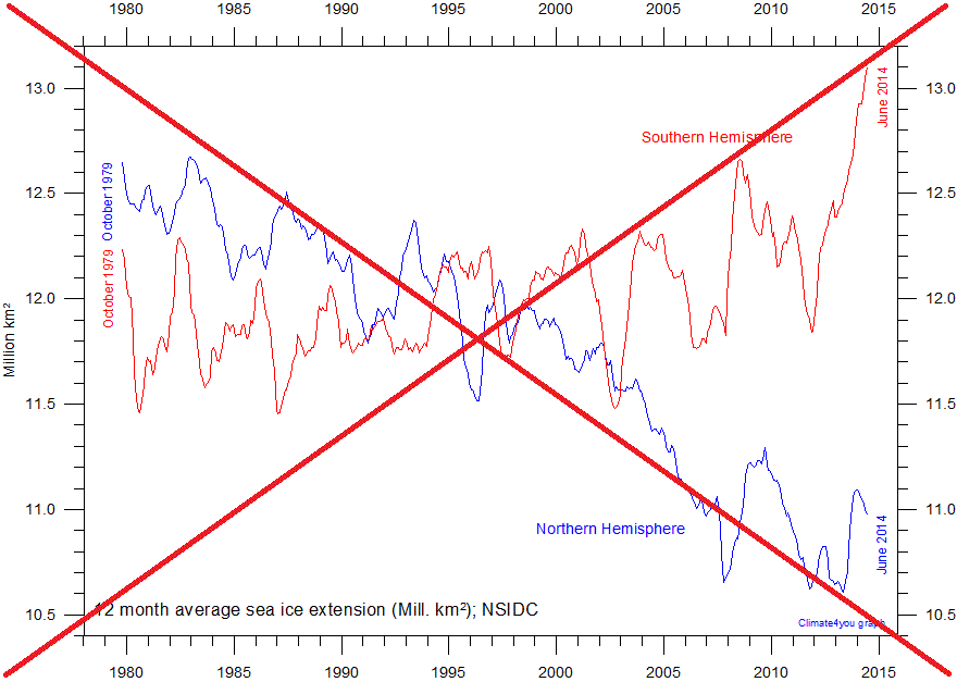
In addition to the temperature, I thought it might be interesting to visually analyze the amount of sea ice at the poles. Note that sea ice is the ice floating on the water, not the ice on land. I found an interesting graph here, (see screen-capture below):
I decided to try to locate similar data and create my own version of the chart. I found a source of data here, and wrote a SAS job to import, summarize, and plot the data similarly to the original plot. It shows that the annual average (12 month moving average) sea ice level at the north pole is decreasing, and at the south pole is slightly increasing.
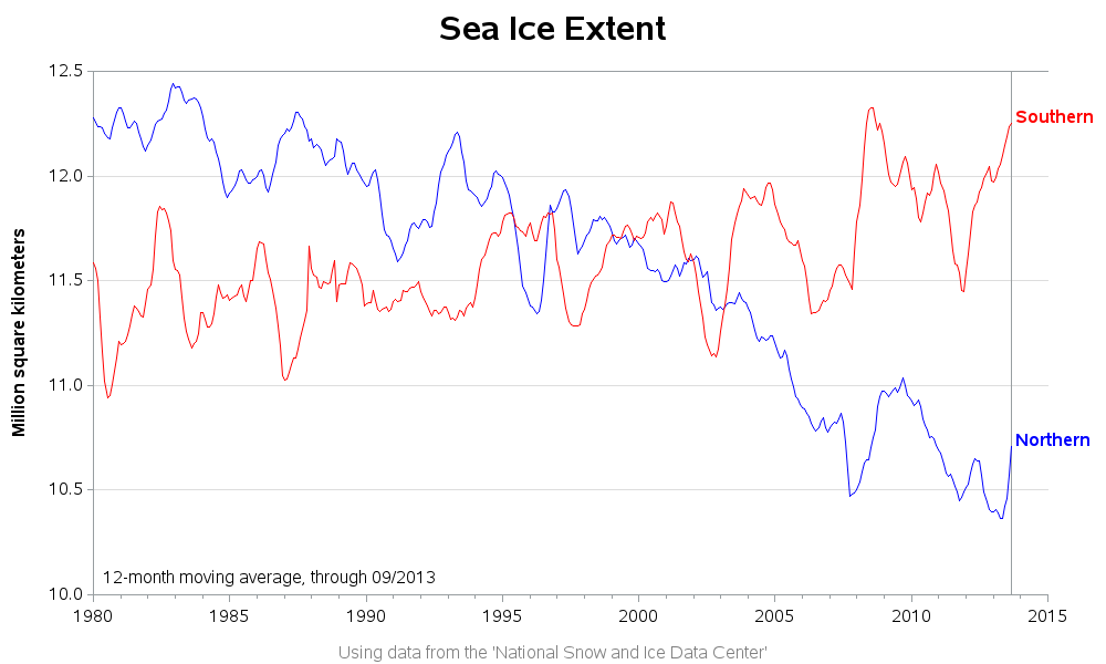
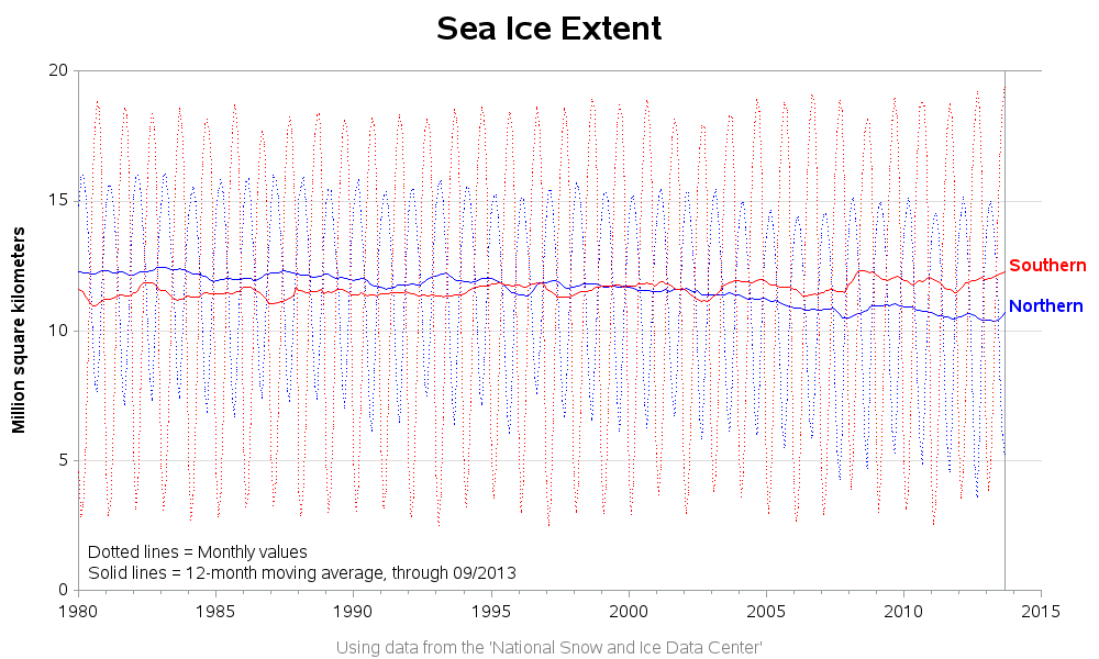
But if my recent shoes blog has taught us anything, we know that auto-scaling the axes can often 'exaggerate' the change in data, and it is often useful to plot the data scaled to the minimum and maximum possible values. Therefore I added the monthly values (dots) to the plot in addition to the above 12-month average (solid lines), so we could see the 12-month averages in the context of "the grand scheme of things".
It's great to live in a day & age when this kind of satellite data is available on the Web, isn't it?!? What other kinds of interesting data have you found on this topic, and how else might we visually analyze it?
So, how would you finish the joke/question, "How cold was it? It was so cold that..." :)


3 Comments
The readme from 2012 on that data is very interesting insight into how the data is created: http://vortex.nsstc.uah.edu/data/msu/t2lt/readme.26Jun2013
Also, in your plots, you have the moving average. There's clearly fluctuations in there; what are the confidence bands around this?
Good question! - I'm not sure of the answer. I was just striving to reproduce the same graph as the original, and since they didn't have confidence bands, I didn't check into that.