In light of the recent reports that glaciers in Antarctica are melting, what SAS graphs might be useful in analyzing the data?...
When floating sea ice melts (such as at the North Pole), it doesn't raise the sea level - but when ice on land melts (such as glaciers at the South Pole / Antarctica), that does add water to the oceans, and make the sea level rise. Recent research indicates that several glaciers in the western part of Antarctica are melting faster than previously thought, and could raise sea levels by 4 feet over the next several centuries.
How, you might ask, could you use SAS to visually analyze data about rising sea levels? I'm glad you asked! :)
One example would be a map, showing the areas that would be flooded if the water level were to rise a certain amount. To create such a map, I downloaded a grid of elevation data for the area of interest (in this case North Carolina, where I live) from the National Oceanic and Atmospheric Administration (NOAA) web page, and color-coded these points based on their elevation, and plotted them on a map - the points are so dense that it produces what looks like a gradient shaded contour map. I programmatically set the points that were within 1 meter of sea level to be colored red, so you can easily see what area would be flooded with a 1 meter rise in sea level. 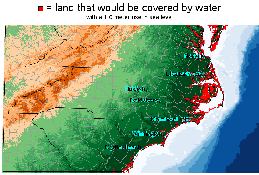
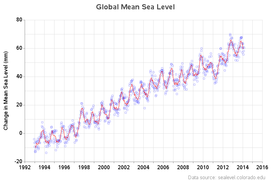
A time series plot, showing the change in the mean sea level, might also be useful. I was able to download the global mean sea level from colorado.edu, and here is a plot:
Hmm ... I wonder if I can use this data to calculate where to buy cheap land now, that will be "oceanfront property" when I retire?!? :)

7 Comments
I think it would be very interesting to include an overlay of areas where houses have been rebuilt multiple times from coastal flooding.
I suspect data may not be readily available but I think the change in glacial ice should go back maybe another 30 to 40 years.
Yep - both of those would make for some interesting graphs/maps!
But not sure where I could get the data for them :\
Pingback: How cold was it? It was so cold that...
This is about a plotting a mean sea-level as a rise. You could be a lot off what that approach as that could vary a lot. Do you have chosen your location? Perhaps still getting wet feet. http://e360.yale.edu/feature/the_secret_of_sea_level_rise_it_will_vary_greatly_by_region/2255/
Yep - 'sea level' is a complex word :)
Here are some more details about the specific data in this plot:
http://sealevel.colorado.edu/content/2013rel3-global-mean-sea-level-time-series-seasonal-signals-retained
And...thanks for bringing back the plot of the original Superman movie, where Lex Luthor plans to create Costa de Lex by eliminating the western part of California. I'm not sure it's a sound investment plan.
Hmm ... come to think of it, you are looking a lot more like Lex Luthor these days... Coincidence? :)