With tornadoes in the news lately, I wondered how I might could use SAS to analyze tornado data. How about animating 60 years of tornado path data? ...
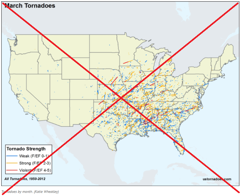
I was using Google to search for ways to analyze tornado data, and found an example on ustornadoes.com that animates the tornado path data, by month, for the last ~60 years. I thought it was very enlightening how the tornadoes consistently affected certain areas of the US during certain months of the year. Here's a screen-capture:
I thought "Hey, that's pretty cool! ... Let's try that with SAS!"
So, I dug up my old tornado tracking map from last year, and added just a few lines of code to use the new SAS 9.4 gif animation syntax, and added a 'by month' to my Proc Gmap ... and now I've got the desired animation!


4 Comments
Cool animation - Just curious - Is there a reason that there are lots of long lines in the map - do tornados travel hundreds of miles, or do they touch down, then disappear again? (from a land of long white clouds, not tornados)
Yes - some tornadoes travel 100+ miles. Here is a map from ustornadoes.com showing several of those!
http://www.ustornadoes.com/wp-content/uploads/2014/04/100mile-or-greater-tornado-tracks-thru-2013.gif
Wow, the animation clearly shows the tornadoes more prominent areas. Stay safe...
Indeed!