Here's an example that shows SAS is more than just a tool to create analytic graphics - it can also be used to create 'cute' infographics! :)
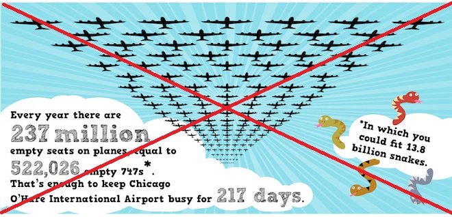
An infographic that recently caught my eye had a fleet of airplanes stretching from overhead out to the horizon, along with some interesting info about empty seats on airplanes (see screen capture below). I decided to create my own version (minus the 'snakes' nonsense), using SAS.
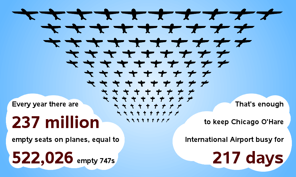
I created a radiant color-gradient sky/background by annotating concentric pies, of slightly different sizes, and slightly different shades of blue. The pies are a glob solid white pies of random sizes, with the text annotated on them. I display these annotated things on a blank Proc Gslide.
Then the tricky bit was the 3-D fleet of airplanes. I created a rectangular grid of airplanes by looping through the desired locations on the screen, and annotating a text label containing a font character shaped like an airplane. I mathematically size the airplanes such that the ones near the bottom of the screen are smaller (so they'll look farther away). And to get the 3-D perspective angle, I created a custom (non-rectangular) greplay template that "squeezed" the bottom of the grid of airplanes in closer together at the bottom.
Here's how it turned out:
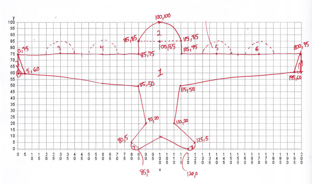
Note that the non-rectangular greplay template trick does not work with non-SAS/Graph font characters (such as the airplane character in the Webdings font), therefore I had to create my own custom SAS/Graph software font containing an airplane. To do that, I worked out the coordinates for the desired airplane shape on graph paper:
And then I turned those coordinates into a SAS/Graph software font using the following code:
LIBNAME gfont0 "."; data figures; input char $ ptype $ x y segment lp $; datalines; A W 100 200 0 P A V 85 75 1 P A V 85 85 1 P (and so on...) ; run; proc gfont data=figures name=figures filled height=.75in showroman romht=.5in resol=4; run; |
I think the results turned out pretty nice. Does this give you any ideas about custom font characters, or trick/3-D effects you might want to use in your infographic? Feel free to share your ideas in a comment...


6 Comments
I think it turned out great. BRAVO!!! Hopefully, point and click module of the enterprise capable of similar abilities will come one day. Not that any statistical platform is currently on-board the infographic train.
That would be pretty cool, eh?!? :)
Bravo!!! Truly outstanding!
I just ran this code and it was a lot of fun. Can't wait to tweak it to do some other fun stuff.
Thanks for this post, truly remarkable!
Hopefully you'll come up with a super-cool variation you can share with us! :)
Your ability to produce outstanding graphs and in this case an infographic amazes me!
Thanks Michelle! ... Most of the credit should go to the SAS developers though, who created such a powerful/flexible software! :)