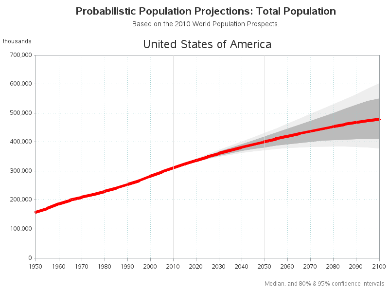
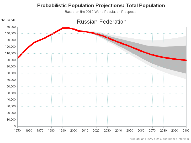
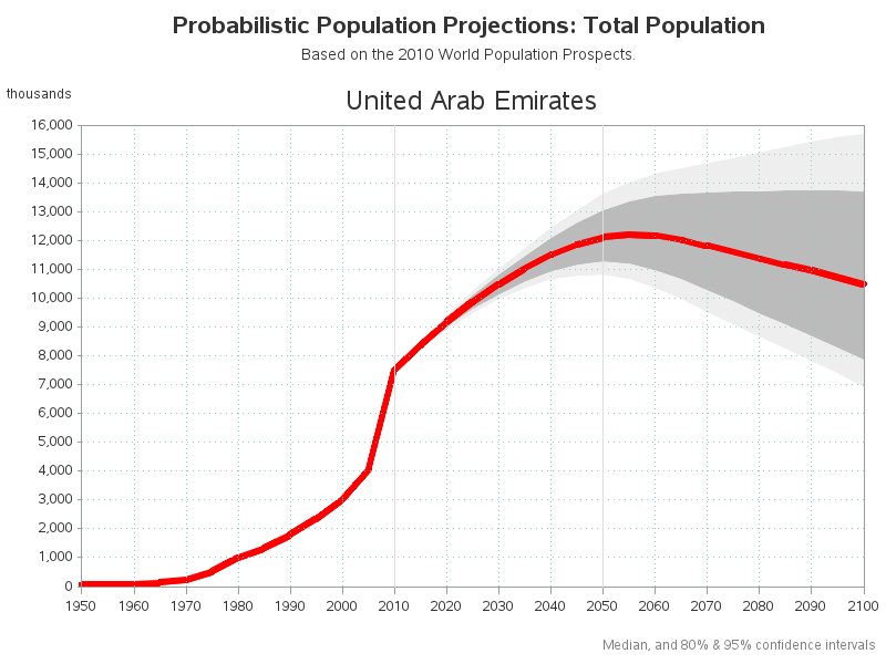
The farther you try to forecast into the future, the less certain you are -- how can you represent that graphically? One way is to draw a shaded/colored "confidence interval" around your forecast line, but this is something a lot of SAS users have trouble with.
That's why I decided to create a simple example (using United Nations' population projections) to demonstrate the technique. There are multiple ways to do this in SAS - I'm using SAS/Graph Proc Gplot with the 'areas=' option.
The part that confuses must users is that gplot shades the area under the line (from the line to the bottom axis), rather than the area between two lines. Therefore in order to make it look like the area between two lines is shaded, you have to overlay multiple shaded areas - starting with the uppermost, and then progressing to the bottom one ... and then shade from the bottom line to the horizontal axis with the background color (such as white).
For the UN population projections, I first shade the upper light gray area, then the darker middle gray, then the lower light gray ... and finally the white area under the graph. The area colors are specified in the 'pattern' statements (whereas the 'symbol' statements describe the lines, which are basically unimportant since the areas cover them anyway). The order of the pattern statements is important, as is the order that you specify the lines in the plot statement. Experiment with different/unique colors so that you can see where each color is showing up in the graph.
Here are several examples (the code is at the end of the blog):

Here is the essential part of the code:
pattern1 v=s c=white; pattern2 v=s c=grayee; pattern3 v=s c=graybb; pattern4 v=s c=graybb; pattern5 v=s c=grayee; symbol1 value=none interpol=join color=pink; symbol2 value=none interpol=join color=red width=5; proc gplot data=all_data; by Country_or_area; plot Pop_Lower95*year=1 Pop_Lower80*year=1 Pop_Median*year=1 Pop_Upper80*year=1 Pop_Upper95*year=1 Pop_Median*year=2 / overlay areas=5; run; |
Or, if you'd like to see the entire program, here is a link to the full code!


2 Comments
Is there any reason not to use sgplot and two band statements?
One reason is that the gplot technique can be used with old versions of SAS (probably back as far as I can remember) ... whereas the user would need a fairly recent version of SAS to use sgplot. Also, I do not know sgplot :)