Many people today just use their computer to play Angry Birds or post pictures of their most recent meal on Facebook ... but what would some of the great minds of the past have done with a computer?...
For example, Charles Minard was creating impressive information graphics without a computer over 100 years ago, such as his famous representation of Napoleon's Russian campaign of 1812. I wondered what sort of maps Minard (or Napoleon himself) might have created, if he'd had a computer?!?
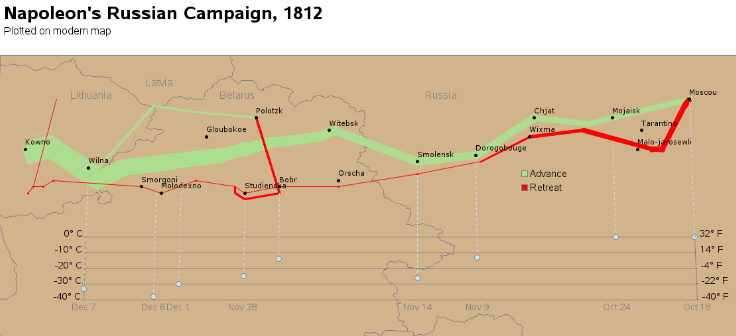
Below is a thumbnail image of Minard's map (click to see full size image). The width of the lines represents the number of soldiers in Napoleon's army. You'll notice how the line gets more and more narrow as the army advances from West to East (the brown line), and even more narrow as they retreat from East to West (the black line). There is also a graph below the map, showing the temperature during the army's retreat.

I set about trying to make a new version of Minard's map, adding some modern mapping capabilities made possible by both creating and viewing the map with a computer...
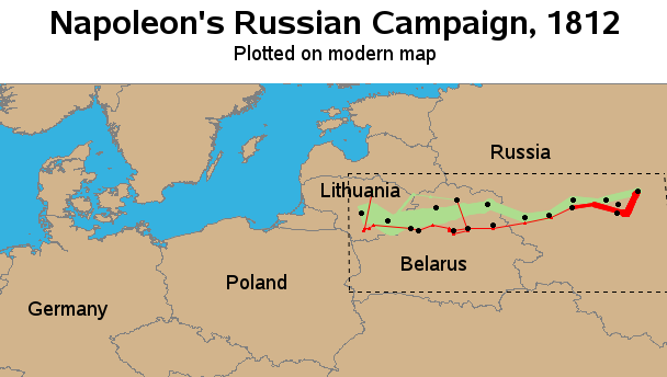
First, I thought it would be useful to create a map zoomed-out such that you can see the campaign area in context. In particular, I thought it would be useful to see where the borders of the neighboring countries are (note that I'm using the modern borders and country names). Below is a thumbnail of my map - click the thumbnail to see the full size interactive map, in which you can hover your mouse over the countries to see their name (hover-text). The area of Minard's map is shown with a dashed rectangle, and you can click in that rectangular area to zoom-in.
Once you zoom-in, my map shows the same area as Minard's map. I've included a thumbnail below - click it to see the full size interactive map. Notice that there is hover-text at various points along the lines, showing the number of solders still alive at that point. There is hover-text for each city name, so you can see the date the army went through that city, and you can click the city names to launch a Google search for information about each city. In the temperature graph, I label the axes with the temperature in both Fahrenheit and Celsius.
I wouldn't say my map is better than Minard's, but I think it is fun to explore the possibilities! :-)
What other features and capabilities would you add to Minard's map, made possible by computers?

4 Comments
Hi Robert,
Do you have any Examples showing the Difference between Graphs produced by SAS GRAPH Procedures and the new STATlSTICAL GRAPH Procedures ,basically differences in Common Graphs such as Bar Graphs,Pie Charts,Line Plots etc produced by these Procedures. I also want to understand where the STATlSTICAL GRAPH Procedures excel and the SAS GRAPH Procedures fail and vice versa when producing the same type of graphs.I guess this may be covered in one or more of your Next posts in this Blog.
Thanks,
Hi Prashant - I haven't learned the statistical graph procs (sgplot, sgrender, etc) yet, so I can't really make a fair comparison.
But, as it relates to re-creating Minard's map, I don't think there is an sg procedure for creating maps yet, therefore Proc Gmap would be the only way to go in this particular scenario!
From the Maestro of SAS/GRAPH, a fresh, value-added update to the Minard 1869 graphic that has so often been shown as an important early map, along with Dr. John Snow's famous earlier London cholera map of 1854.
Hmm ... perhaps I should tackle the famous cholera map next!?! :)