As you've probably guessed, I'm a "visual" person - I like to see things (in a chart/graph/map) rather than just reading about them (in a data table and summary statistic). Don't get me wrong - I'm a big fan of statistics and analytics -- but I'm an even bigger fan of looking at your data in several different ways, to fully understand it!
And although it wasn't always possible in the past (limited by low-resolution screens and dot-matrix printers), we now live in a time when it is possible to graph just about any data on a high-resolution screen or laser printer.
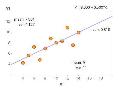
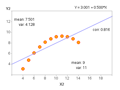
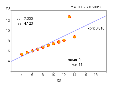
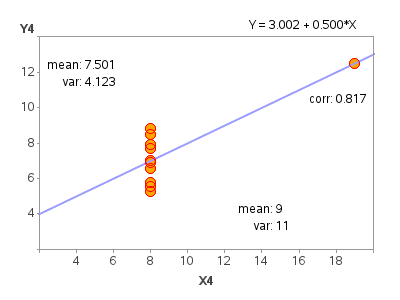
And here's a little SAS/GRAPH 'magic' to show you how important it is to plot your data, rather than just blindly looking at a statistic... :)
This is a SAS/GRAPH version of Anscombe's Quartet - 4 data sets that have nearly identical statistical properties, but the graphs tell a different story!
And here's a link to the SAS code used to create these graphs, and display all 4 on one page (using Proc Greplay)!
Question: Have you ever run into a situation where the statistical description of the data was misleading, and the graph showed the real story? If so, please share with us in a comment!





2 Comments
Hi Robert.
I also believe that data presented in form of charts and graphs are easy to understand and view trends and draw inferences. I am eager to see your next insight.
Hi Robert,
Really fascinating. However are the skewness and kurtosis are also the same /close ? I doubt .
I can always check on my own (since you have shared the raw data) , yet would like to hear from you.
Regards,