There's an old expression "easy as pie." Have you ever tried to bake a pie??? ... It's not so easy, LOL! And neither is using pie charts correctly! :)
Below are several examples of different kinds of pie charts you can create with SAS/GRAPH. And at the bottom of this blog, you will find a link to the full tutorial, with easy step-by-step directions for creating all of these charts, and some tips on when to use (and not use) pie charts to help analyze your data ... all for FREE!
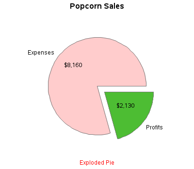
Part-to-Whole, and Exploded Pies
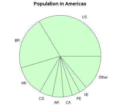
Tips for pies with "too many" slices
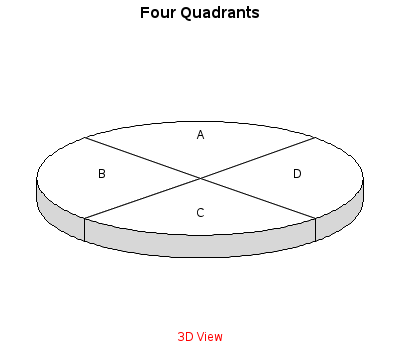
3D Pies (reasons not to use them!)
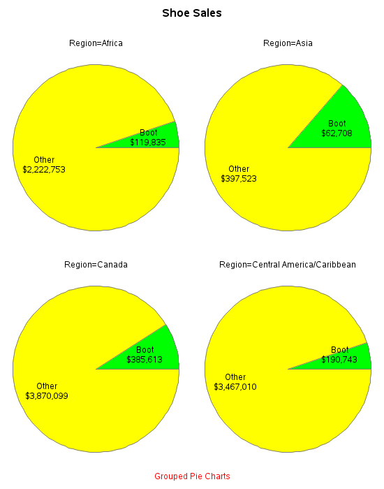
Grid of Pies
And, as promised, here are links to the PDF files for the tutorial:
Do you like the format of this tutorial? What other kinds of charts would be useful to include? I'd love to hear your feedback and suggestions!
Click here to see my other tutorials on creating basic graphs!


4 Comments
Thanks for your post. I find the tips especially 'EXPLODE' and putting four pie charts on one page really useful. Does EXPLODE also work on a 3-D graph?
Yes - here is an example of a 3d pie, with exploded slice:
http://robslink.com/SAS/democd7/pie4.htm
Great work!.
I have gone through all the posts, they are wonderful, lovely, very colorful and informative. In my opinion, these posts are addressing both the experienced and novice at the same time. Very Nice contributions, as I am learning from those and Thankyou very much for bringing it up in these posts.
Thanks Srikanth ... comments like yours makes it all worthwhile! :)