Not everyone agrees on a definition of "big data" -- but you'll probably agree that the amount of data available today is a lot bigger than in the past, eh?!?
... so let's just call it "Bigger Data"! :)
And you might have noticed that some of your old tried-and-true graphing techniques don't work that well when the number of data points goes up by an order of magnitude or so -- there are simply too many bars, plot markers, pie slices, labels, or map areas to fit in a traditional graph.
There's always the option of "summarizing" the data before you plot it, but I still like trying to plot all the data. This blog contains several tips & techniques that might help. Note that I'll be shrinking many of these graphs quite a bit to have the snapshot fit in the blog, and they might not look great shrunk like that - but please click on them to see the full size example. Also, a few of the graphs are very "tall/long" - rest assured it will be worth your time to scroll to the end of the tall graphs, to see the next bigger data graphing tip! :)
Use 'big' graphs for bigger data:
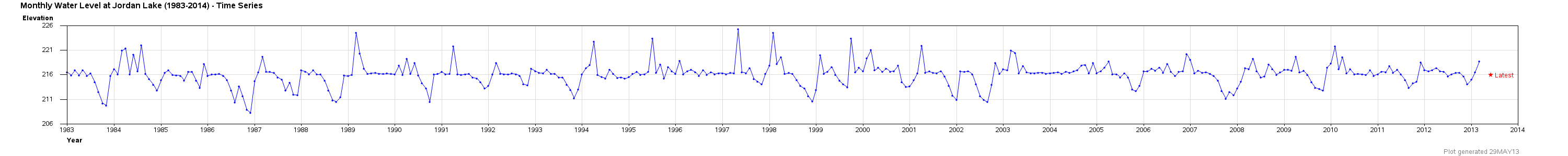
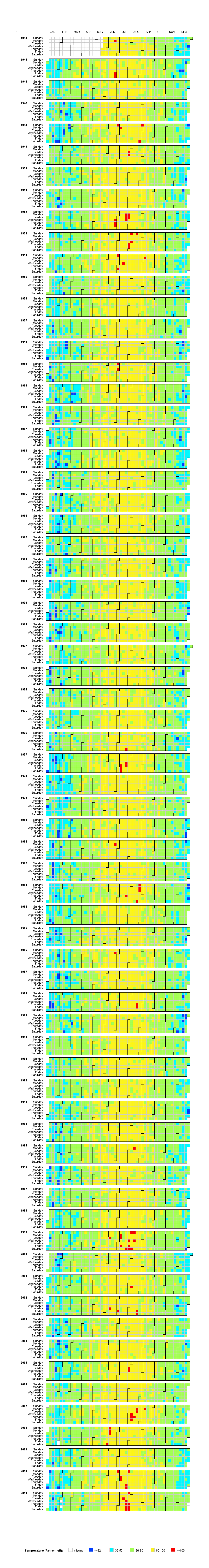
There's no rule saying your graph has to be limited to a traditional size, such as 800 x 600 pixels. Often, with bigger data (especially long time series data), I set the xpixels and/or ypixels to a much larger value, and then scroll left & right (or up & down) in the browser to see the entire graph. Here are examples of a very wide line plot, a wide calendar plot, and then a very tall calendar plot:

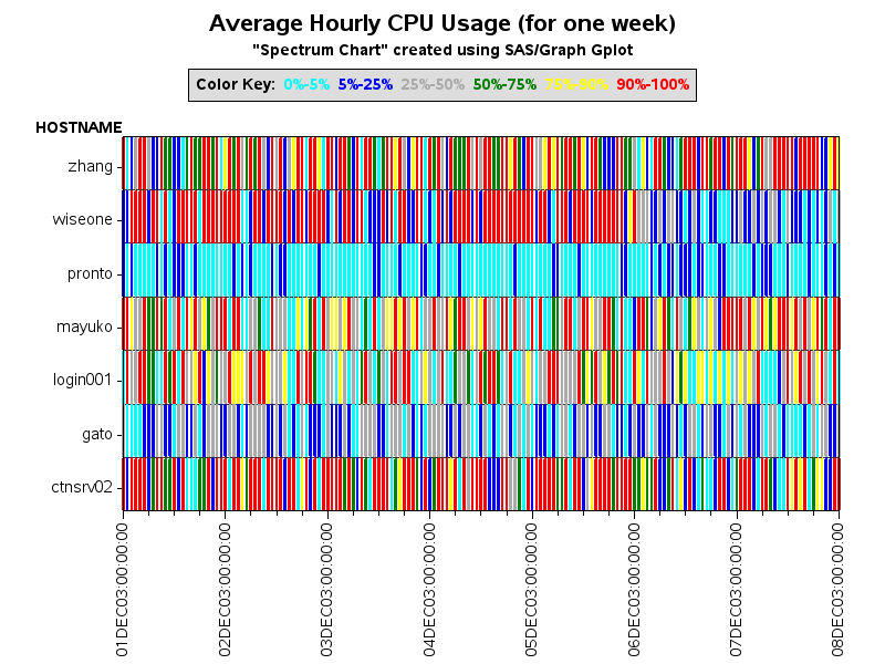
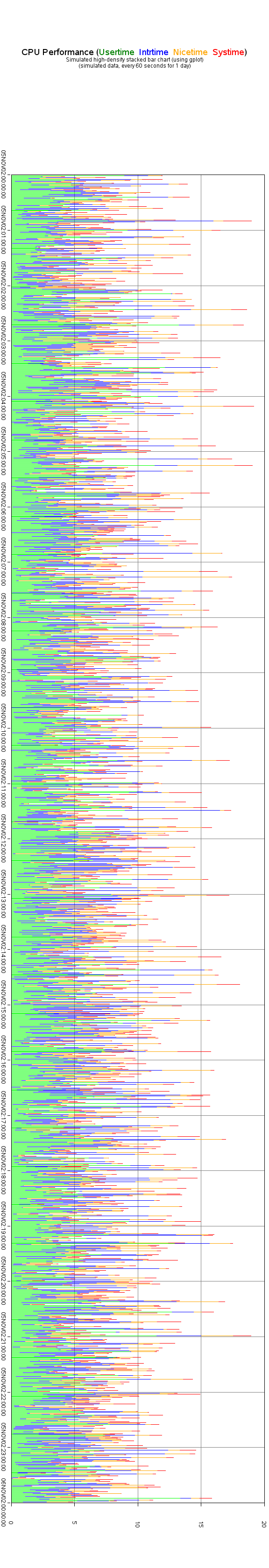
Use Gplot 'needles' or individual line segments, instead of bars:
Bars require a lot of space - for example, a bar outline requires at least 1 pixel on each side of the bar, and then the color inside the bar requires at least 1 pixel ... that means a bar is going to be at least 3 pixels wide. Whereas a line segment is 1 pixel wide! Here are several examples - first a traditional needle plot, then a plot of line segments that "just so happen" to line up like stacked bars, and then a cpu plot comprised of line segments:
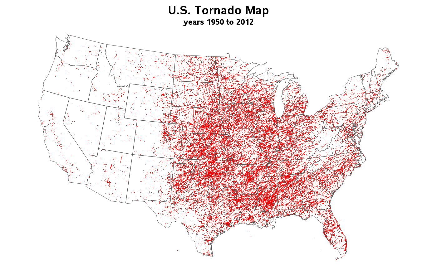
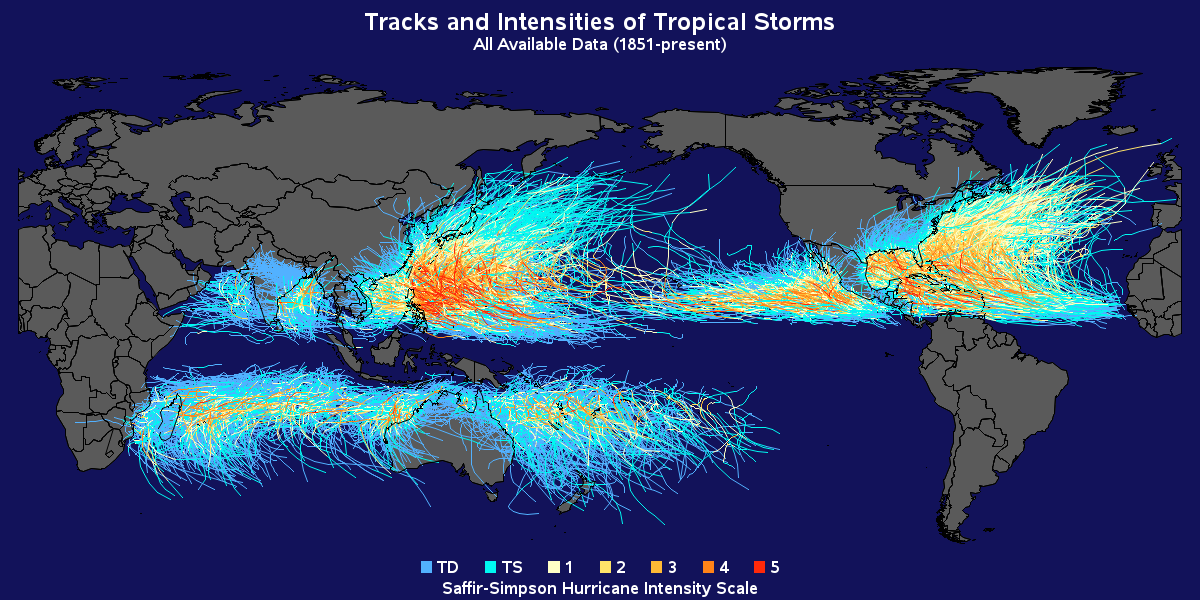
This trick (using small line segments) even works on geographical maps. Here are examples showing the paths of many years of tornadoes and hurricanes:
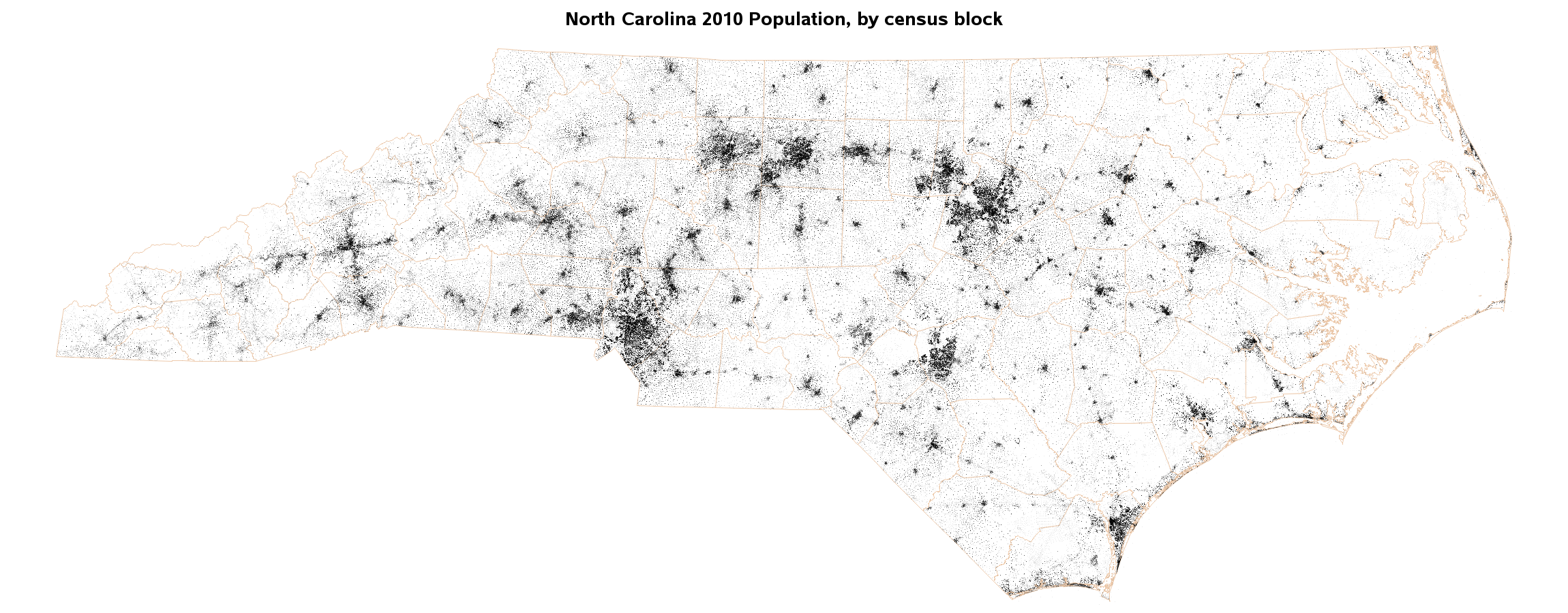
Or, similarly, you can use single 1-pixel points in maps to represent very dense data:
Use font characters as your plot markers:
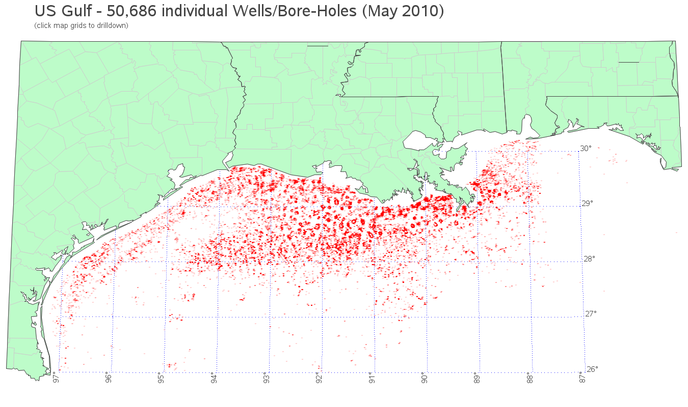
In recent versions of SAS, you can use just about any font character as a marker in your graphs and maps. And when you're dealing with very dense data, and using very small plot markers, this can come in handy! At small sizes, the font characters still do a really nice job of looking smooth (anti-aliased) and maintaining their shape. Here is an example using a font character (style="albany amt/unicode"; text='25cf'x) as the plot marker annotated on a map, showing the individual locations of over 50,000 oil well bore-holes in the U.S. Gulf of Mexico:
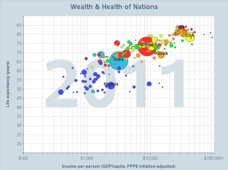
Use semi-transparent plot markers:
With bigger data, even a simple scatter plot can become one big 'blob' of ink, with no discernable patterns. In such cases, it is often helpful to use semi-transparent markers, so you can see the 'density' of the overlapping markers. In such cases, I also find it helpful to use circular markers rather than solid dots. SAS/GRAPH supports alpha-transparency in SAS 9.3, and can be used to create plots like the following:
![]()
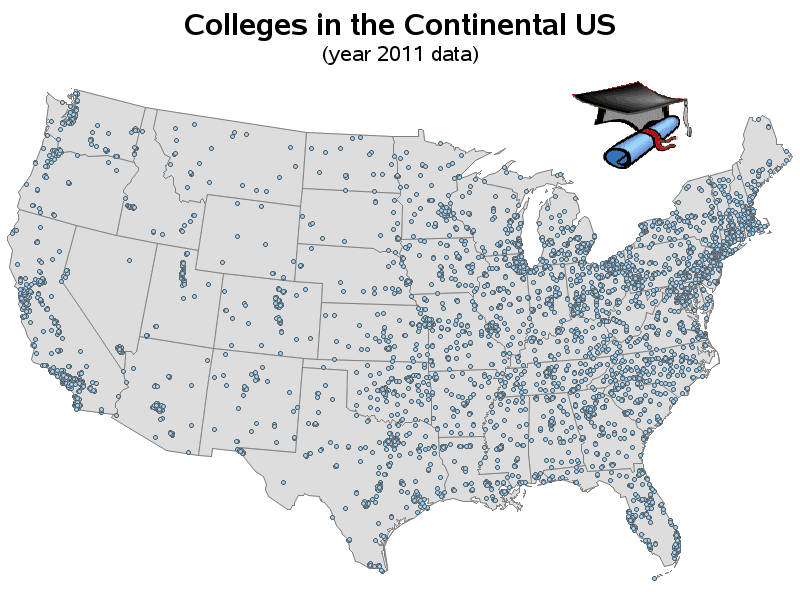
Use drill-downs to see more detail:
Sometimes the data is just too dense to be useful when viewed all at once - in cases like that, I like to allow users to click on the graph (or map) and drill-down to a subset of the data. For example, in the following map of colleges, many of the plot markers overlap when viewing the whole U.S. map. But by allowing the user to drill-down to the state and county levels (by clicking on the maps), they can better see the individual plot markers for each college!
Animate the data:
And last, but not least, you can use animations to help make sense of very dense data (especially data that is changing over time). Rather than trying to view all the data at once, you can view time-unit of the data at a time, and then by displaying each time-unit successively, one after another, it produces an animation. It not only helps you view the data in a less-dense, less-cluttered manner ... the animation can also give you insight into the dynamic nature of the data, and how it is changing over time! Click the graph below to see an example:
What other tips and tricks have you found to be useful in handling your bigger data?!? :)


3 Comments
Nothing wrong with the labels, they are very well placed. I was just refering to the white spaces every 10 years,
Yes - there are many ways to create animations and/or slideshows. For example, SAS has device=javameta, and SVG (Scalable Vector Graphics). And I have seen some really nice looking Flash/Flex animations. But as with anything, there are trade-offs ... For example with java-based ones the user might need to have a certain version of java, and if you want to email it to someone then they might have to worry about a 'codebase'. With SVG, the user might have to install something to view it in their browser. With Flash/Flex, users can't typically view it on an Apple iPad (unless they jump through some hoops).
GIF animations seem to be the simplest & most universally-viewable form of animation. You can view them on ~any browser, and you can email just the 1 gif file and the recipient can view it without worrying about codebases, etc. :)
That's after you've set
goptions xpixels=1000 hpos=1000;
of course