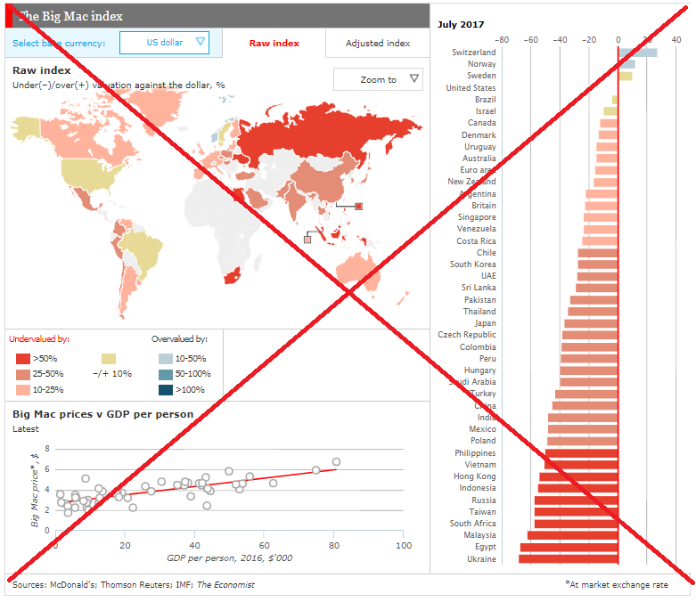
I recently read an interesting article in The Economist, where they describe "The Big Mac index." This is an index they invented as a lighthearted guide to compare currencies in different countries.
In their article they create a multi-panel display (similar to a dashboard) where they compare the index for several countries using a map, a scatter plot, and a bar chart. I decided to see if I could recreate their graphs with SAS, and maybe make a few improvements.
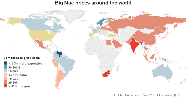
In the SAS map, my main improvements were to the legend -- moving it closer to the map, adding extra descriptive text, and sorting/stacking it in a more intuitive order:
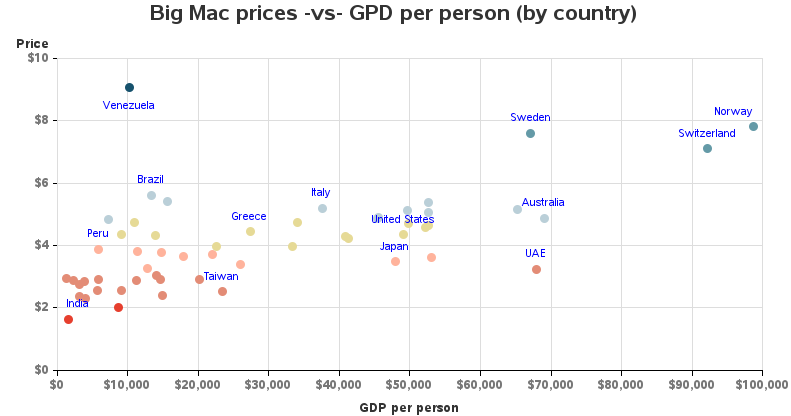
For the scatter plot, I shaded the plot markers the same as the countries in the map, and I labeled the countries with the highest/lowest/outlier values. Note that Venezuela (which is near the top/left of my scatter plot) is missing from the original scatter plot.
Here is a link to my complete SAS graph, with all three charts (map, scatter, and bar chart) on the same page, and mouse-over text for the countries, plot markers, and bars, so you can easily see the country names and data values.
- What other items do you think would make interesting indexes to compare different countries or regions?
- How else might you analyze or graph this type of data in SAS?


8 Comments
Hey Robert,
Very nice example!
Did I miss the possibility to create some dynamics? In the economist example, by clicking on a country on the map, the panel below shows the evolution of the Big Mac index in that country. Can you create that with an other SAS technology?
Thanks a lot,
Tom.
Good question, Tom!
If I were to use some of the more dynamic SAS technology that could create custom graphs on-the-fly (such as Stored Processes or SAS/Intrnet App Dispatcher), I could make the example a bit more dynamic. But in order to do that, I'd have to maintain a "server" machine on the external web. Since I don't have one of those servers, I just stick with simple ods html output, with maybe a few simple html href drilldowns. But perhaps I'll have to check on that, in the near future! :)
When I was just out of college and looking for a job and place to live, my cost index was tied to a food staple that reflected my simple grocery needs: the price of a can of tuna fish.
This seems quite a step above many college students' staple - Ramen Noodles! :-)
Now compare the prices with the obesity rate within each country. Is there an observable correlation between lower priced big macs and higher rates of obesity? That would be an interesting thing to observe.
My work here is never done! Hahaha!
Big Mac as a single CP in an index is problematic because McDonald's business model is to surpress the price nearly to cost. The margin is in the Big drink purchased with it. In countries such as Sweden, Norway and Switzerland soda pop with the Big Mac may not be the habit, and consequently the model adapts to capture the consumer surplus as margin.
A liter of petrol could substitute but it is heavily subsidized -- as is so many other goods like sugar, etc.
How about the average cost of a daily newspaper?
Thanks for providing the interesting details/insights!
But, per the last suggestion ... what's a newspaper? (LOL - I'm such a joker!) ;)