I probably shouldn’t admit this… When I first started learning the SAS programming language 15 years ago, I just couldn’t figure out how to easily create pretty, customized graphs and reports. So, I would prepare my data in SAS, then export to some other application to produce my results. I know – not very efficient or practical, but it got the job done. If I only had SAS® Enterprise Guide® back then! The quality of the graphs and reports that can be created in Enterprise Guide using point-and-click tasks and wizards is impressive. No more exporting data out of SAS to another application...
I’m so excited to be wrapping up development on a new course that will teach SAS Enterprise Guide users how to create impressive graphs and reports, all with point-and-click techniques – plus a few simple edits to the generated code. As I’ve developed the course, I’ve enjoyed pushing SAS Enterprise Guide to the limits to learn just how much is possible.
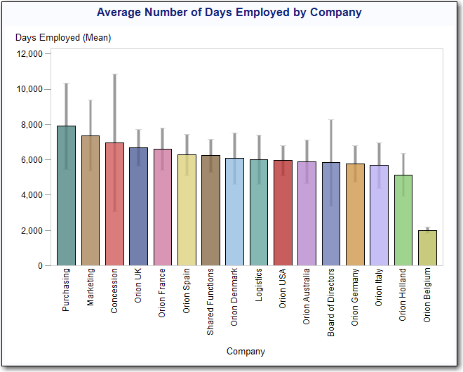
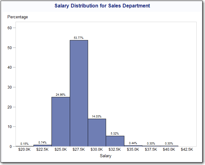
Let me show you a few examples of the types of reports and graphs that we teach users how to create in the course. First we go in depth with the Bar Chart task:
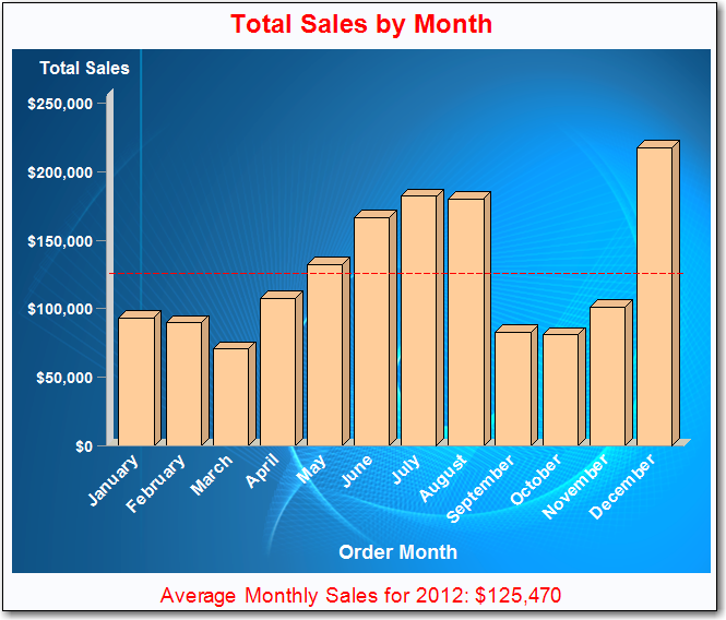

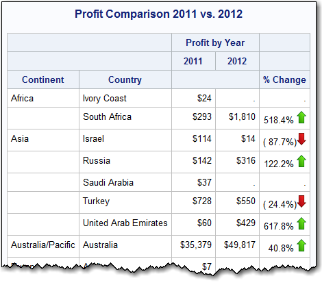
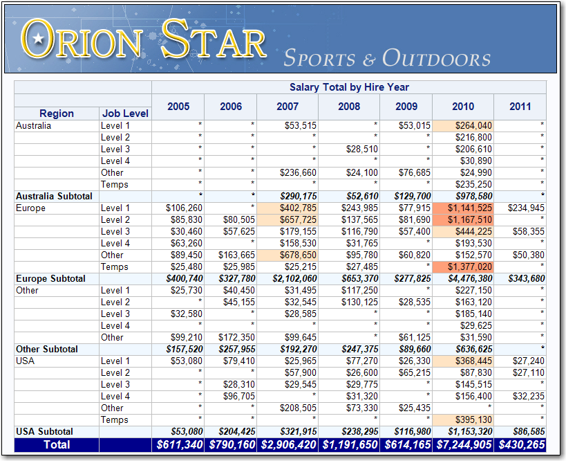
Next we use the Summary Tables task and List Report Wizard to create and customize reports. As you can see we dress things up a bit with color-coding and graphics:
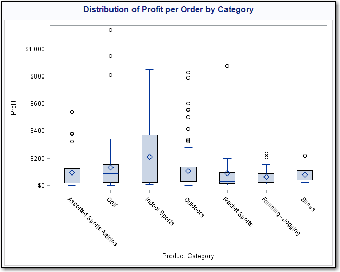
Then we discuss how to visually analyze the distribution of certain types of data using histograms and box plots:
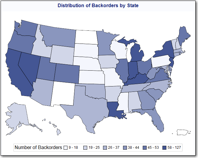
Next we create map charts to present data geographically:
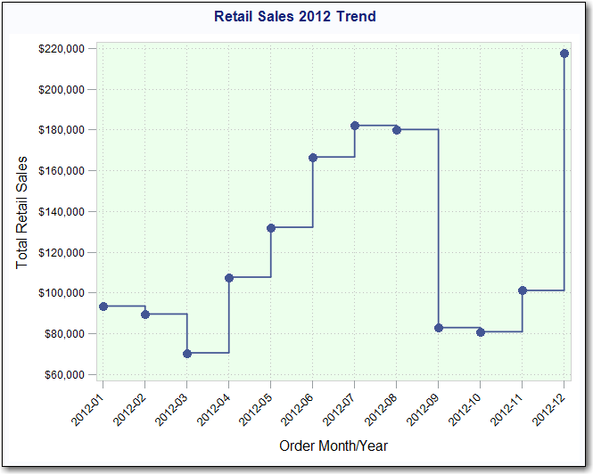
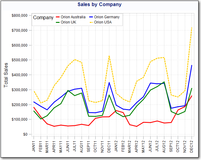
Finally we wrap up with scatter and line plots to illustrate and compare trends:
This course is designed for the person who has taken our SAS Enterprise Guide 1: Querying and Reporting course or has similar experience. Please be aware that this course does not assume any prior SAS programming experience, so the edits that we make to the code are pretty simple and don’t require any previous knowledge of SAS syntax. However, it’s a great opportunity for you to get a taste of what is possible, if you’re willing to get into the code created behind the scenes.
There is an art to presenting data numerically and graphically in a simple and effective way, and this new course will give you the tools to do just that. Check out the upcoming Creating Reports and Graphs with SAS Enterprise Guide course dates.

2 Comments
Thanks for your comment, Patrick! We actually include in the course an example of a 3D vs. 2D chart and compare and contrast the interpretation of the results. The conclusion that I expect most students to reach is that while 3D charts produce nice "eye candy", they can be misleading. So in the course, I think we only produce one 3D bar chart. And I absolutely agree with you that box plots are really underused and provide such an effective way to examine within- and between-group variability. Thank you for the book references as well. Some of Tufte's examples have been long-time favorites that I often mention when teaching.
G'Day Stacy
You have shown the capabilities of SAS in creating eye catching graphs. However I have some suggestion/comments. In your second graph where you are recording sales in dollars, I have some issues with this. The use of 3D image makes it harder for people to estimate from the graph because they are unsure of which edge to use, the front or the back edge as they extrapolate back to the Y-axis. A 2D bar graph would make that easier. In general for I perfere 2D over the 3D for all my graphs, unless I am plotting a response surface graph. I do like the use of the green up and red down arrows in the fourth graph(first table), simple but effective. I really do like the use of he boxplots in the profit graph and I wish that more people would use that to display thier data.
I would like to put a plug in for a book by William Cleveland "The Elements of Graphing Data" Also Edward Tufte has several books on envisioning data.
Cheers