Are you an NFL fan, or curious about analyzing social media data? -- Well, in either case, this blog's for you!
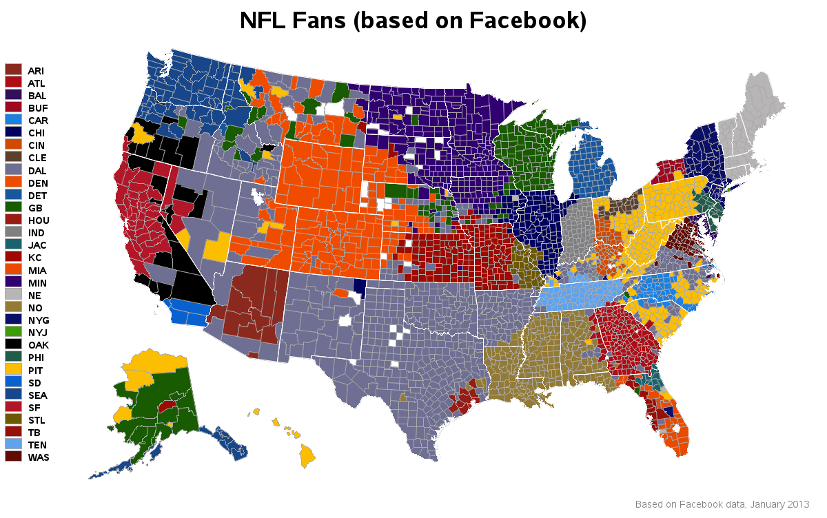
I recently read a fascinating Facebook article that included a U.S. county map showing which NFL (U.S. football) team had the most 'likes' in each county (based on ~35 million Facebook users who have 'liked' one of the 32 NFL teams). It was very interesting to see which teams had mostly 'local' support, and which teams had a large fanbase spread across multiple states. For example, I was surprised to see that my county (Wake County, NC) was dominated by Pittsburgh Steelers fans.

But upon closer examination, I found that the map in the Facebook article had some problems. For example, many of the teams were represented with nearly the same colors - and even when I used a tool to find the exact RGB of the pixels on the screen, I could not determine exactly which colors in the map went with which colors in the legend, because the RGB values varied from pixel to pixel (perhaps there was some shadowing/blending going on?) Also, I wasn't sure exactly what some of the team names were, since the map only showed the abbreviations. And the map had no title or other identifying information (so it was hard to know the 'context' when people took just the png image of the map and re-posted it). And I wasn't sure if the blue 'things' between Alaska and Hawaii were the islands of some other U.S. territory, or part of Alaska.
Of course, it's "poor form" to just point out flaws in a map, without actually providing a useful alternative ... therefore (of course) I set out to create my own SAS version!
I invite you to click the thumbnail snapshot image below to see my full-size interactive SAS map!
Note that the colors in my map exactly match the colors in the legend, and you can hover your mouse over the counties to see the county name and the name of the NFL team. You can also hover your mouse over the legend color-chips to see the full-text team name for each of the abbreviations. The SAS map makes it clear that the blue blobs between Alaska and Hawaii are indeed part of Alaska. And the title and footnote provide a clear 'context' for the map and the data.
Does anything in the map surprise you? Do you think it's a good/accurate representation of the distribution of NFL fans? How might you enhance this visualization to be even more useful? (For example, I would love to plot this data as an animation, to see if the fans shift geographically over time).
Don't you agree that SAS is an awesome way to visualize social media data!?! Do you have access to similar data that you could also visualize on a map? If you'd like to learn more about creating maps with SAS, check out the training course, Mike Zdeb's excellent book, and do a search for gmap in the SAS Global Forum proceedings - there's lots of great info out there!
Note/disclaimer: I didn't have the original/raw data, therefore I had to 'estimate' the value for each county, by visually looking at the original map. In some cases (because of the color ambiguity) it was impossible to definitively determine the favorite team of a county, so I made my best guess.


15 Comments
The sports are great to design amazing charts and i love the 49ers corporation image.
The 49 ers are popular in many states,it is a big brand.
Nice
Great map - One feature I would like to see is to click on a team on the left and only the counties for that team are highlighted. Finding small market counties like the Jets would be easier and it would also emphasize the extensive fan base of teams like the Steelers.
Good idea!
It would take a bit of work, but I could create a separate 'drilldown' map for each team (showing only that team's counties), and then use gmap's 'html_legend' option to encode the link for each team-map into the legend color-chips.
Note that some of those counties in western states have VERY small populations and very small differences could yield things like the possibly unexpected "cluster" of Green Bay preferences in Idaho and Montana. For instance, Camas County in Idaho has a population just over 1,000 people (the small green county in the lower-middle) but is about the physical size of Rhode Island. Idaho's Adams County preference for Detroit isn't very noticeable as the color is close to the Seattle shade of blue.
Yep! - Good point!
I've heard some aspects of that referred to as "area size bias". And, as luck would have it, it's often the smallest areas that have the largest populations, and vice versa.
During elections, sometimes when a certain candidate wins large sparsely-populated states, you'll hear the expression "dirt don't vote".
Very interesting graph. Is it just my eyes seeing similar colors or does the Cowboys fan base extend all the way from Arkansas to parts of Nevada, Utah and Idaho?
Click on the map/link, and then you'll see the full-size interactive version, and you can hover your mouse over the counties and see exactly which team that county favors (in the html hover-text)! :-)
Of course, this isn't the NFL fan base directly - it's the NFL fan base that is also on Facebook and chooses to "Like" an organization, receiving the attendant advertizing. It would be interesting to compare these results to other, more objective metrics such as ticket sales or visits on anonymous web sites (e.g. visits by team to a major sports media outlet - how many people look up the stories for different teams). The NFL teams are franchises, sharing advertizing at a national level. If the IP addresses of visitors to the several teams web sites were captured and collected, the geocoding of the IP addresses would provide a less biased esitamte. Then, a comparison of the two - this Facebook map and various objective, more representative metrics - would be an interesting study in bias in big data. At SAS Global Forum 2013, one of the streamed presentations (which are still available on the SGF web site) talked about addessing bias in internet survey data.
Good points!
Hopefully the people who have access to those other sources of data will use SAS software to do those kinds of analyses! :)
To me, three facts jump out:
1) The extremely local geographical support of small-market teams such as Jacksonville, Tampa Bay, Houston, and San Diego
2) The popularity of the 49ers in the Bay Area, which overshadows the Oakland Raiders in their own home town. Similarly, the Giants swamp the Jets.
3) The huge geographical support of the Steelers and Cowboys. When there is not a local team to root for, these are the teams that are the most popular. This lends credence to the claim that Dalla is "America's Team."
I'm no NFL expert, but it appears the data backs you up on these points! :)
Great graph! I agree, an animation over time would an interesting visual and valuable to the NFL I suspect too.
Too bad we don't have Facebook data going back 10 or 20 years (... mainly because we haven't had Facebook 10 or 20 years! LOL)