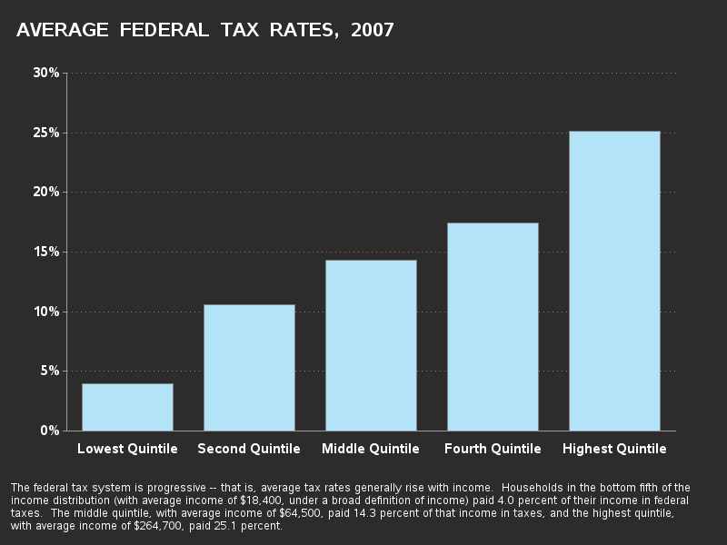
It's said that the only things you can't avoid are Death and Taxes ...
Well, in this blog, I'm going to avoid the "Death" one (for now), and just show you some graphs on taxes in the U.S., since the deadline for paying 2012 taxes is quickly approaching! :-)
I created these graphs a few years ago, so they don't have the data for the most recent years, but I still found them 'interesting' (and they also demonstrate how you can graph this type of data effectively using SAS). Note that these graphs are just the federal tax rates and do not include the state taxes, sales taxes, property taxes, etc.
The first graph is my SAS version of a chart I saw in a publication from the Congressional Budget Office. I'm not generally a fan of graphs with black backgrounds, but they're sometimes useful for presentations on a projection screen in a dark room or to entertain a crowd that isn't particularly savvy when it comes to graphical "best practices." One disadvantage of a black background is the thin text is a bit difficult to read, and another disadvantage is that if a user wants to print the graph, it will consume a *lot* of black ink. Anyway - here is the 'dramatic' (black background) Federal Tax Rate graph...
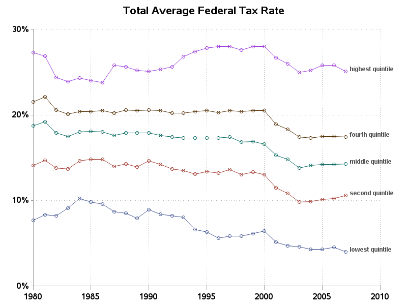
Whereas the previous graph showed the tax rates for 1 particular year, this next graph shows the tax rates over time. This graph was created using PROC GPLOT, with the 'overlay' option, and then annotating the labels on each line.
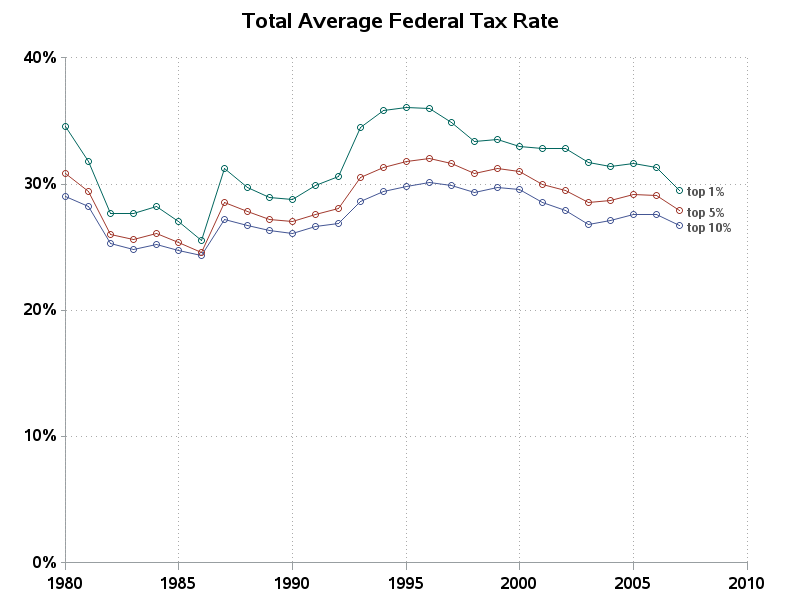
And what about the infamous "One Percenters" (people with top 1% of income)? Well, here's a plot showing the tax rates of the Top 1%, 5%, and 10%...
If you would like to see the SAS code used to create the above graphs, here are links for the bar chart, and the line plots.
If I were to update these graphs with the last few years (and the upcoming few years), how would the bars and lines change?
What would similar graphs look like for other countries?


