Are you ready for the upcoming International Year of Statistics? I have prepared myself by doing a correspondence analysis. Excusez-moi?
Correspondence analysis is a technique that has been very popular in France and is therefore sometimes referred to as French Statistics.
Correspondence analysis is a technique for categorical data analysis. It maps the associations between rows and columns in a frequency table graphically, as points in a space of few dimensions.
The advantage is that no distributional assumptions are necessary, unlike classical techniques involving inference to population parameters. The main objective is to discover the structure inherent in the data.
Categories with similar distributions will be represented as points that are close in space, and categories that have very dissimilar distributions will be positioned far apart.
If a profile is very different from the average profile, then the point will lie far from the origin, whereas profiles that are close to the average will be represented close to the center.
As last week, like every first week of December, all roads led to Oslo and Stockholm for the Nobel Prize Award Ceremonies, I decided to apply the correspondence analysis to the list of Nobel Prize winners by country found on www.britannica.com.
Since 1901, the Nobel Prize has been awarded to men and women from all corners of the globe for outstanding achievements in physics, chemistry, physiology or medicine, literature, and for work in peace. In 1968, economic sciences were added to the list of fields.
For my analysis I selected all countries with at least one Nobel Prize in each category.
What do we learn from the two-dimensional plot?
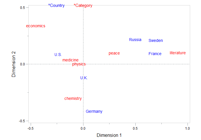
The horizontal dimension separates, from right to left, alpha- (literature and peace), beta- (physics, chemistry and medicine) and gamma sciences (economics).
The vertical dimension separates countries at the bottom that are considered as advanced economies by the IMF (Germany, UK, US and France) from the countries at the top (Sweden, Russia).
The positions of the points indicate that Russia, Sweden and France are associated with peace and literature, whereas Germany is situated closer to chemistry and U.S. and U.K. are the countries closest to medicine and physics.
It should be emphasized that correspondence analysis may suggest patterns of association among the variables but it does not establish whether those patterns are significant.
How to obtain this two-dimensional plot?
If you want to run the analysis yourself, just copy and paste the SAS code below.
This program reads the country and category data into the data set nobel and calls the corresp procedure. To input a contingency table in the corresp step, the categories (columns) are specified as the variables in the var statement, and the countries (rows) are indicated as the ID variable. This example illustrates the use of the annotate facility with proc gplot to produce a labeled display of the correspondence analysis solution.
data nobel; input country $ medicine peace chemistry literature physics economics; cards; France 11 8 7 14 13 1 Germany 16 4 27 8 22 1 Russia 2 2 1 4 9 1 Sweden 8 5 4 9 4 2 U.K. 30 13 26 7 20 7 U.S. 94 22 64 12 87 50 run; proc corresp data=nobel out=coord short; var peace chemistry literature physics economics medicine; id country; run; data label; set coord; xsys='2'; ysys='2'; x=dim1; y=dim2; text=country; size=1.3; function='LABEL'; if _type_ ='VAR' then color='RED '; else color='BLUE'; run; data key; xsys='5'; ysys='5'; length text $12; x=25; y=100; size=1.4; color='BLUE '; function='LABEL '; text='*Country '; output; x=40; color='RED '; function='LABEL '; text='*Category'; output; data label; set key label; run; proc gplot data=coord; plot dim2*dim1 /anno=label frame href=0 vref=0 lvref=3 lhref=3 vaxis=axis2 haxis=axis1 vminor=1 hminor=1; axis1 order=(-.5 to 1. by .5) label=(h=1.5 'Dimension 1'); axis2 order=(-.5 to .5 by .5) label=(h=1.5 a=90 r=0 'Dimension 2'); symbol v=none; run; |
Want to learn more about statistics?
If you want to prepare yourself for the International Year of Statistics, take a look at our statistical courses.


4 Comments
You need to be a little careful in interpretting the relationships between the countries and Nobel categories.The plot should be thought of as two different overlaid plots, one for each categorical variable. The plot tells us that for the rows, Germany has the largest effect on the chi-square statistic. For the Nobel categories, economics and literature have the largest effects.
Distances between points within a variable have meaning, but distances between points from different variables do not. Nevertheless, you can use the plot to comment on associations between rows and columns. For example, the first coordinate shows a greater association between Russia/France/Sweden and literature than would be expected if these two categories were independent. Similarly, the association between German and Chemistry is greater than expected under the assumption of independence.
If you prefer to point and click instead of writing code, you can do the correspondence analysis in JMP. Go to the menu Analyze and select Fit Y by X and assign the variables to the roles Y (Response), X (Factor) and Freq. In the output, click on the red triangle and select correspondence analysis.
Nice use of a custom SAS/GRAPH Gplot!
It's funny to see a statistical technique that is so regional. That's why I've referred to Correspondence Analysis as the "Jerry Lewis" of stat methods.
You can get a basic plot (not quite as nice as yours with the reference lines) by using ODS Graphics: