Have you heard the expression "Talk Turkey"?
Well then, what better (tongue-in-cheek) thing to do around the Thanksgiving holiday, than talk some turkey using SAS Graphs! ;)
I don't usually decorate my graphs with images and pictures (they typically make the graph more difficult to read), but when it comes to casual graphs for a festive holiday ... well, I decided to go ahead and create an eye-catching graph that conveys the data "well enough" for the intended purpose, and at the same time suits the festive holiday mood.
So I searched the Web for some interesting graphs that had data related to Thanksgiving turkey dinners, and came up with a couple that I thought I could reproduce using SAS ... and of course, I also tried to add a few improvements.
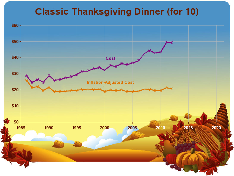
First was a graph from the American Farm Bureau Federation, showing the cost of preparing a "Classic Thanksgiving Dinner" for 10 people, overlaid on a "Horn of Plenty" image. I found their latest data, and also the BLS consumer price index data to convert the values to constant dollars.
I used Proc Import to read the spreadsheets into SAS, and then SAS/GRAPH PROC GPLOT to create the graph. There are several ways to incorporate a jpg image into a graph, but I found the easiest in this situation was to use the iback goption. And here's the graph I came up with - click the link to see the interactive version, where you can mouse over the plot markers to see the actual data values:
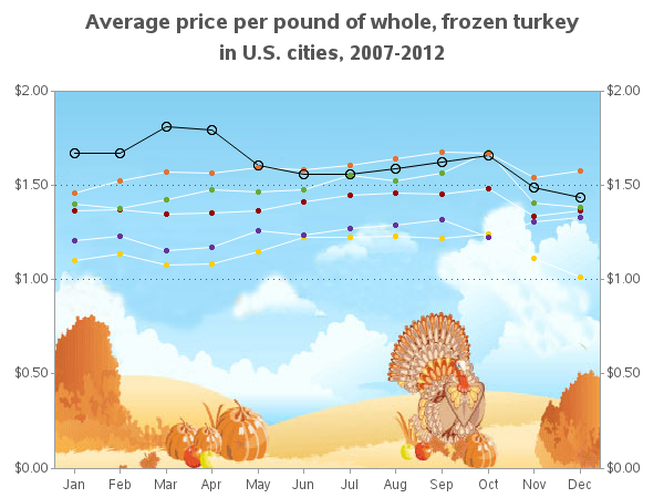
Next, I found a graph from the Bureau of Labor Statistics (BLS) that showed the price of frozen turkey each month throughout the year - this graph could help you see if the increased demand at Thanksgiving (November) increases the price, or if perhaps the stores offer discount prices to lure in more customers. Do you see any trends here, and do you have any theories about the price of turkey?
In this case, since I only wanted the image to be inside the axes, I used Proc Gplot's iframe option. Here's a link to the interactive version, where you can hover your mouse over the plot markers to see the actual values.
Here are links to the SAS code for Example 1 and Example 2.
Did you know that SAS could create graphs with images? You will learn about tricks like these, as well as many others, in the SAS/GRAPH training classes!


4 Comments
I love the creative graphs and just in time for Thanksgiving! Thanks for sharing the SAS code too.
I love using timely topics to show graphing techniques! I think that helps make an otherwise technical/dry topic fun & interesting!
Very attractive graphs. Thank you for sharing!
Thanks! :)