In the U.S. we have a presidential election every 4 years - and as luck would have it, 2012 is an election year!
I see a lot of election maps & graphs in the news, and I'm always subconsciously critiquing them in my mind and thinking to myself, "How would I graph this data?"
And, to that end, I've put together a few examples to show how SAS might be used to graph election data...
First, here's my most recent graphic, which I created today using the current election data. I got the idea for this graphic partly from a CNN map (data & colors), and partly from a Huffington Post map (better bar chart section). If you click on the image below, you can view the full-size interactive version where you can hover your mouse over the states and bar segments to see the number of electoral votes, and other information. This is a SAS/GRAPH GMap and a GChart bar chart, combined on the same page using Proc GReplay.

And now, two more graphs -- both of these only plot the data in one way, and neither tell the complete story...
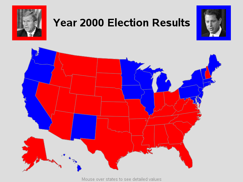
First is a traditional map, colored by the winner of the state's electoral votes. One neat feature in this map is that I include the image of the candidate in the color legend. One weakness of this map is that it suffers from "area size bias" - the geographically big states are very prominent, and the small states look insignificant ... but as the old saying goes, "dirt don't vote!" Montana is very big in geographical size, but it only has 3 electoral votes. Massachusetts is geographically small, but yet it has 4 times as many votes as Montana. Another weakness is that it's difficult to determine which candidate received the most votes (which is the most important thing in an election).
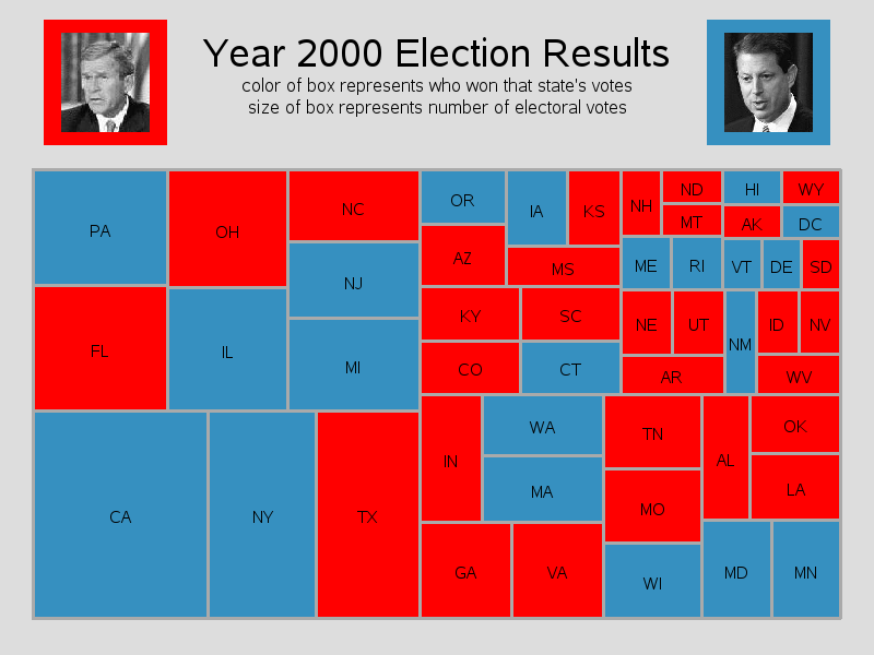
Here's another way to look at the same (year 2000) election data - using a rectangular tree map. This technique helps overcome the area size bias, with the size of the box for each state being proportional to the number of electoral votes. But now you lose the geographical location of the states, and it's still difficult to count how many votes each candidate received.
In my opinion, there's no one "perfect" way to visualize election data - it all depends on what you want to see about the data. That being said, I do like the first graphic above (with the map & bar chart), and I think it tells the general observer a lot about the data.
If you'd like to see the SAS code for the above 3 examples, here is it:
Example 1, Example 2, Example 3
I welcome your feedback, suggestions, questions, and ideas about plotting election data! But, of course, let's keep the discussion about the technical aspects of graphing data, and not about likes/dislikes of the candidates! :)


11 Comments
Can we have this map available for the 2016 election? I am thinking it would not be hard to alter and it would be great fun to use.
Yes - I'm thinking about creating a new version for this election! :)
Kindly also send me the info how we can use SAS for elections.
I think you will find these examples (SAS code included!) helpful:
http://robslink.com/SAS/democd_election/aaaindex.htm
Another way to present numeric data in a map context was developed by my one-time colleague Steven J. Subichin, and enhanced by me.
It provides PERMANENT annotation of up to three lines of whatever you would like to show in each geographic unit area. For small states near the US East Coast, the annotation is placed off shore with a line back to the state or DC. Within any of the color-coded geographic unit areas (most of them) where annotation can fit, to guarantee its readability, the annotation is presented inside a box of white.
The annotation typically is two-character state code, an absolute measure of interest, and a second numeric, such as Rank, or Change since a comparison date, or whatever you like.
If you want to compare numbers between different geographic unit areas, permanent annotation is always a better choice than mouse-over text. Mouse-over text has the advantage only if you need to present verbose information and if you definitely have no desire to print the map and still have the numbers. A graph or map makes inference or revelation quick and easy, but to have a reliable inference or maximally usable revelation, you need the precise numbers.
In a five color map like the first one above, my choice for the Toss-Up state area fill would be light gray with black text. When presenting text over a color background, high contrast is always important for readability. White and Yellow (or Black and Blue) are two combinations to avoid.
For one of my last papers on Subichin-Enhanced-By-Bessler SAS/GRAPH mapping, which has code that anyone can use, see http://www.sascommunity.org/sugi/SUGI96/Sugi-96-130%20Bessler.pdf where a relevant map is Figure 3. Unfortunately, the illustration is in a scan from a hardcopy proceedings, which means that the area fill is not rendered at all well.
To see a well-delivered color five-color map, analogous from a functional standpoint to the election map above (and for a general tutorial on effective communication with color), see http://www2.sas.com/proceedings/sugi29/176-29.pdf and, in particular, Figure 1 in Appendix A.
Interesting ideas & useful papers LeRoy -- I would love to see you use this same data, and create an alternate map using the ideas & suggestions you mentioned!
Per making the toss-up states light gray ... that was exactly the same as my first thoughts!
But I tried that, and the light gray was too similar to the light blue. So I went back to the original colors.
very, very good & informative graph: even we Canadians are watching this election extremely closely.
Thank you Edwin - glad you're reading my blog, and glad you find this map useful!
There seems to be an awful kit if code to generate a fairly simple image. Given visualisation is a hot topic, it should be much easier to create these images than all that code.
Damian - you make a valid observation! :-)
Most of my graphs are highly customized to look a certain way, and therefore require quite a bit of code. Ideally, code such as this would be wrapped in a SAS macro or stored process, so that the user just passes in their data, variable names, and maybe a few options, and then out pops the graph (without the user needing to be aware of the code being run behind the scenes).
It's a 2-edged sword, I guess - our software is flexible, but with the flexibility comes the need for some programming :)