Avast Mateys! Did you know that International Talk Like a Pirate Day is coming up?!? (September 19)
Here's the official website, if you'd like more info.

And what better way to get into the spirit of things than to use SAS/GRAPH to plot some real pirate data - Arrrr!!!
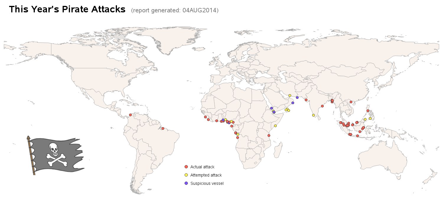
Here's a gmap showing the locations of pirate attacks this year. Click this link (or the map below) to see the full-size interactive map where you can hover over the markers for more information about individual attacks, and click the markers to drill down to a full report about the attack!
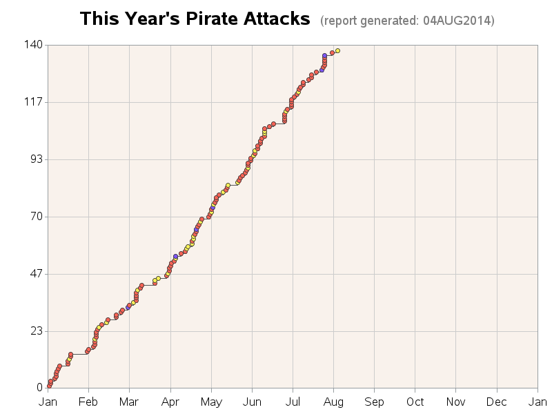
There's also a gplot of the same data below the map, so you can see how many attacks have happened over the course of the year, and look for trends:
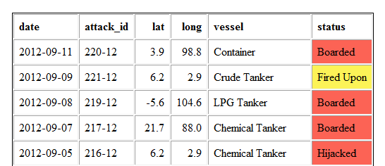
And a table of all the attacks (color-coded the same as the markers in the map and graphs) if you're more of a table person. Here's a screen capture of the first few observations in the table:
Details:
Note that this is more than just a 'fun' example - there are a lot of neat SAS 'tricks' being used here!
- The attack lat/long locations are read directly from the HTML of a web page, using some code that Rick Langston helped me develop. All of the data was on a single very long line in the HTML, which required us to get somewhat tricky.
- I reused the same colored markers from the map, in the plot, by just changing their x/y coordinates. (rather than letting gplot color the markers) This guarantees that the colors match between the map and the plot.
- The colored dots have HTML mouse-over text, and when you click them they drill down to the detailed report on that attack.
- I use a user-defined format to control the background color in the "proc print" table, so they match the marker colors.
- There's an annotated image (pirate flag) on the map, as well as a custom annotated color legend.
Doesn't this inspire you to learn more SAS tricks?!? Click here to see the actual code used.
P.S. If you leave a comment, please "Talk Like a Pirate" -- Arrr!!! b)


7 Comments
arrrrr, matey! How about some skulls & crossbones instead of red dots on the map? ;) Tiny cannons for yellow dots? A scurvy dog for blue dots! Arrrrrrrnnotate!
Arrre ye tryin' to get me keel-hauled?!? ... If I be usin' odd-shaped markers, they won't mark the timy spots on the map as well, and the likes of Stephen Few will likely run-me-through! b)
awesome...can i forward? (our silly management's silly security software ...ummm blocks any blogs...even SAS blogs.)..so i thought i'd just give credit and pass the graphs/maps..We ARE a SAS site and have been for the last 30 yrs.
Aye matey! - Ye have me permission to forward the link to the treasure map, even if ye aren't allowed to forward blogs by yer cap'n!
Someone asked if I used aRrrrrr to create this map - 50 lashes to that scurvy dog! b)
Ahoy, Robert! You and your creative ideas never cease to amaze me. Arrrrggghhh!
Thanks! :-)