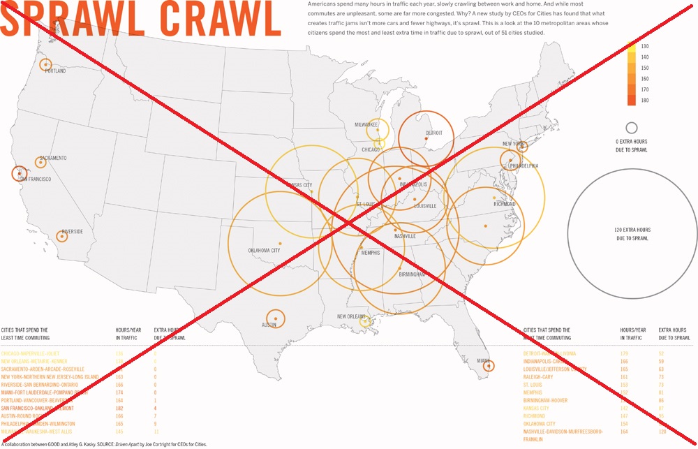
A while back, I had seen the following map on the CEOs for Cities website. It seemed like an interesting topic and an interesting map, but I just couldn't grok what their map was saying ...
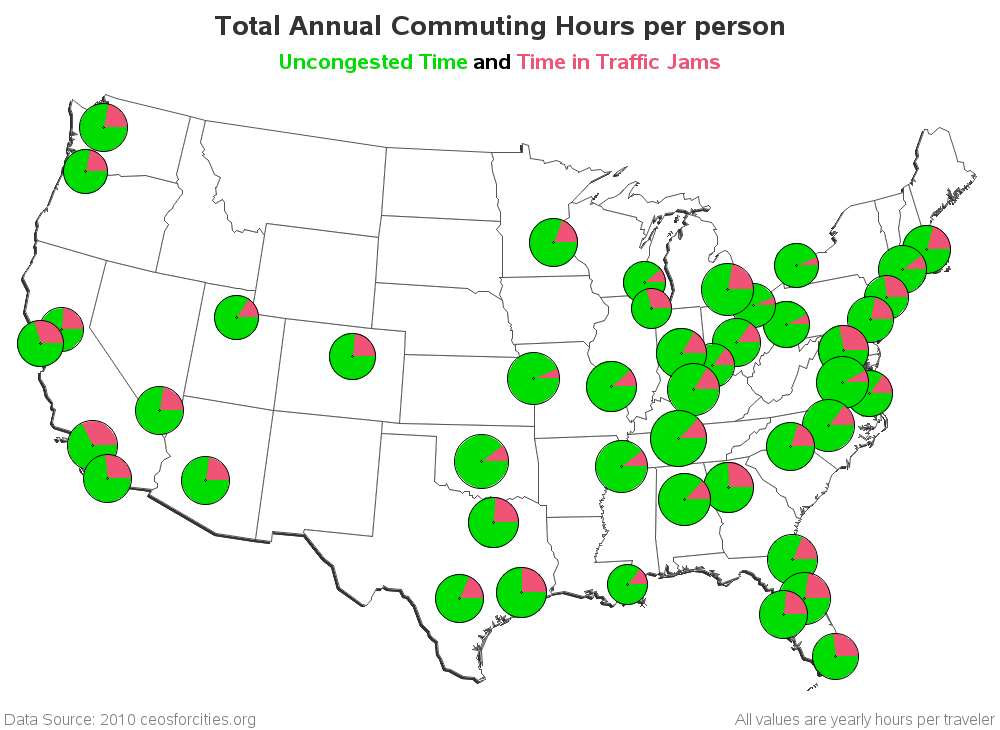
So I decided to download the data and create my own map with SAS. I used pies as my markers, and I set the size (area) of the pies proportional to the commute time, and I made a red slice in the pie to show what % of the commute time was spent in congested traffic. My map is not nearly as 'dramatic' as theirs, but I think it provides a better and more intuitive representation of the data. It basically says that most cities have similar average commute times, but some cities have a much higher percent of that time spent in traffic jams (look for the larger red slices).
How do these maps compare to your personal first-hand knowledge of commuting in these cities? Are LA, Chicago, San Francisco, and DC really the worst? Do Kansas City and Buffalo have the least traffic jams?
Here's a link to my SAS code, if you'd like to see exactly how I created this map!


3 Comments
Pingback: URL
Interesting data. I am surprised that the pie charts are nearly the same size. I expected more variabilitiy. I have created two other ways to visualized the same data at my blog.
Pingback: Visualizing US commute times and congestion - The DO Loop