Everyone in the world has their attention turned towards the Olympics this week, so what better topic to tie in to a SAS/GRAPH blog than that?!?!
I had seen a graph on the guardian website that I thought was interesting, so I decided to try to create my own (slightly different) SAS version...
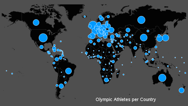
After a bit of experimentation, I came up with the following (note the map below is just part of it - be sure to click to see the whole/interactive thing!)
Here's how to use the graph:
When you first view the graph, it shows a map of the world, and the size of the 'bubble' on each country shows the total number of athletes from each country who participated in the 2012 Olympics. You can hover your mouse over each bubble to see the country name and number of athletes in html hover-text. You can click a graphic icon along the top of the page, and the map will show just the athletes for that sport (hover over each icon to see the sport name, if you're not sure what it is). Oh, and there's a bar chart below the map, if you prefer to see the data that way! :)
Here's how the graph was built:
I downloaded the Excel spreadsheet, and used Proc Import to read the data into SAS data sets. In our SAS world map, I converted the numeric country ids to country names, and then modified a few of the names so they would exactly match the country names in the Olympic data. I use the %centroid macro to find the center of each country, and then annotate the bubble to represent the number of athletes. The bar chart is fairly standard, except that I determine how many bars it will have, and set my "goptions ypixels=" based on that number.
The 'clever' part of the graph is the picture/buttons at the top of the page that let you select the desired sport! These are created by annotating images on a blank Proc Gslide, and associating html drilldowns with each image. And when I generate the drilldown graphs, I 'obscure' all of the other (non-selected) images with a square of alpha-transparent blue, so that they will visually look un-selected. This produces a radio-button effect.
The black background of the png graph images is created using "goptions cback=black;" ... but then I additionally modify the ODS graph style and set the docbg (document background) color to black, so that the entire web page background will also be black.
You can download the code if you'd like to see more details!
What was your favorite event in the Olympics, and how would you like to see the data from that event graphed?


4 Comments
very impressive! It seems that your approach is based on the traditional SAS graph framework. Are you considering leverage sg plot?
I personally prefer using traditional SAS/GRAPH procedures (gplot, gchart, gmap, gslide, and annotate) ... probably because I know them *very* well ... and I only know the basics of the new sg procedures such as sgplot (the new sg procedures are very powerful, and make certain graphs very easy though).
Nicely done!
Thanks!