When working with "big data" you usually have too many points to view in a plot, and end up subsetting or summarizing the data. But now, in SAS 9.3, you have an alternative!
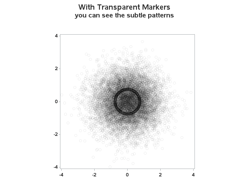
For example, the following scatter plot of 10,000+ points is just a visual "blob":
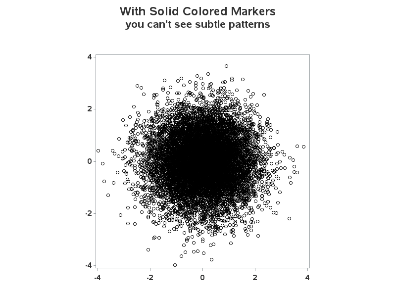
But using a new SAS 9.3 feature, alpha-transparency, you can make the plot markers semi-transparent, and "see" the hidden patterns. When multiple markers "stack up" in the same location, their transparent colors "add up" and they become darker.
In this case, I had "hidden" a densely-packed 'ring' of points in the data. This pattern is visually obscured when plotted with solid-colored markers (above), but very visible in graph with transparent markers (below):
Learn more about this example, and the exact code used to create it.
UPDATE: The idea for this post was inspired by a post on Yihui Xie’s website. I originally linked to the post from my ‘info’ page but a few readers have mentioned that they missed the link in that file, so I wanted to include it here too.


28 Comments
Pingback: Creating customized graphs for SAS analytic procedures
this is really cool. i am using SAS 9.2 and it is such a pity that i cannot see the effect on my pc. this could be very helpful for cluster analysis, gives you a much better idea how the data looks like and help you to choose the right distance measure and algorithm.
Perhaps you can use this cool new feature as part of a 'justification' for your company to upgrade to a newer version of SAS!
SAS 9.2, that you're using, was released in 2008 -- in the computer industry that's "ancient"! ;)
Here's one "plausibly real life" example (using imaginary data from a contest) where I used this technique to look for patterns of higher density geographical locations to try to track the origin & spread of an epidemic.
http://robslink.com/SAS/vastopolis/sas-mc1/
All of the maps except the gif animation use alpha-transparent colors for the markers.
Pingback: The best of SAS blogs for 2012 - SAS Voices
Pingback: togel online
Pingback: My Homepage
This seems a little strange to me. The SAS code has about 53 lines of actual, while the R code is only about 13 lines of code. I see that some of this is creating the data in SAS but why not download the actual data used and import it. The SAS code also only does about one third of the what the R code does, which is make the code in the first few lines of R. It would be interesting to see how many lines it would take to match functionality exactly. Is it possible to make a movie in a similar manner in SAS? You also mention that this is possible due to advancements in version 9.3, but the R version was made just about four years. I have used SAS and R a lot but in the past year have used SAS everyday with only slight interactions with R. I would imagine the more recent exposure to SAS would allow the codes meaning to jump out at me, but to the contrary it seems almost alien to me. It seems that the SAS code has lots of bulky statements and is very wordy in a somewhat illiterate way while the R code is very literate and succinct. I was wondering how SAS would fair against a more current set of graphics done in R. These are just a few of the interesting graphics I have seen on R-Bloggers over the last week or so. Would the same effects of more code for similar functionality and less readability appear?
http://www.r-bloggers.com/simulation-the-modellers-laboratory/
http://www.r-bloggers.com/animated-gif-annual-correlation-of-48-industries-for-50-years/
http://www.r-bloggers.com/universal-portfolio-part-10/
http://www.r-bloggers.com/exploring-distributions-of-ensatina-salamander-subspecies-using-rvertnet-by-neil-kelly/
http://www.r-bloggers.com/48-industries-dendrogram-ordered-over-50-years/
http://www.r-bloggers.com/genetic-algorithms-a-simple-r-example/
k - thanks for the comment, and the links to these cool samples! This might give me some ideas for future cool graphs! :)
Per the comparison of SAS and R - that's one of those topics of much debate, similar to religion and politics! LOL I can't really join in the debate, because I'm not an R expert ... but based on examples I've seen I feel safe in saying that both SAS and R are very capable, and both can produce some really useful graphical output.
Per this particular example, I hadn't really intended it to be a comparison of SAS and R, nor had I tried to use the minimum lines of code. As you mention, I could have re-used their data, but I thought it would make a better example to show how to do that in SAS also - making it a totally self-contained example (nothing else needed, other than what's in the code!) If I had *really* wanted to keep the code to the minimum, I guess I could have created the plot in "about 3 lines" - a libname to reference the data, a symbol statement to specify the alpha-transparent color, and then call 'proc gplot' (taking the default axes and such) ... but that wouldn't have been nearly as much fun! :-)
I believe many (if not all) of these graphs can be done using the new SGPLOT, SGPANEL or SGSCATTER procedures using very succint code released with SAS 9.2. Other, more complex, graphs can be done using GTL. For many examples, see Graphically Speaking.
Pingback: Top blog comments last week - SAS Voices
For an SGPLOT example, see "How to use transparency to overcome overplotting"
Thanks Rick!
Yes, but +10k are not "big data". Moreover, it is said in the code that the exercise is based on a previous post about R. Such attribution should be made more apparent to visitors of this page.
Hi Carlos - first, sorry for the delay in responding to you comment!
Per "big data" hopefully the reply I recently posted to Andrew's similar comment (above) will address that. Perhaps I should call it "bigger data"? :-)
And, per attributing the the original idea for the graph to Yihui Xie’s R blog, I was thinking that having the URL to his blog in my 'info' page (which is linked from my blog) would be enough, but I'll add a link here to make that a little more obvious/direct:
Note that I got the idea for the graph & the look of the graph from Yihui's excellent blog, but I implemented my SAS graph code 100% from scratch!
Hmm ... that link didn't come out right (I'm still getting used to this particular blog software!) Here's the bare URL:
http://yihui.name/en/2008/09/to-see-a-circle-in-a-pile-of-sand/
Yes, always keep an eye out for stuff from Robert Allison
He is the King of Cool SAS Graphics.
See his new book "SAS/GRAPH: Beyond the Basics"
and his web page http://robslink.com/SAS/Home.htm
But I don't know where his "future blogs" will be posted.
Thanks LeRoy!
Keep an eye on this blog (The SAS Training Post) - I plan to post several blogs here.
Bout time they get Robert Allison on one of these blogs.
His super cool plots are the "cowbell" these blogs need.
More cowbell !!! ; via sas/graphs.
More cowbell indeed!
Hopefully Christopher Walken would even approve! ;-)
I agree--Robert Allison graph posts fill a much wanted need. I kept the cool graphs for just after lunch today in my SAS Enterprise Guide class. Instead of sleepy minds trying to wake up to code, all you could hear was "oohs & aahs"!! as class was thinking of ways to show off on their return back to work on Monday!!
:-)
Very cool. Even without LOTS of data, can see how this would be useful as an alternative to jittering values when two data points overlap, or showing how two different distributions overlap (yellow+blue=green). Thanks.
Good point Quentin! ... Keep an eye out, and you will likely see several other cool uses of "transparency" (in graphs & maps) in my future blogs!
The alpha transparency is a useful but relatively minor feature. I've followed Robert Allison's SAS graph site and enjoyed it. However, the title of this brief article "Finding patterns in big data with SAS/GRAPH" promises way too much. Big data is so much more than 10K records, it seems the title is either hype or, especially with the link the first pagagraph, an attempt at SEO. A better title would be "Alpha transparency mitigates overplotting in SAS 9.3."
True - your suggested title would be much more 'correct' and provide a better description. As I write more blogs, you'll notice that I tend to "sensationalize" my titles a bit (and sometimes I'll even make them witty plays-on-words!) It's just my writing style - hopefully you'll grow to like it ;-)
Hopefully this blog in combination with my future blogs will show that although alpha transparency is a subtle feature, it is very powerful, and allows you to visualize your data in ways that are not possible without transparency. The feature has only been added to SAS/GRAPH for a short time, but I've already found that I "cannot live without it"!
Per the "big data" ... I hope you'll agree that alpha transparency will allow you to visualize "bigger" data than without it(?) And, therefore, it provides better capabilities for plotting big data than before (ie, without alpha transparency).
The great thing is now you don't even need SAS/GRAPH for that. sgplot and sgscatter both do semi-transparent scatters!
SAS/GRAPH and the 'SG' procedures (sgplot, sgscatter, etc) have some overlap in their feature sets, but they also each have some unique capabilities that are not available in the other. I would recommend you use them both! :-)