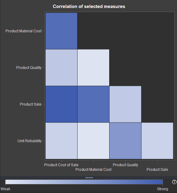
 If you've watched any of the demos for SAS Visual Analytics (or even tried it yourself!), you have probably seen this nifty exploration of multiple measures.
It's a way to look at how multiple measures are correlated with one another, using a diagonal heat map chart. The "stronger" the color you see in the matrix, the stronger the correlation.
You might have wondered (as I did): can I build a chart like this in Base SAS? The answer is Yes (of course). It won't match the speed and interactivity of SAS Visual Analytics, but you might still find this to be a useful way to explore your data.
The approach
There are four steps to achieving a similar visualization in the 9.3 version of Base SAS. (Remember that ODS Graphics procedures are part of Base SAS in SAS 9.3!)
- Use the CORR procedure to create a data set with a correlations matrix. Actually, several SAS procedures can create TYPE=CORR data sets, but I used PROC CORR with Pearson's correlation in my example.
- Use DATA step to rearrange the CORR data set to prepare it for rendering in a heat map.
- Define the graph "shell" using the Graph Template Language (GTL) and the HEATMAPPARM statement. You've got a lot of control over the graph appearance when you use GTL.
- Use the SGRENDER procedure to create the graph by applying the CORR data you prepared in the first two steps.
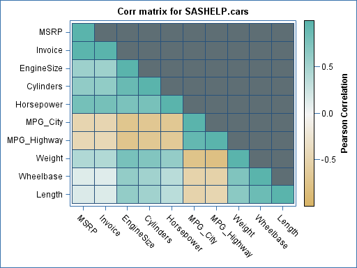
Here's an example of the result:
The program
I wrapped up the first two steps in a SAS macro. The macro first runs PROC CORR to create the matrix data, then uses DATA step to transform the result for the heat map.
Note: By default, the PROC CORR step will treat all of the numeric variables as measures to correlate. That's not always what you want, especially if your data contains categorical columns that just happen to be numbers. You can use DROP= or KEEP= data set options when using the macro to narrow the set of variables that are analyzed. The examples (near the end of this post) show how that's done.
/* Prepare the correlations coeff matrix: Pearson's r method */ %macro prepCorrData(in=,out=); /* Run corr matrix for input data, all numeric vars */ proc corr data=&in. noprint pearson outp=work._tmpCorr vardef=df ; run; /* prep data for heat map */ data &out.; keep x y r; set work._tmpCorr(where=(_TYPE_="CORR")); array v{*} _numeric_; x = _NAME_; do i = dim(v) to 1 by -1; y = vname(v(i)); r = v(i); /* creates a lower triangular matrix */ if (i<_n_) then r=.; output; end; run; proc datasets lib=work nolist nowarn; delete _tmpcorr; quit; %mend; |
You have to define the graph "shell" (or template) only once in your program. The template definition can then be reused in as many PROC SGRENDER steps as you want.
This heat map definition uses the fact that correlations are always between -1 and 1. Negative numbers show a negative correlation (ex: cars of higher weight will achieve a lower MPG). It's useful to select a range of colors that make it easier to discern the relationships. In my example, I went for "strong" contrasting colors on the ends with a muted color in the middle.
/* Create a heat map implementation of a correlation matrix */ ods path work.mystore(update) sashelp.tmplmst(read); proc template; define statgraph corrHeatmap; dynamic _Title; begingraph; entrytitle _Title; rangeattrmap name='map'; /* select a series of colors that represent a "diverging" */ /* range of values: stronger on the ends, weaker in middle */ /* Get ideas from http://colorbrewer.org */ range -1 - 1 / rangecolormodel=(cxD8B365 cxF5F5F5 cx5AB4AC); endrangeattrmap; rangeattrvar var=r attrvar=r attrmap='map'; layout overlay / xaxisopts=(display=(line ticks tickvalues)) yaxisopts=(display=(line ticks tickvalues)); heatmapparm x = x y = y colorresponse = r / xbinaxis=false ybinaxis=false name = "heatmap" display=all; continuouslegend "heatmap" / orient = vertical location = outside title="Pearson Correlation"; endlayout; endgraph; end; run; |
You can then use the macro and template together to produce each visualization. Here are some examples:
/* Build the graphs */ ods graphics /height=600 width=800 imagemap; %prepCorrData(in=sashelp.cars,out=cars_r); proc sgrender data=cars_r template=corrHeatmap; dynamic _title="Corr matrix for SASHELP.cars"; run; %prepCorrData(in=sashelp.iris,out=iris_r); proc sgrender data=iris_r template=corrHeatmap; dynamic _title= "Corr matrix for SASHELP.iris"; run; /* example of dropping categorical numerics */ %prepCorrData( in=sashelp.pricedata(drop=region date product line), out=pricedata_r); proc sgrender data=pricedata_r template=corrHeatmap; dynamic _title="Corr matrix for SASHELP.pricedata"; run; |
Download complete program: corrmatrix_gtl.sas for SAS 9.3
Spoiler alert: These steps will only get easier in a future version of SAS 9.4, where similar built-in visualizations are planned for PROC CORR and elsewhere.
Related resources
You can apply a similar "heat-map-style" coloring to ODS tables by creating custom table templates.
If you haven't yet tried SAS Visual Analytics, it's worth a test-drive. Many of the visualizations are inspiring (as this blog post proves).
Finally, while I didn't dissect the GTL heat map definition in detail in this post, you can learn a lot more about GTL from Sanjay Matange and his team at the Graphically Speaking blog.
Acknowledgments
Big thanks to Rick Wicklin, who helped me quite a bit with this example. Rick validated my initial approach, and also provided valuable suggestions to improve the heat map and the statistical meaning of the example. He pointed me to http://colorbrewer.org, which provides examples of useful color ranges that you can apply in maps -- colors that are easy to read and don't distract from the meaning.
Rick told me that he is working on some related work coming up on his blog and within SAS 9.4, so you should watch his blog for additional insights.

35 Comments
Two points.
1. How can the heat map be labelled by variable labels instead of names?
2. Without specifying a variable list (which saves needing drops or keeps) the order of variables is the same as in the dataset as seen by position option in proc contents. I would prefer a varlist approach so as to match PROC CORR output from its given var list. At the moment I have not amended the macro but use KEEP and RETAIN in a prior data step so get the right order.
I'm not smart enough to solve point 1 though!
Hans,
I think you can get what you want for the labels on one axis by changing this line:
to this:
But for the other axis, you have to reintroduce the labels into the corr matrix data set. Here's one way.
  /* Parse libname.member, stopping at open paren */
  %local mem lib;
  %let lib = %scan(&in,1,%str(.));
  %let mem = %scan(&in,2,%str(.());

  /* rejoin LABEL into corr matrix */
  proc sql;
  create table _newCorr as select t1.*, t2.label as _LABEL_
  from _tmpCorr t1 inner join sashelp.vcolumn t2 on (t1._NAME_ = t2.name)
  where libname=upcase("&lib") and memname=upcase("&mem")
  ;
  quit;

/* prep data for heatmap */
data &out.;
 keep x y r;
 set work._newCorr(where=(_TYPE_="CORR"));
 array v{*} _numeric_;
 /* Use label if available, else use name */
 x = ifc(missing(_LABEL_), _NAME_, _LABEL_);
 do i = dim(v) to 1 by -1;
  y = vlabel(v(i));
  r = v(i);
  /* creates a lower triangle matrix */
  if (i<_n_) then
   r=.;
   output;
 end;
run;
It looks like you have what you need for controlling the order: specify the numeric vars that you want, in the sequence you want, on a KEEP= option. For example:
Pingback: Visualize a matrix in SAS by using a discrete heat map - The DO Loop
Pingback: A Christmas tree matrix - The DO Loop
Love this! Exactly what I needed. Thank you!
Pingback: Creating a basic heat map in SAS - The DO Loop
An alternative method to custom table templates is much simpler: define a format and use that to set the background of the table cells. This works in PROC TABULATE and PROC PRINT. I use a non-linear 18-point scale from red to blue through white coded as HSV colours.
.
In PROC PRINT use (where the format is corr.):
var Corr / style(data)={background=corr.};Hello Chris
Thanks. Your example is amazing.
I want to make a panel graph of this heatmap.
For example I am trying to display child mortality rates by year and states by gender in a panel graph. I mean 2 graphs for separate genders with a common Y-axis 'state', male and female graphs show side by side. Basic graph works with the following codes.
ods graphics /height=800 width=1200 imagemap;
proc sgpanel data=heat_map_data_q;
   format StateCode $Statef. deceasedsex $Sexf.;
    panelby deceasedsex;
    heatmapparm x=survey_Year y=StateCode
      colorresponse=Death_rate_LB_cat;
run;
I was tried to bring your template to Proc SGrender to show a panel graph but failed all my attempts.
Would you be able to advice me what changes to be done in your proc template scripts and what changes to be done in Proc SGrender or Proc SGpanel procedures to produce a panel graph.
Wilson, this is a great question to post into the SAS Support Communities. Try the board about ODS Graphics.
Hi, I want to make this using Spearman correlations instead of Pearson, but I keep getting this error: ERROR: Physical file does not exist, /tmp/SAS_workB53E000040A6_localhost.localdomain/_0B0906D7F5ADC49B6F284B117A04453.bmp. along with java.lang.ArrayIndexOutOfBoundsException: 3
If I run the code using pearson, I have no problems generating the heat maps. This only happens when I change the outp= to outs=
Ex:
proc corr data=&in. spearman noprint nocorr
outs=work._tmpCorr
I was wondering if you know what could be causing this and if it's possible to create the heat maps using spearman?
Thanks for reporting this. I think this is a bug, but I'll ask the developers and see what I can find out.
I found the issue. It's a precision issue with the Spearman output, which sometimes can be so close to 1.0 for self-correlations but can actually be just a tiny bit over 1. That value falls outside of the colormap range that is defined in the GTL code. We can work around with the ROUND function in preparing the matrix for plotting.
Change the DATA step in the "prep data" portion to:
data &out.; keep x y r; set work._tmpCorr(where=(_TYPE_="CORR")); array v{*} _numeric_; x = _NAME_; do i = dim(v) to 1 by -1; y = vname(v(i)); /* Round to account for precision differences */ r = round( v(i), 0.0000001 ); /* creates a diagonally sparse matrix */ if (i<_n_) then r=.; output; end; run;Thank you so much Chris!! It worked perfectly!
Glad to hear! I'm also happy to report that the developers fixed this exception -- should be better in the next maintenance release of SAS.
Hi Chris,
I am trying to use your program verbatim to generate a heat map of the correlation matrix . The only problem is I have too many variables - about 43. So the labels are all overlapping and aren't readable, though the heatmap with the colors are generated fine. Could you point me to a fix or to the lines in your code which I would have to modify?
Thanks!
If you want the labels and values to be readable, you might just need to increase the dimensions of the graph:
ods graphics /height=1500px width=1500px imagemap tipmax=4000;
Adding the TIPMAX option allows the higher number of hover-over tips to be included as well.
Pingback: Use a bar chart to visualize pairwise correlations - The DO Loop
Hi Chris,
How to add the value (i.e. numbers) in those boxes?
I have 9.4 M1 release so textplot is not working in PROC Template.
Any way to do it in 9.4M1
Thanks
Good question to post on communities.sas.com -- the Programming->ODS Graphics board. Be sure to include details about your version and any code that you've tried. Experts will help!
Hi Chris,
I was able to manage it by using scatterplot with MARKERCHARACTER option in PROC Template.
Thanks.
Glad you got it working!
Pingback: A Christmas tree matrix - The DO Loop
Hi Chris,
This has been of immense help to me but I am having trouble obtaining partial correlations. I inserted the partial statement and listed the covariates to adjust for and received an error. How can I get around that?
Thanks
Fred
What types of errors? I suggest that you post the question to the Stat Procs board on the SAS Communities. Include your code and log -- someone will chime in with helpful suggestions, I'm sure.
Hi Chris,
I am having trouble adding the P-value inside the Pearson correlation heat map. Can anyone help me with that please? Below is part of my data and the your code I am using to create the heat map but I do not know how to include the P-value statement.
I really appreciate your help.
It looks like you've got your answer from the communities -- glad to see it was asked and answered.
I just had a quick question, what is this line of code doing?
ods path work.mystore(update) sashelp.tmplmst(read);
Thank you.
It tells SAS where to write the ODS template that we're creating for this. We don't want to save it permanently, so we add a WORK location into the search path.
Ok, that makes sense! It is updating the work directory and only reading the template directory.
If I ran the code without the ods path statement, does that mean it overwrote the template permanently? If so, how do I restore it back to its default?
Thank you!
I think in this case, we're just adding a new template and it won't affect any "shipped" templates. Usually you would not have update access to the installed templates, unless you are running on a machine where you have full admin rights.
Ok! Thank you for your help!
Hi Chris,
Used the code and it works very well, thank you. Is there a way to display the values too inside the boxes?
Another question: Before passing the dataset to sgrender if the dataset is sorted by X Y then the display changes to left upper triangle, however certain boxes in below triangle too gets populated, Is there a way to fix it.
Hi Prakash, I'm sure it's possible. I think it would be a good question to post to the Graphics Programming forum on the SAS community.
Chris, has this been added to Proc Corr as a statistical graphic yet? I'm totally fine with macros, but it seems like a no-brainer that this should be incorporated into Proc Corr.
Hi Robert,
No, actually this hasn't been added. It would make a nice addition but not sure if it's on the roadmap. In the meantime, we can make do with other methods (like this macro).