Like millions of other Americans, I recently was asked to make a decision of tremendous importance to my household -- a decision that would affect the welfare of everyone in my family. That decision, of course, was whether to continue to receive Netflix movies by mail, or opt for the less-expensive "streaming only" subscription.
Let me just say this up front: we love our Netflix subscription. We subscribed way back in 2005 on the low-cost "one-disc-at-a-time" plan, and since then we've seen over 180 movies that we received on-loan, delivered via the US Postal Service. Many of these were movies that we never would have seen otherwise: older films, independent films, and many other titles that would have been difficult to find at a local video rental shop.
But having arrived at this crossroads, it's a good time to try and measure just how much the DVD-by-mail option would cost us, and then we can decide what action to take. And of course, I used SAS Enterprise Guide to analyze my Netflix history, and thus created additional insight about the movie-rental pattern of my household.
Getting my account history into SAS
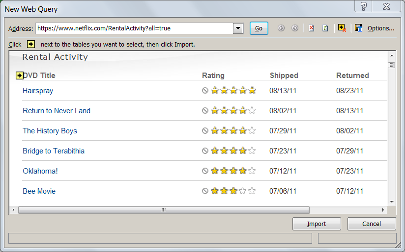
One of the things that I like about Netflix is how they allow you to see your entire account history online. At the time that I'm writing this, this URL will get you to your complete DVD shipping activity (although this could change, as Netflix is restructuring their DVD-by-mail business):
https://www.netflix.com/RentalActivity?all=true
In order for that URL to work, you must be already signed in to your Netflix account in your web browser. While there are several ways to turn this web page into data, I found the easiest method within Microsoft Excel. On the Data ribbon menu, select Get External Data->From Web. On the New Web Query window, paste the URL in the Address field and click Go. You'll see a preview of the web page where you can select the table of your account history to import as data.
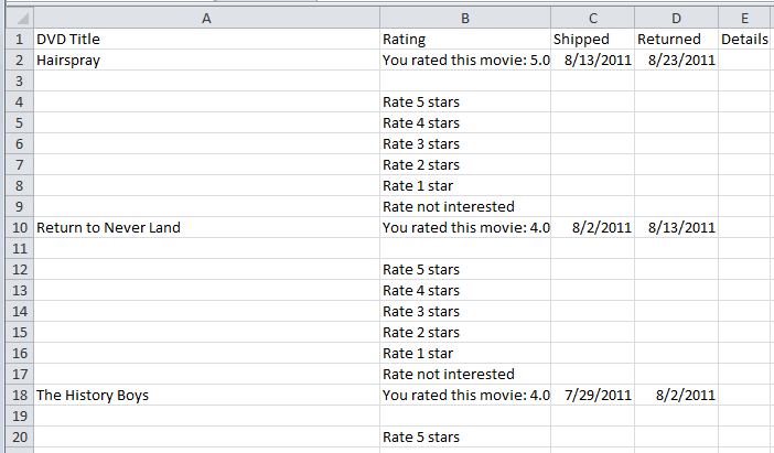
When the content is transferred into the Excel spreadsheet, I saved the file (as NetflixHistory.xlsx), and closed Microsoft Excel. The spreadsheet doesn't look like data that's ready to analyze yet (lots of extra rows and space as you can see in the example below), but that's okay. I can fix all of that easily in SAS.
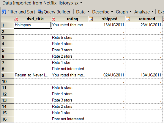
With the data now in an Excel spreadsheet, I fired up SAS Enterprise Guide and selected File->Import Data. After just a few clicks through the wizard, I've got the data in a work data set.
Cleaning the data and calculating the value
The data records for the account history are very simple, containing just four fields for each movie: DVD_Title, Rating (whether we liked it), Shipped (date when Netflix shipped the movie out to me), and Returned (date when Netflix received the movie back from me). My goal for this project is to measure value, and there are no measures in this data...yet. I also need to filter out the "garbage" rows -- those values that had some purpose in the HTML page, but don't add anything to my analysis.
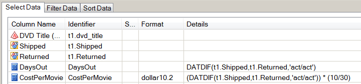
I'm going to accomplish all of this within the SAS Enterprise Guide query builder, building it all into a single step. First, I need to design a few filters to clean up the data, as shown here:
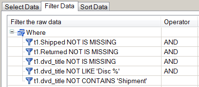
The first three filters will drop all of the rows that don't contain information about a DVD title or shipment. The last two filters will drop any records that reflect multi-disc shipments, or the occasional replacement shipment from when I reported a damaged disc. Those are rare events, and they don't contain any information that I need to include in my analysis.
Next, I want to calculate some measures. The most obvious measure to calculate is "How many days did we have the movie" -- the difference between the Shipped Date and Received Date. And while that number will be interesting, by itself it doesn't convey value or cost. I want a number that I can express in dollar terms. To come up with that number, I will employ the tried-and-true method used by data hackers all over the world: I will Make Something Up.
In this case, I'm going to create a formula that reflects my cost for each movie. That formula is:
(Netflix Monthly Fee / Days In a Month) * Days We Had the Movie = Cost of the Movie
Using the query builder, I calculated new columns with these values. I assumed the fee was $10/month (varied over time, but this constant is good enough) and that there are 30 days in a month (again, a "good enough" constant). Here are the new columns in the query builder:
After applying these filters and calculations, I finally have a result set that looks interesting to analyze:
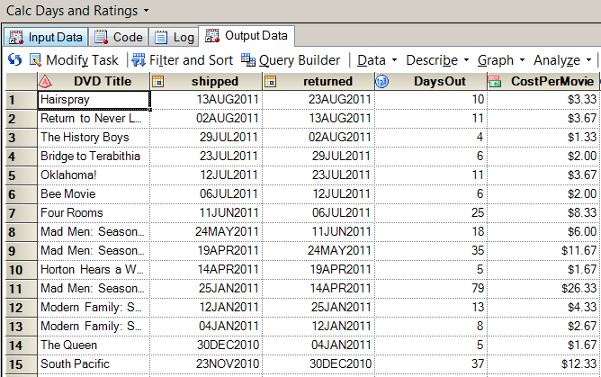
By sorting this data by CostPerMovie, I can see that the "cheapest movies" were those that we had out for only 3 days, which is the fastest possible turnaround (example: receive in the mailbox on Monday, watch Monday night, mail out on Tuesday, Netflix receives on Wednesday and ships the next DVD in our queue). By my reckoning, those DVDs cost just $1 to watch. The most expensive movie in my list came to $26.33, a Mad Men DVD that sat for 79 days while we obviously had other things to do besides watch movies.
Visualizing the results
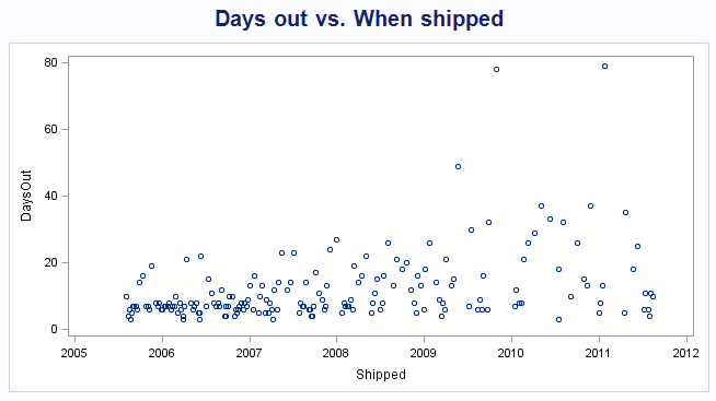
To visualize the "Days Out" as a time series, I used the SGSCATTER procedure to generate a simple plot. You can see that at the start of our Netflix subscription, we were enthusiastic about watching the movies immediately after we received them, and then returning them in order to release the next title from our queue. These are where the DaysOut values are closer to zero. But as time goes on and Life Gets Busy, there are more occurrences of "extended-period loans", with higher values for DaysOut.
Because I've calculated the cost/movie with my sophisticated model, I can plot the cost over time by using the SERIES statement in PROC SGPLOT, with this result:
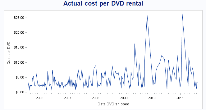
This plot makes it easy to see that I've had a few "high cost" DVDs. But it's still difficult to determine an actual trend from this, because the plot is -- and this is a technical term -- "too jumpy". To remedy that, I used another task in SAS Enterprise Guide -- one that I probably have no business using because I don't fully understand it. I used the Prepare Time Series Data task (found under the Tasks->Time Series menu) to accomplish two things:
- Calculate the moving average of the CostPerMovie over each 10-movie interval, in an effort to "smooth out" the variance among these values.
- Interpolate the CostPerMovie value for all dates that are covered by these data, so that on any given day I can see the "going rate" of my CostPerMovie, even if that date is not a Shipped Date or Received Date.
This magic happens behind the scenes by using PROC EXPAND, part of SAS/ETS. And although PROC EXPAND creates some nice plots by using ODS statistical graphics, I created my own series plot again by using PROC SGPLOT:
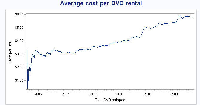
This plot confirms what I already know: our movies have become more expensive over the past 6 years of my subscription. But more importantly, it tells me by how much: from an initial cost of $3-4, it's now up to nearly $6 per movie -- based solely on our pattern of use.
Important note: The data I collected and analyzed covers only the DVDs we've had shipped to us. It does not include any movies or shows that we've watched by streaming the content over the Internet. The "instant watch" feature is an important component of the Netflix model, and we do use this quite a bit. I know that this accounts for much of the decrease in frequency for our DVD watching. But by changing their pricing model, Netflix basically asked the question: how much is it worth to you to continue receiving movies by mail, independent of the streaming content?
And I answered that question: it's not worth $6 per DVD to me (as I reckon it, given my pattern of use). Like millions of others, I've opted out of the DVD-by-mail service. But we've kept the streaming service! In a future post, I'll take a look at how we use the streaming content and what value we receive from it. [UPDATE: Here it is, the analysis of my streaming account.]

10 Comments
Very cool analysis, especially the ease with which you were able to get the data into SAS. I don't know much about the ETS procedures, but one of my favorite smoothers is the LOESS procedure. There is also a LOESS statement in PROC SGPLOT. The loess proc/statement will compute the "best" smoother according to some criterion, so try it out and see what that looks like. If the smoother is too wiggly, try using a SMOOTH= value that is larger than auto-selected value. I'm going to guess that SMOOTH=0.16 or 0.25 will be large enough to see yearly trends without being too wiggly. The smoothers in my "most likely birthday" posts are loess smoothers.
Thanks Rick!
I tried LOESS with SGPLOT, and I did find the trends too "wiggly" by default. But I didn't know about the SMOOTH= option, so I'll need to try that.
Thanks for the post, using your steps I was able to calculate that my average cost per DVD was over $9.50 per DVD and on the rise. Will be canceling "Qwikster" ASAP.
Awesome analysis. I wonder if there is a way to get my ratings for all those movies (2500+) that they use to base my suggested list on. I recall in the early years - I spend several hours rating movies so they could make suggestions. I was worried if something happens to Netflix ... what about my ratings!!!!???!!??!
I would love to know how they project what I would like. Only a handful of times has their suggestion been inaccurate. If I did want to switch to another service - what about my ratings?!?!?!?!
Actually Tricia, my analysis grabs the ratings as well. I didn't feature that in the post, but if you follow the steps I describe you'll get those ratings in the data. I have a SAS Enterprise Guide project that features a report showing how many movies we liked (or didn't like).
Pingback: JMP helped me decide between Netflix and Qwikster - JMP Blog
Pingback: Netflix streaming: Making every minute count - The SAS Dummy
Pingback: Friday’s Innovation Inspiration – He’s No SAS Dummy - SAS Users Groups
Pingback: Using source control management with SAS Enterprise Guide - The SAS Dummy
Pingback: Add a stars-style rating column to your SAS output - The SAS Dummy