
When a busy university analytics team is tasked with creating a new, interactive way to share data with dozens of different constituents, data visualization from SAS is the obvious answer.
The University of Idaho’s office of Institutional Effectiveness and Accreditation is the source for comprehensive information, analyses and university statistics. The office serves university decision-makers, governmental agencies and other internal and external constituencies.
They also work closely with offices throughout the university to provide data, conduct analyses and design and implement systems required for timely business decisions, compliance with state and federal reporting requirements and accreditation. They also support student, faculty and staff recruiting and retention efforts.
With all these responsibilities, Dale Pietrzak, Ed.D., Director of Institutional Effectiveness and Accreditation, and his team, needed a way to make data more readily available. The Provost asked Pietrzak to develop an operational visual presentation system and a new data access process in a short timeframe (between 6 months to 12 months).
The University of Idaho (UI) team had several goals:
- Replace their current BRIO/Hyperion product.
- Integrate with a Base SAS environment that has been in place for 20 to 30 years.
- Handle complex joins and merges, data manipulation and clean-up activities.
- Provide a relatively fast learning curve for new hires and current team members.
The team chose SAS Visual Analytics as it was powerful, interactive, visual and integrated well with their current SAS environment early in the spring term. Leveraging a strong working relationship with UI’s IT Department, they were able to quickly install and align their data process and data security rules within 3 months.
To ensure success, the UI team took basic training on SAS Visual Analytics, and within a month, they had initial dashboards demos in operation. Since then, the university has been piloting internal reports with constituents, and they have rolled out a first internal set of dashboards for:
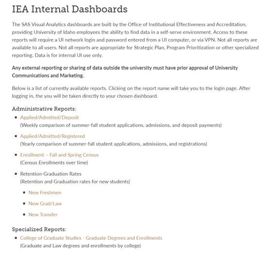
- Student Population (IPED Fall Enrollments).
- Applied Admitted and Enrolled.
- Retention and Graduation.
- Drop, Fail, Withdraw, Incomplete (DFWI)
- Several custom reports.
According to Pietrzak, the reports allow for a relatively complex filtering and trend reporting, making them highly interactive. Various elements in the majority of these reports allow for:
- Overview.
- Trends by Level.
- Trends by College and Program.
- Race and Residency.
- High School Locations.
- Ethnicity Academics.
- Differences from Prior Year.
Now, the UI team is working on a more user friendly web linked system and presentation process, and they’re developing additional reports as requests arise.
To learn more, several additional education institutions have shared their use of data visualization and analytics. For more details check out - Ten Tips for Using Data Visualization and Analytics Effectively in Education.