After acquiring personal IoT data in part 1 and cleaning it up in part 2 of this series, we are now ready to explore the data with SAS Visual Analytics. Let's see which answers we can find with the help of data visualization and analytics!
I followed the general exploratory workflow described by the Visual Analytics Mantra):
"Analyze first, show the important, zoom, filter and analyze further, details on demand."
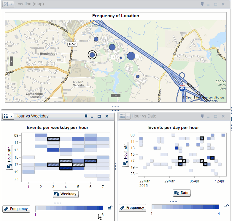
Path analysis pointed me to the most common patterns on my daily wanderings around campus. Geographical maps made the results easier to relate to. Temporal heat maps - where categories are derived from different time binning levels - made it trivial to zoom in and filter on time-based events. Details were always just a click away with the ability to show the data behind a visualization, and convert on the fly to a table view where additional columns could be added to provide context.
These visualizations were useful on their own but were made even more powerful through the use of data brushing and linking. Shared selections showed synchronized sets of significant stories and similar situations. The image below shows how, after normalizing the color scales of two temporal heat maps, data linking was used to find patterns over time and geographical location at the same time.
By applying the exploratory workflow, I played the role of data analyst with my own data, much like a corporate data scientist or government analyst would do. In that spirit, I listed a few "questions" that one of these inquisitive figures might have wanted to investigate, had they been on my case and obtained access to my data. Then I described ways in which they could explore the data to find the answers.
Since we are now playing the data analyst role, from now on I will be referred to as "the suspect."
1) Has the suspect been going to campus on weekends?
That could indicate unusual activity... but the combination of a temporal heat map based on weekdays and a geographical map quickly shows that the suspect spent his weekends at home, away from the SAS campus.
He might have been logging from home though; we need to check his Internet access logs later.
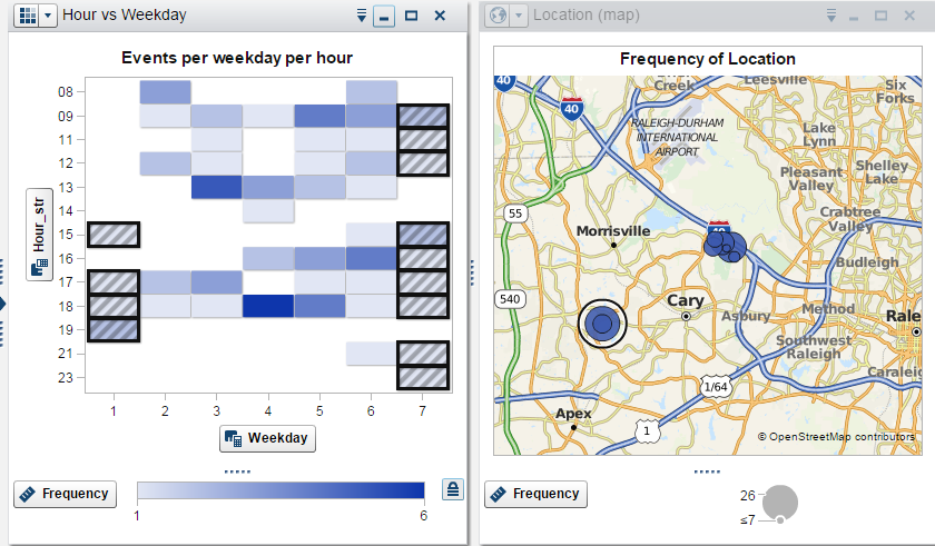
2) Which buildings have restaurants or cafeterias?
By looking at the suspect 's whereabouts during lunch time hours on weekdays, we can make an educated guess of which buildings have eateries in them. A temporal heat map and a frequency plot will do the trick. The partial selection shows the relative number of the lunch time visits compared with total visits, supporting a better-informed conclusion.
The partial selection on the frequency plot, triggered by data brushing and linking from the heat map, shows the relative number of the lunch time visits compared with total visits. Knowing this ratio supports a better-informed assessment. We can be pretty sure building R has a restaurant, a little less about buildings F and T (in fact all of them have restaurants).
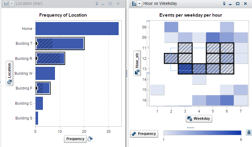
3) Which exits does the suspect use when driving home?
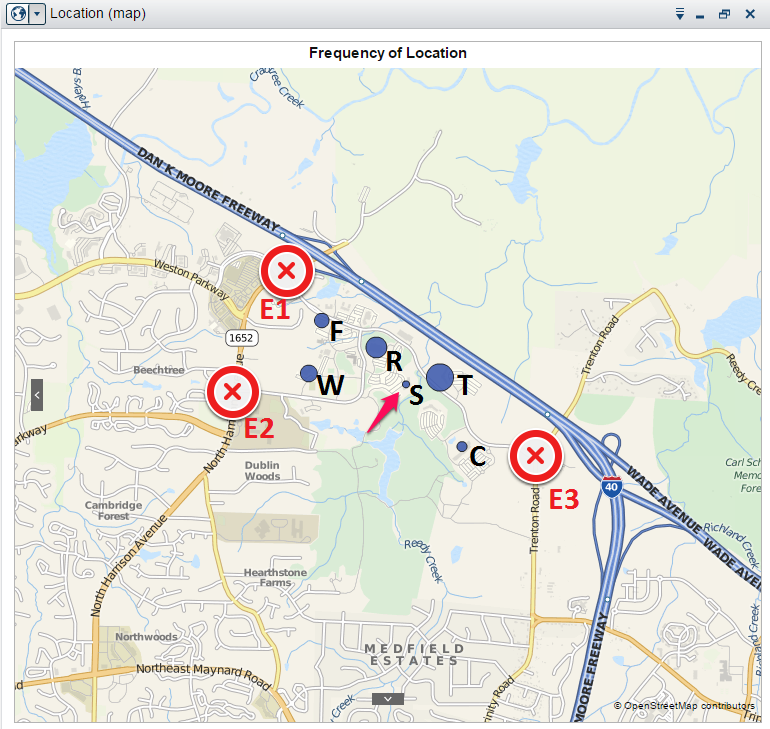
This is a more complex question. As we can see in the previous picture, the SAS campus has three main exits. The suspect works in building S (indicated by the red arrow), which is in the middle of campus; in theory any of the exits would work. How can we figure out, using only the GPS data available, which one of them he takes to go home?
We can start by remembering that the data was collecting when the user enters an area and that the capturing rule is triggered by proximity in a large area around the selected locations. This means that the rules might also be triggered by driving close to a building, even if the suspect does not enter it.
So we can narrow our search space to the buildings that are 1) close to an exit and 2) show up in the data right before the user arrives home. And we can narrow it even further by looking at 3) the time the event was captured, as we did when finding which buildings contain restaurants. Only, in this case, we will look at the end of afternoon hours.
We can figure #1 out by a simple visual inspection of the annotated geographical map. We have done #3 already and know it can be done with a temporal heat map. But how about #2? How do we find which buildings satisfy the condition of being visited before the last event (arriving at home) on each given day?

This problem is actually a perfect use case for path analysis. By using the date portion of our timestamps – one of our "data decorations" introduced during data preparation – we can isolate events inside the day they happened, so each "path" along the campus can be examined individually. Path analysis provides both a way to visualize these paths in a Sankey diagram, as well as data in a format close to what we need to answer the question.
We want to filter on the edges that lead to the final node ("Home"). But we don't care about the position in the path, which is added to the node names. This is not ideal, but easy to solve. We just have to export the data generated by the path analysis, then load it as a new data source in the Visual Analytics Explorer (we can load multiple data sources in an exploration, and create linked filters between them).
Add a calculated item to remove the position from the node name, and we have the most common predecessors to the exit node - just what we wanted to answer #2!
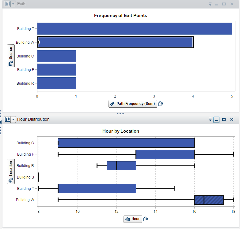
Putting these visualizations together and using the distribution over time as the final criteria, we can safely arrive at the conclusion that the suspect drives by building W before going home – which implies he takes exit 2 when leaving the campus. Building T shows up as a predecessor more frequently – but the hours don't match (building T is very close to building S, where the suspect works, so its rule sometimes triggers in the morning, when the suspect arrives at work).
I hope you had fun playing intelligence analyst and also learned a few exploratory tricks. Now it is your turn: what are you going to find when exploring your personal IoT data?