In my last blog post, I introduced SAS Visual Analytics for UN Comtrade, which helps anyone glean answers from the most comprehensive collection of international trade data in the world. I’d like to share some of what we learned in the development process as it pertains to big data, high performance data visualization and cloud computing.
What visualizations are best for your data?
In the past, traditional reporting of trade data required us to be quite specific about what we wanted to see: Which reporting countries? Which time period? Which commodities? And which partners? Data visualization exposes relationships and insights that are traditionally hard to display.
For example, when looking at the interactive visualization for Trade Balance, we see that the world tends to import the most things from China. However, clicking on the top traded commodity of “mineral fuels”, we see that the Russian Federation is the top provider for the most heavily traded category in the world. The US and Germany are almost tied to be the world’s top provider for “plastics and articles thereof.” These insights were obtained with three mouse clicks and a curious mind.
Pick the right visualization
There are two key considerations when deciding which types of visualizations to use.
First, consider the data. Data visualization brings out the unique “personality” of each data set, revealing which types of insights the dataset is best suited to provide. Second, consider the desired user experience. Visualizations present many options for analysis, ranging from a short animation that shows a specific insight in a fresh way, to self-service interrogation of 300+ million rows where people can spend hours.
It does not require fancy never-before-seen graphics to be insightful. It can be as simple as linking two or more simple graphs that dynamically update each other to provide new perspectives.
What role can big data technologies play?
The UN Statistics Division confirmed that seeing the full dataset quickly provided many new stories and insights. SAS Visual Analytics eliminates the need for sampling or summarizing the data, allowing us to tell thousands of stories using one screen. For example:
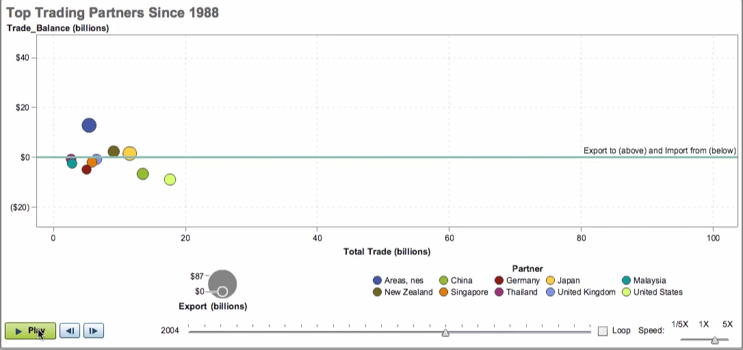
- An animated Trade History bubble chart shows that China transformed from being a major import partner to the largest export partner for Australia over the past 10 years (see above).
- The Trade Composition visualization reveals that a disruption in Brazil’s iron and steel production could severely impact Argentina.
- The exportation of live animals is big business for Ethiopia. The largest trade partner? Somalia.
While many are intrigued by the promise of open-source big data storage technologies like Hadoop and high performance analytics, they are also deterred by the complexities of making these highly technical components work together. The UN anticipated these issues and selected a partner like SAS, whose data visualization technologies have automated connections to big data sources like Hadoop and Twitter. And with the requirement to make these capabilities available to the public, we turned to SAS cloud computing to address these remaining issues.
Why should you use cloud computing?

With cloud computing, the end user does not need to administer any of the technical details and components. They simply access the environment through an internet browser or mobile tablet. They will never see any of the complexities required to maintain a high performance visualization environment with Big Data. Also, a cloud computing environment is easily scalable. When either the data size or user count grows beyond the current capacity, it is easy to add additional computing power to accommodate increasing demand. While cloud computing has many advantages, it may not always be the cheapest option, depending on variables like security level, performance expectations, etc. but it is certainly worth exploring.
SAS Visual Analytics for UN Comtrade is a good example of how Big Data, high performance data visualization and cloud computing were used to provide a new and refreshing way to get better answers in this Big Data age.
I encourage you to dive into the largest repository of trade data in the world and share the interesting, and surprising, stories the data tells you.