Introduction
Understanding the behavior of your customers is key to improving and maintaining revenue streams. It is a an important part when crafting successful marketing campaigns. With SAS Visual Analytics 7.1 you can analyze, explore and visualize user behavior, click paths and other event-based scenarios. Monitoring the customer journey by visualizing all touch-points in your organisation will help you to identify gaps and improve the overall customer experience. Flow visualizations will help you to best understand hotspots, highlight common trends and find insights in individual user or aggregated paths.
In path analysis you are typically trying to determine a sequence of events in a particular time window. For example you pay attention to paths more frequently used than others in order to understand what path prospects take before they become new customers. Path analysis works best with linear event streams such as customer life cycle (1. prospect, 2. trial subscription, 3. customer, 4. product upgrade, etc.) but is also commonly used for web usage analysis. As a data scientist you may look for optimal paths to compare with paths customers have actual taken. This often reveals interesting insight and opportunities for revenue improvements.
Challenges
Path analysis can be challenging especially when analyzing web usage. There are often many ways customers can navigate on a website, so even if we determine the optimal path in this scenario, it’s very likely that just a very minor number of users will actually take the optimal path. This means you must pay special attention to the path analysis results in order to gain the right insights. You may for example compare the least and most used paths in terms of sequence count or the number of drop off’s (e.g. customers who left a session and therefore didn't complete an order).
It can be useful to apply segmentation to path analysis (more details below), as this will greatly reduce the number of steps in a path and may represent a better aggregated view about paths taken. In most cases, you are after the number of people taking the optimal path to reach your goal such as purchasing a product. Once you are understanding common paths you can try to influence the customer behavior by redesigning the web page or starting a marketing campaign, for example.
Path analysis in SAS Visual Analytics
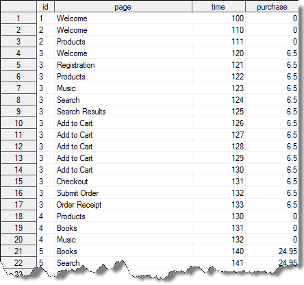
Let’s start with a very basic example about path analysis to explain the basic steps. Consider the following simple data set:
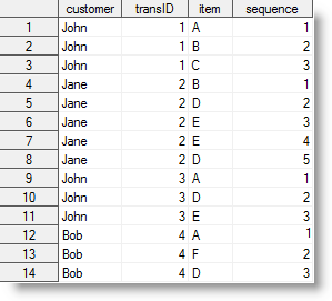
The table structure shows our customers (John, Jane and Bob) and the visited web pages (item column) per session (transId column). As you can see the customer “John” visited our web page twice at different times. The sequence column is just used to maintain the order of the events. Typically you would take a date/timestamp here.
Since this is very simple data set you can easily see what paths each customer has taken:
- John: ABC, ADE
- Jane: BDEED
- Bob: AFD
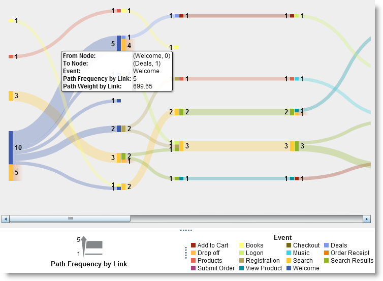
Visualizing this example in SAS Visual Analytics provides the following Sankey diagram:
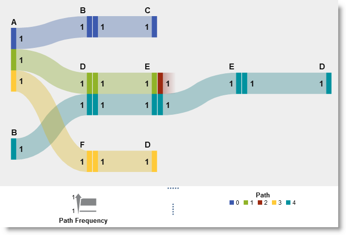
The diagram is colored by path indicating that there are 5x different paths including a drop off (path 2, red). This already gives interesting insights such as partly shared paths (John/green and Jane/turquoise share event D & E) as well as a common start event (A).
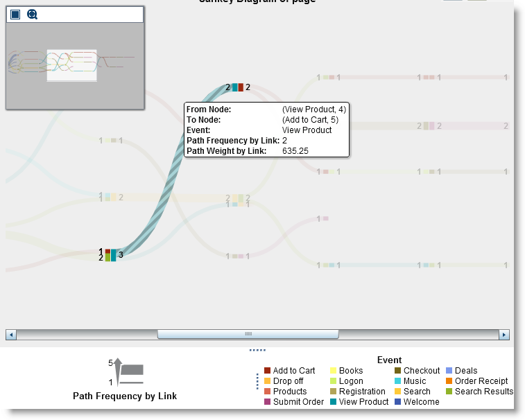
As part of the path analysis in SAS Visual Analytics you can also change the link aggregation and colorization. Switching the aggregation to color links by event shows the following:
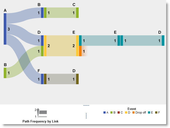
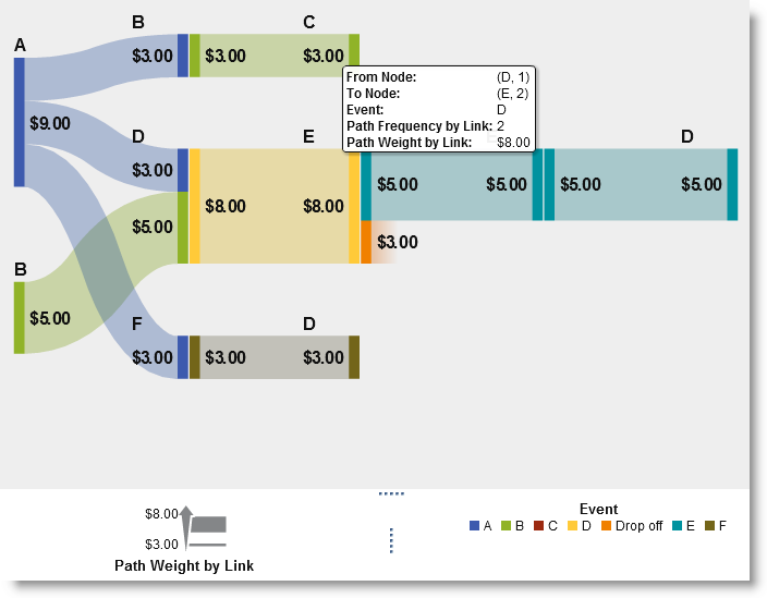
Again highlighting the common partial path in yellow. By default the diagram uses the sequence count or frequency as default link width. However, you may want to weigh paths by a given measure, such as purchases or revenue as this better reflects the impact a path may have. The following example shows a currency measure assigned as path weight:
Let’s look at a more advanced data set with a few more events to analyze. Note, that this data set is just a small extract of a real web site access log file. You will see how quickly the number of paths increases and things like ranking and segmentation will play an important role:
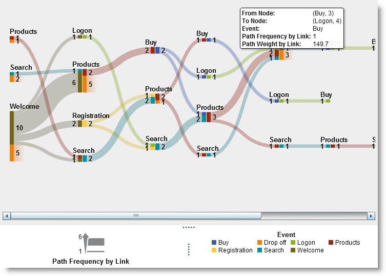
Similar to the first data set we are looking at customers visited specific pages on our website over a period of time. The increased number of potential pages or events also mean an increased number of potential paths a customer can take. Let’s look at a first visualization of this data source:
Not surprisingly most customers enter our web page via the welcome page. This could be mainly driven by the fact that users typically click on the first link in search engines rather than one of the sub categories. As you can see the paths taken are very long making this diagram very wide – tools such as the overview panel or path selection help navigating in the diagram:
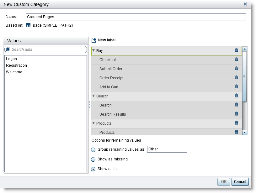
Segmentation for path analysis
One of the methods to reduce the overall number of events is to group events. SAS Visual Analytics provides methods to create custom categories. In our example we are going to group a number of events into groups such Buy, Search and Product:
Applying this new custom group item to the Sankey diagram provides an aggregated and simplified view of paths taken:
Once you have determined a particular path of interest you often want to further analyze the related group of customers having taken this path. For instance to include the group of individuals in your next marketing campaign. SAS Visual Analytics allows you to narrow down the selection by either filtering or merging into a new visualization.
Path filtering
Path filtering is done by selecting one or more events and either include or exclude the items by various conditions:
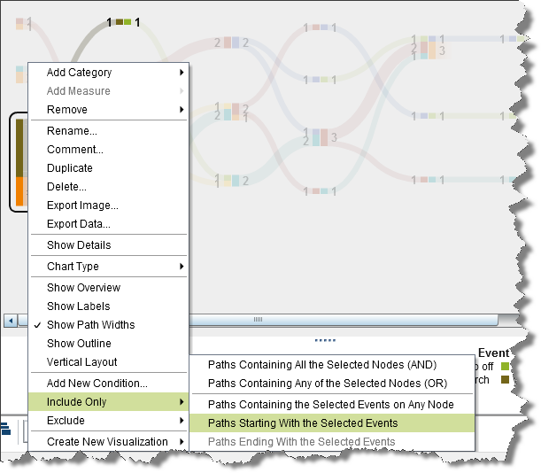
In this example we are only interested in paths starting with the welcome page:
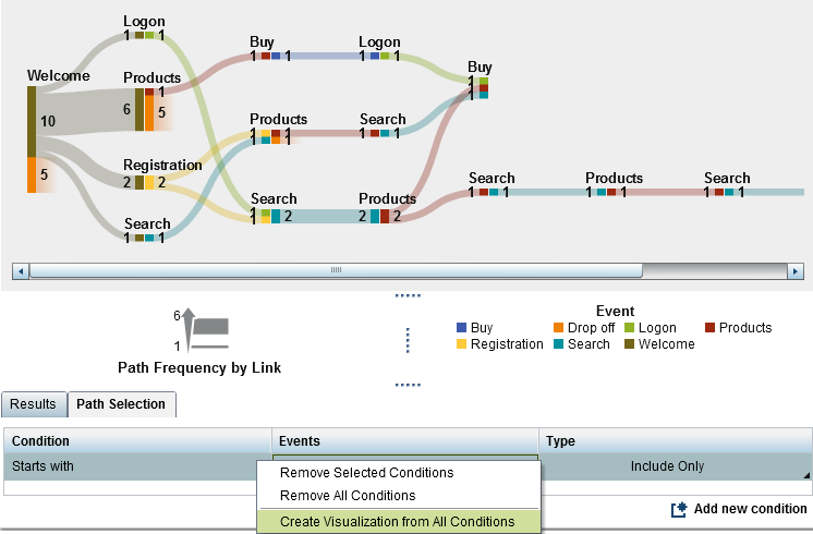
Note, that the user can go ahead use the current filtered selection to create new visualization for further analysis.
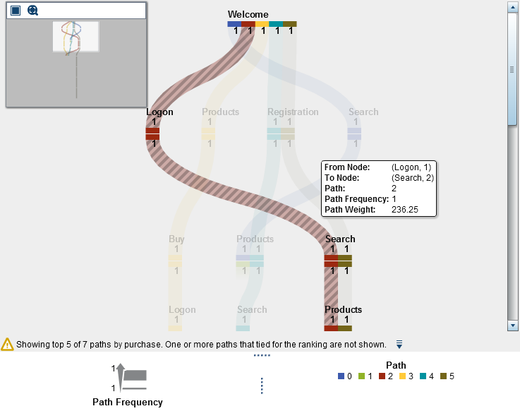
Ranking paths
Given the high number of potential paths a custom can take you may also just concentrate on the top or bottom ranked paths. SAS Visual Analytics provides a number of options to filter and rank paths shown in the following property panel:
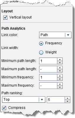
Given the new top 5 ranking settings and the selected vertical layout the diagram renders as follow giving you great understanding of the flow users take in the 5 most common paths.
Conclusion
SAS Visual Analytics provides a robust platform for analytic discovery on your data. Path analysis is important when trying to understand your customers' behavior online. From basic web usage to campaign and attribute analysis, gaining insights from your data will help drive your next email campaign or paid search or banner ad. Even in customer life cycle monitoring as part of acquisition and retention analysis you can quickly see how customer touch points such as email offers, call center sessions or branch visits pay out.

16 Comments
Some readers might find this article by searching for "path analysis in SAS." The name "path analysis" also is used in connection to structural equations modeling, which in SAS is carried out by the CALIS procedure in SAS/STAT. PROC CALIS has the ability to construct path diagrams as described in Yung (2014), "Creating Path Diagrams That Impress: A New Graphical Capability of the CALIS Procedure,"
Great information Falko. Nice to see SAS Visual Analytics can support path analysis. Another area where this type of analysis is highly valuable is in IVR/VRU usage. IVR (Intelligent Voice Response) and VRU (Voice Response Unit) are the service organizations transactional systems that most customers despise, as they are the systems that a caller first hears (press option 1 for XX department, etc.). The challenge most service organizations struggle with is understanding what options customers select in the IVR/VRU and why. Service organizations for years have tried to understand what options are taken, in what order, and what customer behavior is driving the option selection and the option selection order. With path analysis in SAS Visual Analytics, organizations can finally learn the "why" behind customer behaviors in these systems, and develop more logical business rules to more direct and easier to use experiences for customers. This will also have significant impact on overall satisfaction levels, as a customer's experience in the IVR/VRU system is their first impression of an organization. As we all have probably know very well, these experiences are not pleasant. The key to understanding the "why" behind customer behavior in the IVR/VRU, and the "what" to change in the IVR/VRU business rules engine, is SAS Visual Analytics.
Hi,
Can you explain about fig 2.
Jane: BDEED, but it will shows dropoff in fig 2.
Jhon : ADE, but i it will shows continue flow (E-E, E-D) in fig 2.
Hi, Jane's path as shown in turquoise is indeed BDEED - however since John (green) only shares parts of this path (DE) - he drops off at E (compared to Jane who went further to E2 and D. It's all about steps shared across paths. Hope this helps. Cheers, Falko
hi Falko,
That you explained about Path Analysis (Fig1.).
can you explain about Event analysis (fig2.).
Coloring the sankey diagram by Event wont change the actual paths. So you are still looking at the two joined paths (John/Jane) as explained before. The difference in Fig 2 is simply that steps are colored by Event. This means you can now more easily detect common shared events. You would choose different colorization option dependent on your context. So to answer your question the continue flow EED is is part of John's path (BDEED). I should also mention that the color is applied by the outgoing event. Hope this makes sense. Cheers, Falko
Nice article. How to export the path analysis result data with different paths weights and frequency? Also couldn't find a way to export entire diagram if diagram is big. Thanks in advance.
Hi Liju, this depends on your version of SAS Visual Analytics. The current Viya based version 8.5 allows you to export data via right-mouse context menu and related ‚export data‘ option. This should export all data even if this is a large diagram. For different path weights and frequency, you would need to change related role assignments. You may also contact your local Tech Support Team or browse the communities.sas.com posts (you may find many questions already answered by other users)
Hope this helps. Regards, Falko
Thanks Falko for the suggestion.I have latest version of sas viya. In fact i had expoted data and it exports entire data.. To be specific i used custom path filter for a particular sequence of events. Then my client was interested in knowing howmany customers went through that path. After getting the filtered path digram i exported the detailed data but i didnt get only the relevant customer data, instead entire raw data that i imported. Did i miss any steps? How to export data for customized paths only? Thanks alot again for responding.
Hi, Sorry for the delay in responding - I have been traveling. Yes, I believe the export detail data function includes all data not just the filtered one. Have you tried creating a new visualization using right-mouse click context menu -> 'New Object From Selection'? This new visualization should only contain data from the given selected path filter. An export of detail data here should only include the filtered data. You could also add other data items here using the role panel to enrich the result data. Again, for more help on common product usage or issues - you could also make use of our communities.sas.com pages or get in touch with the Tech Support team. Hope this helps! Falko
Hi Falko,
Thanks for the very nice walk-through. I'm wondering if you were able to suggest any process whereby similar results can be achieved, even in a less polished way, using SAS 9.2 STAT/GRAPH. I believe proc calis was introduced in 9.22, so that may be out as an option.
Thanks,
Yll
Hi, Have a quick look at Rick's first comment. I believe procedures such as PROC CALIS could certainly be an alternative approach. Rick also linked a paper containing more information on how to use it. Hope this helps. Regards, Falko
Excellent presentation Falko. Nice way of presenting pathways using Sankeys. I was wondering if the data you used is available for download? I very much like to replicate your analysis as an exercise.
Hi Roberto,
Has been a while since I last updated this post but find below the CSV data used. Hope this helps. Regards, Falko
id,page,time,purchase
1,Welcome,100,0
2,Welcome,110,0
2,Products,111,0
3,Welcome,120,6.5
3,Registration,121,6.5
3,Products,122,6.5
3,Music,123,6.5
3,Search,124,6.5
3,Search Results,125,6.5
3,Add to Cart,126,6.5
3,Add to Cart,127,6.5
3,Add to Cart,128,6.5
3,Add to Cart,129,6.5
3,Add to Cart,130,6.5
3,Checkout,131,6.5
3,Submit Order,132,6.5
3,Order Receipt,133,6.5
4,Products,130,0
4,Books,131,0
4,Music,132,0
5,Books,140,24.95
5,Search,141,24.95
5,Search Results,142,24.95
5,View Product,143,24.95
5,Add to Cart,144,24.95
5,Logon,145,24.95
5,Checkout,146,24.95
5,Submit Order,147,24.95
5,Order Receipt,148,24.95
6,Welcome,150,12.5
6,Registration,151,12.5
6,Search,152,12.5
6,Search Results,153,12.5
6,View Product,154,12.5
6,Search Results,155,12.5
6,View Product,156,12.5
6,Search Results,157,12.5
6,View Product,158,12.5
6,Add to Cart,159,12.5
6,Checkout,160,12.5
6,Submit Order,161,12.5
6,Order Receipt,162,12.5
7,Welcome,160,0
8,Welcome,171,0
8,Search,172,0
8,Search Results,173,0
8,View Product,174,0
9,Welcome,180,47.25
9,Logon,181,47.25
9,Search,182,47.25
9,Search Results,183,47.25
9,View Product,184,47.25
9,Add to Cart,185,47.25
9,Checkout,186,47.25
9,Submit Order,187,47.25
9,Order Receipt,188,47.25
10,Welcome,190,0
11,Welcome,200,0
12,Welcome,210,0
13,Search,220,0
13,Search Results,221,0
13,Search,222,0
13,Search Results,223,0
13,Search,224,0
13,Search Results,225,0
14,Search,230,0
14,Search Results,231,0
15,Welcome,240,0
15,Deals,241,0
16,Welcome,250,0
16,Deals,251,0
17,Welcome,260,99.95
17,Deals,261,99.95
17,Add to Cart,262,99.95
17,Logon,263,99.95
17,Checkout,264,99.95
17,Submit Order,265,99.95
17,Order Receipt,266,99.95
18,Search,270,21
18,Search Results,271,21
18,View Product,272,21
18,Add to Cart,273,21
18,View Product,274,21
18,Add to Cart,275,21
18,Logon,276,21
18,Checkout,277,21
18,Submit Order,278,21
18,Order Receipt,279,21
19,Welcome,280,0
19,Deals,281,0
20,Welcome,290,0
20,Deals,291,0
Thanks for this Falko. Cheers.
Thank you Falko for replying. Your suggestion of creating the new object is very useful. It solves my problem. Thank you. Cheers!