The path to innovation isn’t canned. It’s not formulaic. It involves taking calculated risks and (as much as I hate this cliché) out-of-the-box thinking. It involves creativity and the eagerness to explore ideas. Notice I didn’t say new ideas. Sometimes innovation is more about re-purposing or reworking old ideas into something more productive or interesting. Innovation takes time. Time is money. In business, there’s always a cost associated with time. Given time as a cost center, is it any wonder why most analysts just focus on getting the job done rather than challenging the status quo in an effort to be innovative?
Every analyst has standard reports they have to run that tell the business things they already know or think they know. They have analysis they run that may take hours, so they run it in batch. They set it to run overnight. They have those stressful mornings when they come into the office, ready to roll and realize their job stalled, or there was an exception with the data they weren’t expecting. That sets them back at least a day. When you have a daily process, it’s easy to fall into the doldrums—to get used to standard.
To encourage innovation in business, consider using visual analytics. Visual—pretty graphics, and analytics—the ability to gain insight by letting the data tell the story. It sounds straightforward, but there’s more to it than pretty graphs and even analytics.
Now, add speed to your visual analytics with a true in-memory server. That means no SQL and no MDX. Nothing has to be translated in a database. That means less overhead slowing you down. While those standard reports and analyses are running — you know, those reactive, getting the answers we’re expecting kind of standards, the analyst can become a hero.
Now, the analyst will have the power to explore massive amounts of data in seconds, take risks and look at data in different ways with very little cost.
One of the things that blows me away every time I use SAS Visual Analytics is how quickly I can run a 20x20 correlation matrix. This may not sound like a big deal if you’ve never done it, but on a standard machine, that type of correlation could take hours. In SAS, it takes me seconds. I can quickly look for relationships in my data:
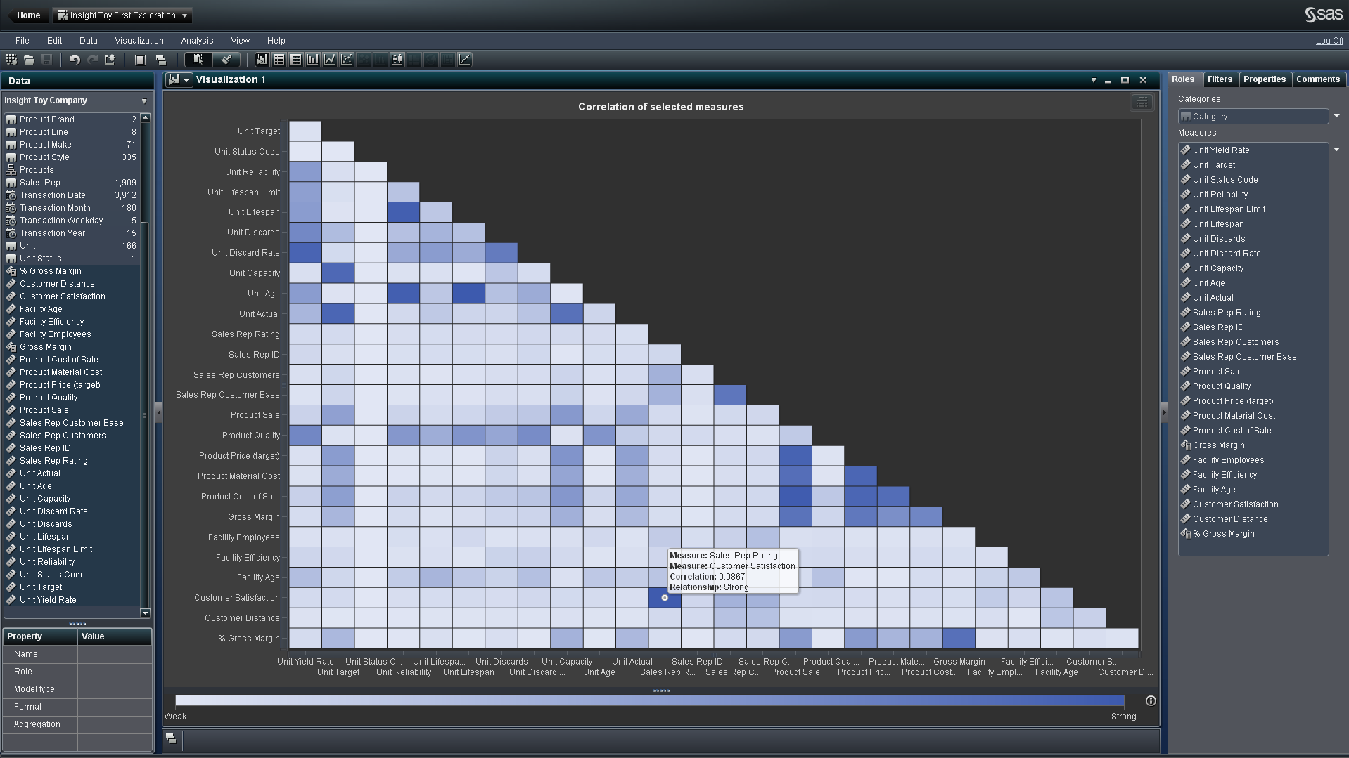
Then explore a relationship further by double clicking. VA runs a regression. On this regression heat map, I can see a cluster of boxes that indicate my best sales reps and most highly satisfied customers.
I can zero in on these bins by using my mouse as a lasso, and choosing to include only those points, which creates an on the fly filter. That action brings me to this visual:
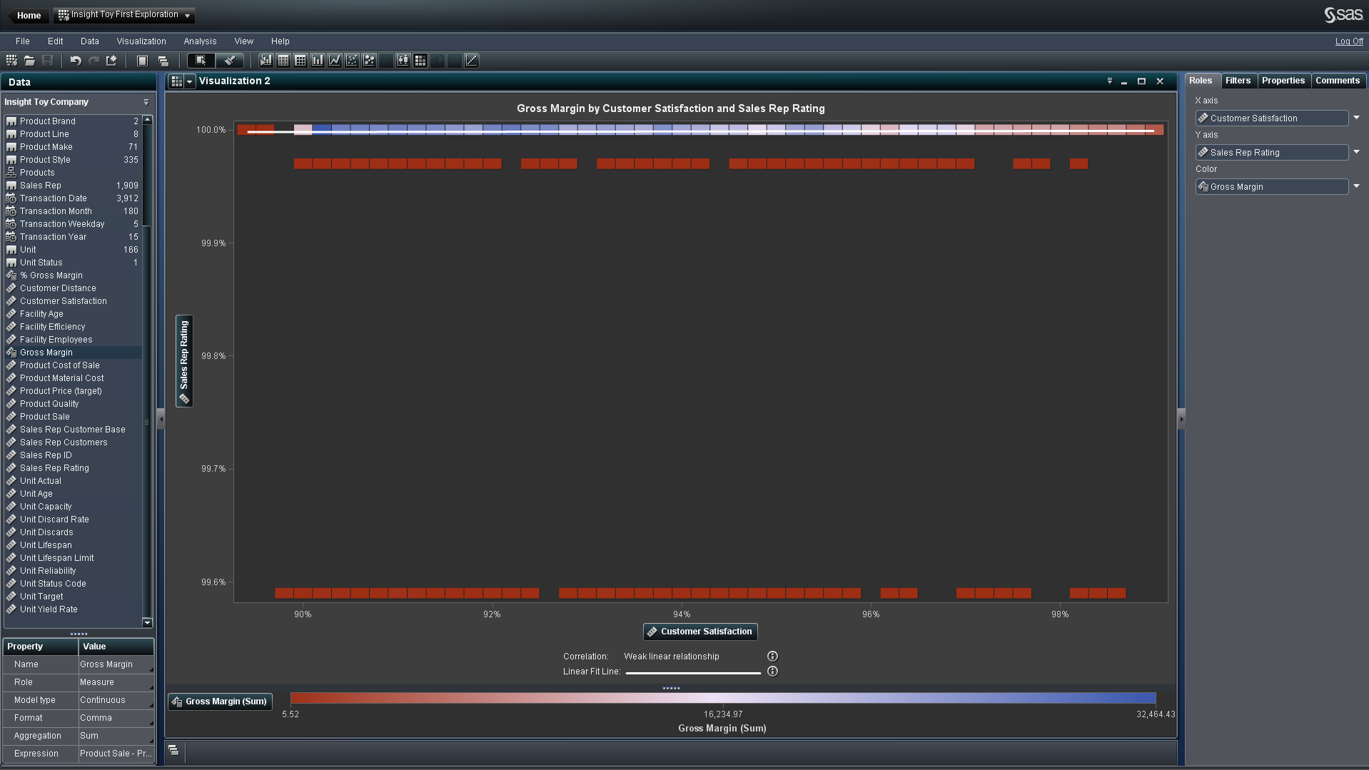
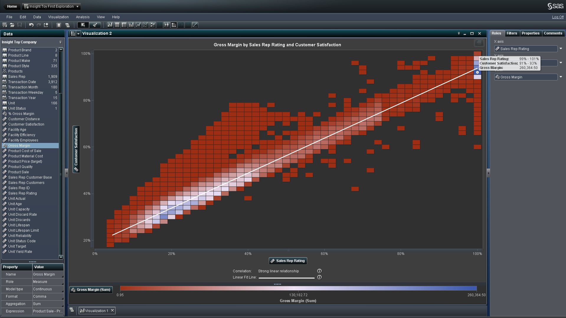
I’m still looking at a heat map of Sales Rep Rating and Customer Satisfaction with Gross Margin as the box color. I’d like to see what’s going on here by product line, so I’ll replace Customer Satisfaction with Product Line:
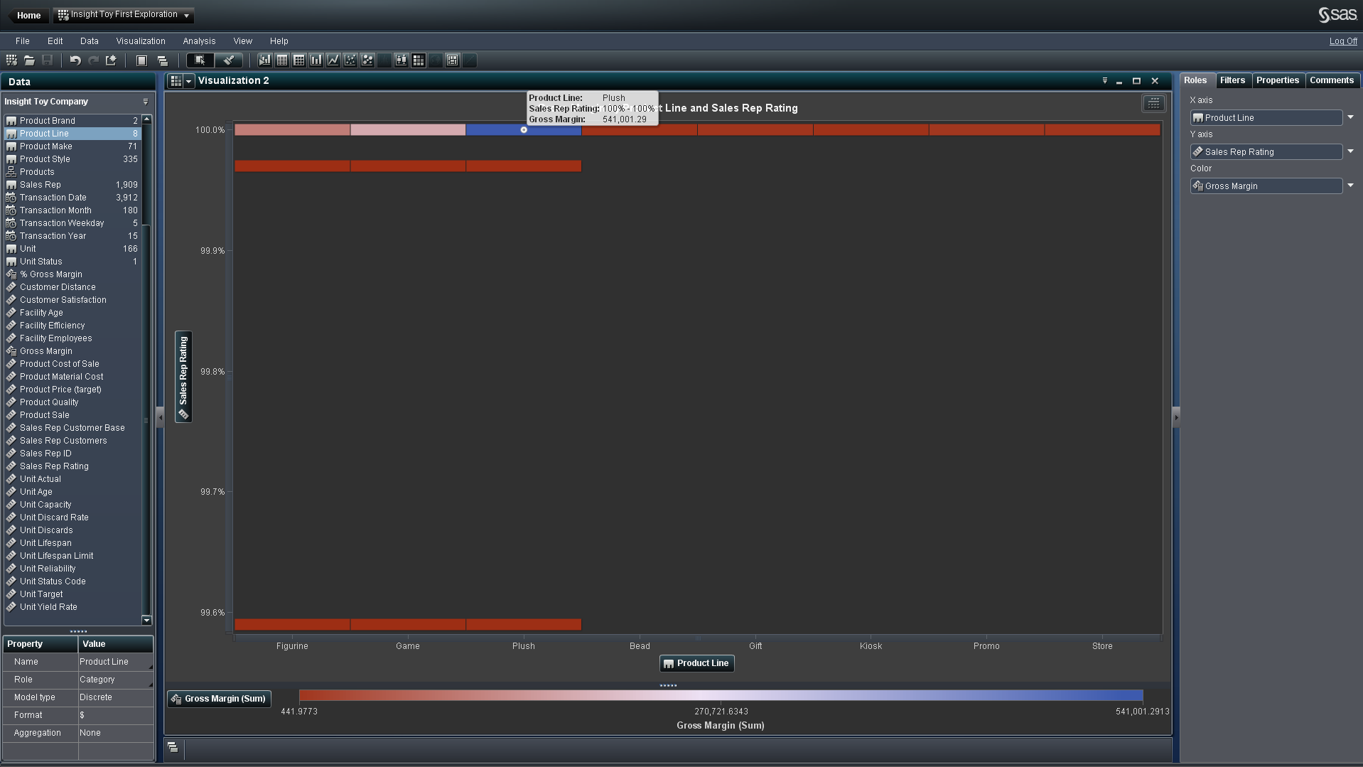
It becomes abundantly clear that the Plush product line is highly profitable and contributes to a high Sales Rep Rating. To make this easier to see, I can change the graph from a heat map to a bar chart:
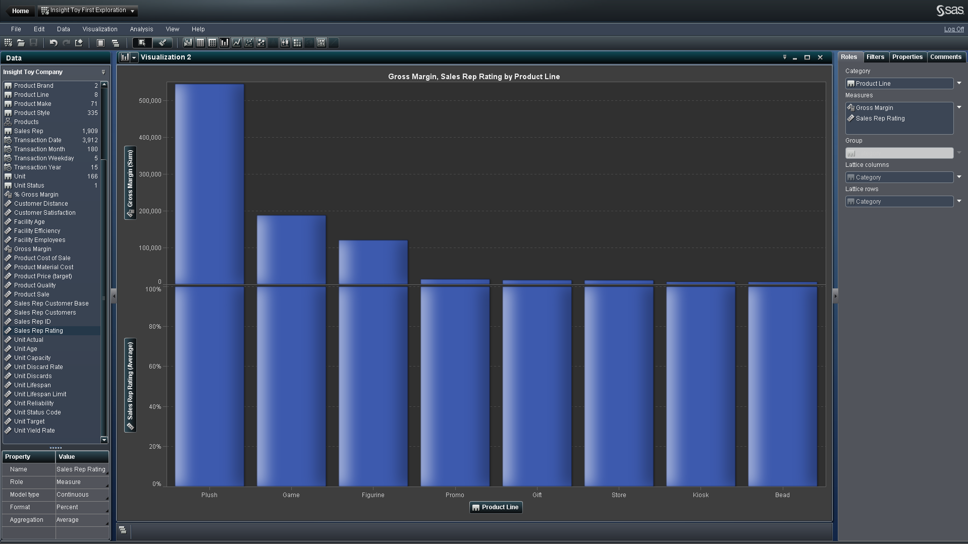
With the bar chart, it becomes obvious that the Plush product line has double the margin of any of the other product lines. We can even switch out Sales Rep Rating for %Gross Margin to further explore the impact.

This is a path of discovery that takes just a few minutes, not the hours that many analysts are used to. Because the processing is so fast, if an analyst goes down a path that doesn’t yield insights, they haven’t wasted much time. Visual Analytics really does give the analyst the flexibility to be innovative by enabling them to work with, spin around and visualize their data very quickly. By giving analysts tools that spark creativity and help them ask better questions of the data, they can not only innovate, but as a result improve business processes and uncover trends and patterns they never knew existed.
You can also watch a full video of this visual analytics example:
Or, you can see for yourself how SAS Visual Analytics works with this demo.