This website uses Cookies. Click Accept to agree to our website's cookie use as described in our Privacy Policy. Click Preferences to customize your cookie settings.
- JMP User Community
- :
- Blogs
- :
- JMP Blog
- :
- What’s a three-way chart, and why would I need one?
Turn on suggestions
Auto-suggest helps you quickly narrow down your search results by suggesting possible matches as you type.
Submit your abstract to the call for content for Discovery Summit Americas by April 23. Selected abstracts will be presented at Discovery Summit, Oct. 21- 24.
Discovery is online this week, April 16 and 18. Join us for these exciting interactive sessions.
Article Options
- Subscribe to RSS Feed
- Mark as New
- Mark as Read
- Bookmark
- Subscribe
- Printer Friendly Page
- Report Inappropriate Content

Staff
What’s a three-way chart, and why would I need one?
Apr 18, 2012 06:41 PM

When I was at the JMP Discovery Summit last year, several people asked me, “What’s a three-way chart and why would I need one?” Not everyone needs one, but some might. In this blog post, I’ll tell you more about them and why you might want to use them.
The Centers of Disease Control (CDC) is advising all adolescent girls, and more recently, adolescent boys to receive the full three-dose sequence for human papillomavirus vaccine (HPV4). Many studies have found that anti-HPV vaccines significantly reduce the cases of both cervical and other HPV-caused cancers. Worldwide in 2008, more than 500,000 new cancer cases and over 275,000 deaths were attributable to HPV, reports the CDC, making HPV one of the most important infectious causes of cancer. As the CDC reported in 2010 that only 32% of girls aged 13-17 had completed all three doses, strong campaigns have been started to study and increase success rates in completing the sequence.
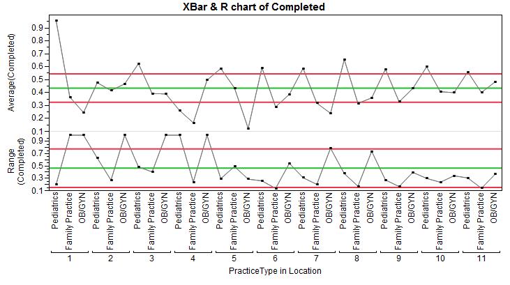
The typical medical practices that administer these vaccines are pediatrics, family practice and OB/GYN offices. Often times there are multiple locations where vaccines are administered within a hospital or medical group. This study considers a simulation of the completion rate of 11 hospitals and their associated clinics, each with all three practices. In this case, each pediatric, family and OB/GYN department is nested within each hospital. That is, we cannot assume a pediatric department in hospital 1 will have the same behaviors and characteristics as a pediatric department in hospital 5; nor are they interchangeable.
To replicate the chart below in JMP:
The data we are plotting on the Y-axis is a ratio of the number of patients completing the sequence divided by the total number of patients in this age range. If each clinic or department had only 5-10 patients, we might consider using a p-chart first. As Shewhart Control Charts make no assumption of normality, and since this proportion data has such large sample sizes, Shewhart charts work well to examine the data.
In Figure 2, we see many practices that would be considered “out of control” by quality standards, since their averages are either above or below the limits. Imagine for a moment if you were plotting 20 or 100 hospitals, each with one or two practices beyond the control limits. This plot would rapidly become useless since nothing would stand out.
Note that the second chart in Figure 2 is a Range chart, which is plotting the ranges of each practice/location combination. The limits for the first chart, the XBar chart are using the average range from the second chart to calculate the limits.
If instead we consider the nested structure of the data and compute the limits using the moving range difference between practices, we may be better able to sort the noise from the regular variation between and within the different clinic types.
To do this, we can right-click on the upper graph and choose “Add Dispersion Chart.” This will:
1) Insert a Moving Range chart between the XBar chart and the Range Chart.
2) Change the limits on the XBar chart to use the average Moving Range as sigma, rather than the average range.
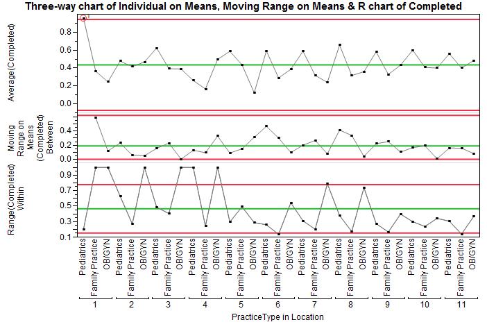
You’ll see the limits on the XBar chart move out, becoming wider. The limits are now using the moving range between each practice-location combination. Since our interest is in comparing practices rather thanin a particular patient within a practice, it makes sense to use the between variation for the limits on the XBar chart. Now we have only one practice standing out, and we can begin exploring what makes this practice so effective.
* Permission to use the image of the HPV molecule above granted by Thomas Zucker-Scharff at the Albert Einstein College of Medicine of Yeshiva University, Epidemiology Cancer Center.
- © 2024 JMP Statistical Discovery LLC. All Rights Reserved.
- Terms of Use
- Privacy Statement
- About JMP
- JMP Software
- JMP User Community
- Contact
You must be a registered user to add a comment. If you've already registered, sign in. Otherwise, register and sign in.