JMP 10 introduces a snazzy way to create control charts with a new platform called Control Chart Builder. JMP's prior Control Charts were designed over two decades ago for the classic process engineer in manufacturing and were past due for an overhaul.
The more we listened to which customers were running control charts and how they were using them, the more I was surprised to learn that people from nearly any field, including health care, medicine, sales, banking, scientific fields and education were running control charts. This was when we realized JMP needed something easily accessible to everyone.
The new Control Chart Builder platform in JMP 10 works much like Graph Builder with a drag-and-drop interface. It displays an Individual and Moving Range chart the instant you drag over a Y, and switches to an XBar and R chart when you drag over a subgroup column.
To replicate the chart below in JMP:
Open Cars Sold.jmp, which you can download from the JMP File Exchange on the JMP website
From the Analyze menu, choose Quality and Process->Control Chart Builder
Drag Volume ($M) sold to the Y-axis area of the chart
To see the labels on the X-axis, drag the column Date to the X-axis area of the chart to see date labels on the X-axis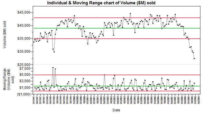
Since sales managers are on alert for low-volume months and always looking to repeat high-volume months, the limits on Control Charts can be useful in sifting out the noise from the more interesting events.
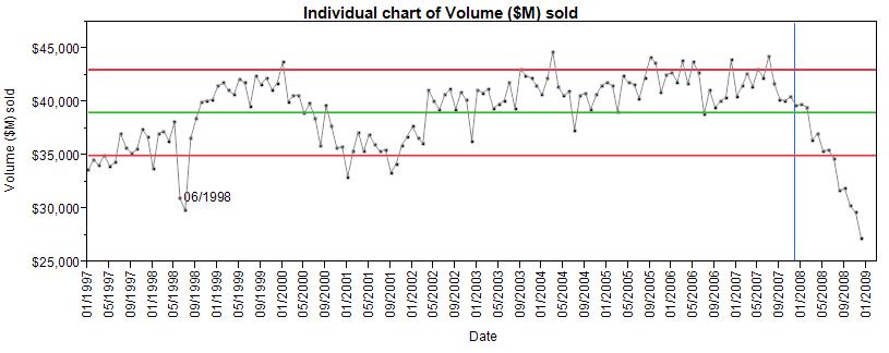
The car sales volume data in this example comes from the U.S. Census Bureau, Economic Indicators.
In the plot above, we first notice the drastic drop in volume for June and July 1998, caused in part by the General Motors labor strike. In 2008, we see the deep continued drop in sales resulting from the 2008 recession. The blue reference line is set at December, 2007, which the US National Bureau of Economic Research states was the beginning of the late 2000’s recession.
To see just the top (Individuals) chart, simply click on the axis label for Moving Range and drag the label out.
We hope you will find Control Charts are more fun to drive now.