An important problem in machine learning is the "classification problem." In this supervised learning problem, you build a statistical model that predicts a set of categorical outcomes (responses) based on a set of input features (explanatory variables). You do this by training the model on data for which the outcomes are known. For example, researchers might want to predict the outcomes "Lived" or "Died" for patients with a certain disease. They can use data from a clinical trial to build a statistical model that uses demographic and medical measurements to predict the probability of each outcome.
SAS software provides several procedures for building parametric classification models, including the LOGISTIC and DISCRIM procedures. SAS also provides various nonparametric models, such as spline effects, additive models, and neural networks.
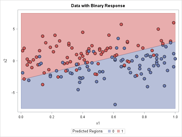
For each input, the statistical model predicts an outcome. Thus the model divides the input space into disjoint regions for which the first outcome is the most probable, for which the second outcome is the most probable, and so forth. In many textbooks and papers, the classification problem is illustrated by using a two-dimensional graph that shows the prediction regions overlaid with the training data, as shown in the adjacent image which visualizes a binary outcome and a linear boundary between regions. (Click to enlarge.)
This article shows three ways to visualize prediction regions in SAS:
- The polygon method: A parametric model provides a formula for the boundary between regions. You can use the formula to construct polygonal regions.
- The contour plot method: If there are two outcomes and the model provides probabilities for the first outcome, then the 0.5 contour divides the feature space into disjoint prediction regions.
- The background grid method: You can evaluate the model on a grid of points and color each point according to the predicted outcome. You can use small markers to produce a faint indication of the prediction regions, or you can use large markers if you want to tile the graph with color.
This article uses logistic regression to discriminate between two outcomes, but the principles apply to other methods as well. The SAS documentation for the DISCRIM procedure contains some macros that visualize the prediction regions for the output from PROC DISCRIM. I am grateful to my colleague Chris B. for discussions relevant to this topic.
A logistic model to discriminate two outcomes
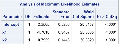
To illustrate the classification problem, consider some simulated data in which the Y variable is a binary outcome and the X1 and X2 variable are continuous explanatory variables. The following call to PROC LOGISTIC fits a logistic model and displays the parameter estimates. The STORE statement creates an item store that enables you to evaluate (score) the model on future observations. The DATA step creates a grid of evenly spaced points in the (x1, x2) coordinates, and the call to PROC PLM scores the model at those locations. In the PRED data set, GX and GY are the coordinates on the regular grid and PREDICTED is the probability that Y=1.
proc logistic data=LogisticData; model y(Event='1') = x1 x2; store work.LogiModel; /* save model to item store */ run; data Grid; /* create grid in (x1,x2) coords */ do x1 = 0 to 1 by 0.02; do x2 = -7.5 to 7.5 by 0.3; output; end; end; run; proc plm restore=work.LogiModel; /* use PROC PLM to score model on a grid */ score data=Grid out=Pred(rename=(x1=gx x2=gy)) / ilink; /* evaluate the model on new data */ run; |
The polygon method
This method is only useful for simple parametric models. Recall that the logistic function is 0.5 when its argument is zero, so the level set for 0 of the linear predictor divides the input space into prediction regions. For the parameter estimates shown to the right, the level set {(x1,x2) | 2.3565 -4.7618*x1 + 0.7959*x2 = 0} is the boundary between the two prediction regions. This level set is the graph of the linear function x2 = (-2.3565 + 4.7618*x1)/0.7959. You can compute two polygons that represent the regions: let x1 vary between [0,1] (the horizontal range of the data) and use the formula to evaluate x2, or assign x2 to be the minimum or maximum vertical value of the data.
After you have computed polygonal regions, you can use the POLYGON statement in PROC SGPLOT to visualize the regions. The graph is shown at the top of this article. The drawbacks of this method are that it requires a parametric model for which one variable is an explicit function of the other. However, it creates a beautiful image!
The contour plot method
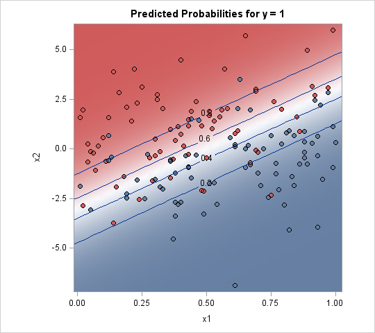
Given an input value, many statistical models produce probabilities for each outcome. If there are only two outcomes, you can plot a contour plot of the probability of the first outcome. The 0.5 contour divides the feature space into disjoint regions.
There are two ways to create such a contour plot. The easiest way is to use the EFFECTPLOT statement, which is supported in many SAS/STAT regression procedures. The following statements show how to use the EFFECTPLOT statement in PROC LOGISTIC to create a contour plot, as shown to the right:
proc logistic data=LogisticData; model y(Event='1') = x1 x2; effectplot contour(x=x1 y=x2); /* 2. contour plot with scatter plot overlay */ run; |
Unfortunately, not every SAS procedure supports the EFFECTPLOT statement. An alternative is to score the model on a regular grid of points and use the Graph Template Language (GTL) to create a contour plot of the probability surface. You can read my previous article about how to use the GTL to create a contour plot.
The drawback of this method is that it only applies to binary outcomes. The advantage is that it is easy to implement, especially if the modeling procedure supports the EFFECTPLOT statement.
The background grid method
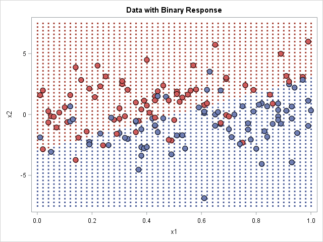
In this method, you score the model on a grid of points to obtain the predicted outcome at each grid point. You then create a scatter plot of the grid, where the markers are colored by the outcome, as shown in the graph to the right.
When you create this graph, you get to choose how large to make the dots in the background. The image to the right uses small markers, which is the technique used by Hastie, Tibshirani, and Friedman in their book The Elements of Statistical Learning. If you use square markers and increase the size of the markers, eventually the markers tile the entire background, which makes it look like the polygon plot at the beginning of this article. You might need to adjust the vertical and horizontal pixels of the graph to get the background markers to tile without overlapping each other.
This method has several advantages. It is the most general method and can be used for any procedure and for any number of outcome categories. It is easy to implement because it merely uses the model to predict the outcomes on a grid of points. The disadvantage is that choosing the size of the background markers is a matter of trial and error; you might need several attempts before you create a graph that looks good.
Summary
This article has shown several techniques for visualizing the predicted outcomes for a model that has two independent variables. The first model is limited to simple parametric models, the second is restricted to binary outcomes, and the third is a general technique that requires scoring the model on a regular grid of inputs. Whichever method you choose, PROC SGPLOT and the Graph Template Language in SAS can help you to visualize different methods for the classification problem in machine learning.
You can download the SAS program that produces the graphs in this article. Which image do you like the best? Do you have a better visualization? Leave a comment?
