Graphs enable you to visualize how the predicted values for a regression model depend on the model effects. You can gain an intuitive understanding of a model by using the EFFECTPLOT statement in SAS to create graphs like the one shown at the top of this article.
Many SAS regression procedures automatically create ODS graphics for simple regression models. For more complex models (including interaction effects and link functions), you can use the EFFECTPLOT statement to construct effect plots. An effect plot shows the predicted response as a function of certain covariates while other covariates are held constant.
Use effect plots in #SAS to help interpret regression models. #DataViz Click To TweetThe EFFECTPLOT statement was introduced in SAS 9.22, but it is not as well known as it should be. Although many procedure include an EFFECTPLOT statement as part of their syntax, I will use the PLM procedure (PLM = post-linear modeling) to show how to construct effect plots. I have previously shown how to use the PLM procedure to score regression models. A good introduction to the PLM procedure is Tobias and Cai (2010), "Introducing PROC PLM and Postfitting Analysis for Very General Linear Models."
The data for this article is the Sashelp.BWeight data set, which is distributed with SAS. There are 50,000 records. Each row gives information about the birth weight of a baby, including information about the mother. This article uses the following variables:
- MomAge: The mothers were between the ages of 18 and 45. The MomAge variable is centered at the mean age, which is 27. Thus MomAge=-7 means the mother was 20 years old whereas MomAge=5 means that the mother was 32 years old.
- CigsPerDay: The average number of cigarettes per day that the mother smoked during pregnancy.
- Boy: An indicator variable. If the baby was a boy, then Boy=1; otherwise Boy=0.
The following DATA step creates a SAS view that creates an indicator variable, Underweight, which has the value 1 if the baby's birth weight was less than 2500 grams and 0 otherwise:
/* Underweight=1 if the birth weight is <2500 grams and Underweight=0 otherwise */ data babyWeight / view=BabyWeight; set sashelp.bweight; Underweight = (Weight < 2500); run; |
A logistic model with a continuous-continuous interaction
To illustrate the capabilities of the EFFECTPLOT statement, the following statements use PROC LOGISTIC to model the probability of having an underweight boy baby (less than 2500 grams). The explanatory effects are MomAge, CigsPerDay, and the interaction effect between those two variables. The STORE statement creates an item store called logiModel. The item store is read by PROC PLM, which creates the effect plot:
proc logistic data=babyWeight; where Boy=1; /* restrict to baby boys */ model Underweight(event='1') = MomAge | CigsPerDay; store logiModel; run; title "Probability of Underweight Boy Baby"; proc plm source=logiModel; effectplot fit(x=MomAge plotby=CigsPerDay); run; |
In this example, the output is a panel of plots that show the predicted probability of having an underweight boy baby as a function of the mother's relative age. (Remember: the age is centered at 27 years.) The panel shows slices of the continuous CigsPerDay variable, which enables you to see how the predicted response changes with increasing cigarette use.
The graphs indicate that the probability of an underweight boy is very low in nonsmoking mothers, regardless of the mother's age. In smoking mothers, however, the probability of having an underweight boy increases with age. For mothers of a given age, the probability of an underweight boy increases with the number of cigarettes smoked.
The example shows a panel of fit plots, where the paneling variable is determined by the PLOTBY= option. You can also "stack" the predicted probability curves by using a slice plot. You can specify a slice plot by using the SLICEFIT keyword. You specify the slicing variable by using the SLICEBY= option, as follows:
proc plm source=logiModel; effectplot slicefit(x=MomAge sliceby=CigsPerDay); run; |
An example of a slice plot is shown in the next section.
You can also use the EFFECTPLOT statement to create a contour plot of the predicted response as a function of the two continuous covariates, which is also shown in the next section.
A logistic model with categorical-continuous interactions
The effect plot is especially useful when visualizing complex models. When there are several independent variables and interactions, you can create multiple plots that show the predicted response at various levels of categorical or continuous variables. By default, covariates that do not appear in the plots are fixed at their mean level (for continuous variables) or their reference level (for classification variables).
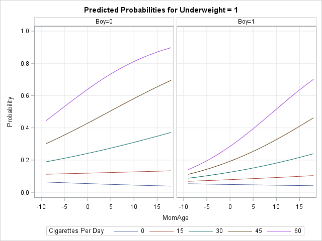
The previous example used a WHERE clause to restrict the data to boy babies. Suppose that you want to include the gender of the baby as a covariate in the regression model. The following call to PROC LOGISTIC includes the main effects and two-way interactions between two continuous and one classification variable. The call to PROC PLM creates a panel of slice plots. Each slice plot shows predicted probability curves for slices of the CigsPerDay variable. The panels are determined by levels of the Boy variable, which is specified on the PLOTBY= option:
proc logistic data=babyWeight; class Boy; model Underweight(event='1') = MomAge | CigsPerDay | Boy @2; store logiModel; run; proc plm source=logiModel; effectplot slicefit(x=MomAge sliceby=CigsPerDay plotby=Boy); run; |
The output is shown in the graph at the top of this article. The right side of the panel shows the predicted probabilities for boys. These curves are similar to those in the previous example, but now they are overlaid on a single plot. The left side of the panel shows the corresponding curves for girl babies. In general, the model predicts that girl babies have a higher probability to be underweight (relative to boys) in smoking mothers. The effect is noticeable most dramatically for younger mothers.
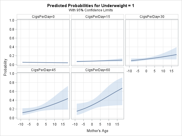
If you want to add confidence limits for the predicted curves, you can use the CLM option: effectplot slicefit(...) / CLM.
You can specify the levels of a continuous variable that are used to slice or panel the curves. For example, most cigarettes come in a pack of 20, so the following EFFECTPLOT statement visually compares the effect of smoking for pregnant women who smoke zero, one, or two packs per day:
effectplot slicefit(x=MomAge sliceby=CigsPerDay=0 20 40 plotby=Boy); |
Notice that there are no parentheses around the argument to the SLICEBY= option. That is, you might expect the syntax to be sliceby=(CigsPerDay=0 20 40), but that syntax is not supported.
If you want to directly compare the probabilities for boys and girls, you might want to interchange the SLICEBY= and PLOTBY= variables. The following statements create a graph that has three panels, and each panel directly compares boys and girls:
proc plm source=logiModel; effectplot slicefit(x=MomAge sliceby=boy plotby=CigsPerDay=0 20 40); run; |
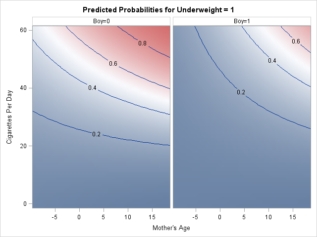
As mentioned previously, you can also create contour plots that display the predicted response as a function of two continuous variables. The following statements create two contour plots, one for boy babies and one for girls:
proc plm restore=logiModel; effectplot contour(x=MomAge y=CigsPerDay plotby=Boy); run; |
Summary of the EFFECTPLOT statement
The EFFECTPLOT statement enables you to create plots that visualize interaction effects in complex regression models. The EFFECTPLOT statement is a hidden gem in SAS/STAT software that deserves more recognition. The easiest way to create an effect plot is to use the STORE statement in a regression procedure to create an item store, then use PROC PLM to create effect plots. In that way, you only need to fit a model once, but you can create many plots that help you to understand the model.
You can overlay curves, create panels, and even create contour plots. Several other plot types are also possible. See the documentation for the EFFECTPLOT statement for the full syntax, options, and additional examples of how to create plots that visualize interactions in generalized linear models.

24 Comments
Rick,
You only show us graph of FIT,SLICEFIT,CONTOUR ,
But you didn't show us other graph like : BOX,INTERACTION,MOSAIC .
Yes, there is much more that could be said, as I admit in the last paragraph right before I linked to the documentation. I think the other plot types are easier to interpret.
Need a combined effectplot chart.
proc glm data=dataset4 ;
model SAD = wM PW_M PD_M CogS_M wMCogS wM | PW_m wMPD AGE MALE ;
weight W1C0;
store contcont;
run;
quit;
proc plm restore =contcont;
effectplot fit(X=PW_m plotby=wM=-1 0 1 ) /clm;
run;
I get 3 charts.
can I put this in one chart and do it for wM by PW_m
You can ask questions and post data and code at the SAS Support Communities.
Is "effectplot" available to ETS procedures? In particular, I am thinking of PROC AUTOREG.
No. Many ETS procedures can create ODS graphics, but they do not support the STORE statement for generating an item store. The following procedures support the STORE statement and post-fitting analysis via the the PLM procedure:
In SAS/STAT: GENMOD, GLIMMIX, GLM, GLMSELECT, LIFEREG, LOGISTIC, MIXED, ORTHOREG, PHREG, PROBIT, SURVEYLOGISTIC, SURVEYPHREG, and SURVEYREG.
In SAS/QC: The RELIABILITY procedure.
Pingback: Let PROC FREQ create graphs of your two-way tables - The DO Loop
Pingback: Let PROC FREQ create graphs of your two-way tables - The DO Loop
Pingback: Visualize an ANOVA with two-way interactions - The DO Loop
Pingback: 3 ways to visualize prediction regions for classification problems - The DO Loop
Hi Rick,
Thank you for the details! I have requirement to do stacked area plot to show the change in effect in multiple groups.
Is it possible to do proc plm?
I saw a sample code using proc gplot to create usual stacked area plot in SAS.
What would you suggest?
Thanks,
Sithara
Hello Rick
I am using PROC PLM after GLIMMIX to generate predictive plots to look at effect of age (continuous) on a binary outcome. I also have sex in the model and variable that has is a score from -2 to 8.
I use the following code to generate the plots:
proc plm source=xmodel;
effectplot slicefit(x=Age sliceby=score=-2 -1 0 1 2 3 4 5 6 7 8 plotby=Sex) / clm YRANGE=(0,1);
run;
I get the following error:
WARNING: Format B failed to load!
ERROR: Format B not found or couldn't be loaded for variable _XCONT1.
ERROR: Could not restore template. Input buffer is corrupt, or some other problem has occurred.
If I sliceby fewer scores - eg. -2 -1 0 1 2 3, then no errors occur. Is there a maximum number of sliceby categories that can be included?
Many Thanks
Sam
There is not a maximum number of categories. I suggest you sent your program and data to SAS Technical Support for further investigation.
Pingback: Visualize interaction effects in regression models - The DO Loop
Pingback: 4 reasons to use PROC PLM for linear regression models in SAS - The DO Loop
Pingback: 3 ways to add confidence limits to regression curves in SAS - The DO Loop
Pingback: Create scoring data when regressors are correlated - The DO Loop
Pingback: Sliced survival graphs in SAS - The DO Loop
It looks like effectplot does not work with data fitted by Lifereg. Are there any ways of getting interaction plots for Lifereg models?
I suggest you ask your question on the SAS Support Communities. You can use the PROBPLOT statement to visualizing many LIFEREG models, but for creating an interaction plot, we need to know the form of your model.
Hi Rick, thank you for providing such a useful blog. I have one more question about the Effectplot INTERACTION syntax. My outcome is a score.
effectplot interaction (x=time_point sliceby=overweight) / clm connect
So, where can I find the values used to plot the figure (the y-axis)? I thought the y-value should be the predicted mean at each time point across different weight groups, and the value should be equal to the least squares means. However, those values don't match.
The documentation for the EFFECTPLOT statement states that the covariates that are not in the plot are evaluated at a default value. For continuous covariates, the default is to use the mean. For a CLASS variable, the reference level is used. In the resulting plot, the Y axis is the predicted values of the model evaluated at the covariates.
Hi Rick, thank you for the quick reply. However, I'm still feeling a little confused.
For instance, in the resulting plot, at the first time point, weight group 1 has a score around 2.5, while weight group 2 has a score around 3.5.
I got the predicted values from the "OUTpredm=" dataset.
How are the values of 2.5 or 3.5 calculated from the predicted values? (I attempted to calculate the predicted mean, but the results were not around 2.5 or 3.5)
For mixed models, there are two common "predicted values." See "Visualize a mixed model that has repeated measures or random coefficients" for a discussion. PROC PLM uses the OUTPREDM= values, which is from the marginal model that does not incorporate the random effects. To incorporate the random slope or intercept for each subject, use the OUTPRED= values.