I was reading a statistics book when I encountered a histogram that caught my eye. The histogram looked similar to the one at the left. It contained a normal density estimate overlaid on a histogram, but the height of the density curve seemed too short when compared to the heights of the bars.
The area under the density curve should equal the sum of the areas of the histogram bars. However, the height of the density curve in the histogram seems about half as high as the bars.
The graph in the book was created by using the SGPLOT procedure in SAS software. Could there be a bug in such a simple operation? I searched for the statements that created the graph and immediately noticed something suspicious. The SGPLOT statements included the NBINS=100 option in the HISTOGRAM statement, which sets the number of bins to 100. As in the graph at the top of this article, this resulted in many thin bars.
I have previously written about problems that can arise when you bin rounded data. It is well known that a histogram can display artifacts when the widths of the bins interact with data that are rounded. Common rounding factors include 1, 5, and powers of 10; commonly rounded variables include age, weight, and income.
I wondered if the histogram in the book was visualizing rounded data. The data were the pulse rates of individuals, measured in beats per minute. It is common for a nurse or technician to time a person's pulse for 30 seconds, and then multiply that value by 2 in order to convert to beats per minute. This can result in data that are multiples of 2. (Or multiples of 4, if the pulse is measured for 15 seconds.)
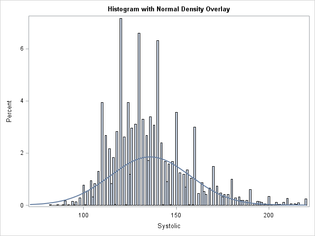
In the book, the range of the data was roughly from 40 beats per minute to 140 beats per minute. The NBINS=100 option therefore set the width of each bin to be approximately 1. If the values of the data are multiples of 2, every other bin could be empty!
A few experiments confirmed my conjecture. The sum of the areas of the histogram bars WAS the same as the area under the curve. However, every other bar was empty, which made the density curve look too short.
After I understood the problem, it was easy to reproduce it for other data sets. The following statements compute a histogram for the Systolic variable in the Sashelp.Heart data set, which measures blood pressure. Most values (93%) are multiples of two.
title "Systolic Blood Pressure"; title2 "Default Bin Width"; proc sgplot data=sashelp.heart(where=(Systolic<=220)) noautolegend; histogram Systolic; density Systolic; run; title2 "Bin Width Smaller Than the Rounding Unit"; proc sgplot data=sashelp.heart(where=(Systolic<=220)) noautolegend; histogram Systolic / binwidth=1; density Systolic; run; |
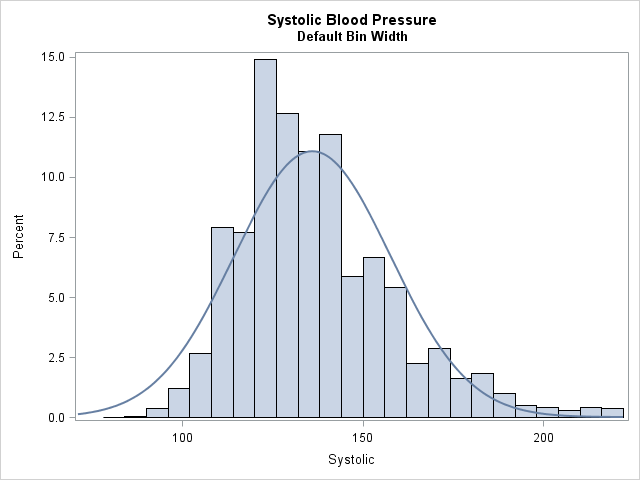
The histogram with the normal density overlay looks fine for the default bin width. However, the second graph (shown at the top of the article) uses a bin width of 1 which results in empty bars in the histogram. Because the empty bars have zero area, the non-empty bars seem tall when compared with the normal curve.
It is easy to make this visual illusion disappear: Use a bin width that is at least as large as the rounding unit in the data. For example, changing the second PROC SGPLOT call to use BINWIDTH=2 makes the histogram look better.
So if your data are rounded, be careful when you choose a customized bin width. In particular, avoid using a bin width that is smaller than the rounding unit. A very small bin width can result in a histogram with many empty bars. When combined with a density estimate curve, the graph can be confusing to your readers.

1 Comment
Nice detective work!