Suppose that you have several data distributions that you want to compare. Questions you might ask include "Which variable has the largest spread?" and "Which variables exhibit skewness?" More generally, you might be interested in visualizing how the distribution of one variable differs from the distribution of other variables.
The usual way to compare data distributions is to use histograms. One technique is to display a panel of histograms, which are known as comparative histograms. I have used this approach to compare salaries between two categories of workers. The comparative histogram is produced automatically by PROC UNIVARIATE when the analysis includes a classification variable.
A related approach is to use transparency to overlay two histograms on the same axis. This method works well for two distributions. However, for three or more distributions, an overlay of histograms can be difficult to read.
A problem of scale
If one of the variables has a range that is an order of magnitude greater than the range of another variable, the comparative histogram can lose its effectiveness. To illustrate this, consider the following comparative histogram of three widely varying quantities:
The variable in the top histogram has a range that is 10 times the range of the variable in the lower histogram. Consequently, all data in the bottom panel is inside of a single histogram bin. This plot does not reveal anything about the distribution of the third variable.
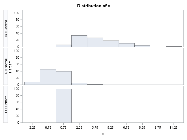
A different way to compare distributions is to plot a panel of the empirical cumulative distribution functions (CDF). The following call to PROC UNIVARIATE creates these "comparative CDF plots," as well as the comparative histograms, for simulated data:
/* simulate three variables with different distributions */ data Wide; call streaminit(123); do i = 1 to 100; Uniform = rand("Uniform"); Normal = rand("Normal"); Gamma = rand("Gamma", 4); output; end; run; /* transpose from wide to long data format to create a CLASS variable */ proc transpose data=Wide name=ID out=Long(drop=i); by i; run; data Long; set Long(rename=(Col1=x)); label ID=; run; /* create comparative histograms and CDF plots */ ods select Histogram CDFPlot; proc univariate data=Long; class ID; histogram x / nrows=3; cdfplot x / nrows=3; run; |

The comparative CDF plot shows the empirical distributions. The horizontal axis indicates the range of the data: [0, 11] for the Gamma variable, [-3,3] for the Normal variable, and [-0.5, 0.5] for the Uniform variable. However, the plot is far from perfect. Although the CDF plot reveals the approximate center and scale of the data, I would find it difficult to conclude from the comparative CDF plot that the Gamma variable is skewed whereas the Normal variable is symmetric.
The spread plot for distributions
In the classic books Graphical Methods for Data Analysis (Chambers, et al., 1983) and Visualizing Data (Cleveland, 1993), the authors recommend using scatter plots of quantiles to visualize and compare distributions.
Consider rotating the CDF panel 90 degrees in the counter-clockwise direction. If you also center the data so that each variable has zero mean, then the result called a spread plot. The spread plot, as its name implies, is used to compare the spread (range) of distributions, as well as to give some indication of the tail behavior (long tails, outliers, and so forth) in the data.
I have previously blogged about how to compute empirical quantiles. The following SAS/IML program centers each variable and estimates the empirical cumulative probabilities. The SGPANEL procedure is then used to visualize the results:
proc iml; varNames = {"Gamma" "Normal" "Uniform"}; use Wide; read all var varNames into x; close Wide; /* assume nonmissing values */ x = x - mean(x); /* 1. Center the variables */ N = nrow(x); F = j(nrow(x), ncol(x)); do i = 1 to ncol(x); /* 2. Compute quantile of each variable */ F[,i] = (rank(X[,i])-0.375)/(N+0.25); /* Blom (1958) fractional rank */ end; ID = repeat(varNames, N); /* 3. ID variables */ create Spread var {ID x F}; append; close Spread; quit; title "Comparative Spread Plot"; proc sgpanel data=Spread; panelby ID / rows=1 novarname; scatter x=f y=x; refline 0 / axis=y; colaxis label="Proportion of Data"; rowaxis display=(nolabel); run; |
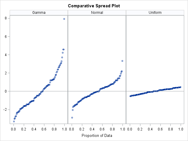
There does not appear to be a standard term for the quantity on the horizontal axis, which I have labeled "proportion of data." I call it the estimated cumulative probability, but it is also called the estimated proportion, the fractional rank, the estimate for cumulative proportion, or simply plotting positions. In Chambers et al. (1983) it is called the fraction of data. In Cleveland (1993) it is called the f-value, which is short for fractional value. In some SAS output it is labeled "proportion less [than the value shown]." (There is also many different ways to compute the plotting positions. Chambers and Cleveland each use the simpler fractional rank given by ri–0.5)/(N+1), where ri is the rank of the ith observations. I have used Blom's 1958 formula, which is used heavily in SAS software.)
You could create a similar plot by using PROC RANK and the DATA step. The nice thing about the spread plot is that the range of the data is evident. The range for the centered Gamma variable is [-3,8]. Furthermore, notice that the mean value is greater than the median value, which is a standard rule of thumb for continuous skewed distributions. In contrast, the Normal and Uniform variables are both visually symmetric. The Normal variable clearly has two moderate tails, whereas the Uniform variable appears to be a bounded distribution.
A plot that uses quantiles to compare distributions is more powerful than the technique of comparing histograms. However, the quantile plot requires more skill to interpret.
Although the spread plot is not a well-known display, it appears prominently in the output of several popular SAS procedures. My next blog post will discuss how to interpret a spread plot when it appears in the output of SAS regression procedures.

5 Comments
Pingback: How to interpret a residual-fit spread plot - The DO Loop
Pingback: Comparative histograms: Panel and overlay histograms in SAS - The DO Loop
Hi, may you upload the dataset for explained example, please?
The data are simulated in the article, just after the comment "simulate three variables with different distributions." They are random samples of size 100 from the U(0,1), N(0,1), and Gamma(4) distributions.
Dear Rick, thank you for your answer, I have noticed that just after posting my comment. I am trying to understand the code because I would like to compare two distributions, but the problem is that one distribution is bigger by an order of magnitude in comparison to other one.