I often see variations of the following question posted on statistical discussion forums:
I want to bin the X variable into a small number of values. For each bin, I want to draw the quartiles of the Y variable for that bin. Then I want to connect the corresponding quartile points from bin to bin.
In other words, the question asks how to create a plot like the following:
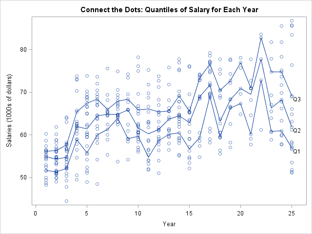
The plot attempts to show how the first quartile, second quartile (median), and third quartile of the response variable vary as the explanatory variable changes. However, I do not recommend using this plot when the explanatory variable is continuous. When I see a question like this, I sometimes respond by saying "you might want to look at quantile regression."
This article takes a quick look at quantile regression. What is quantile regression? How can you perform quantile regression in SAS? And how does it relate to the "binned quantile plot" that is shown above?
Start with the familiar: Standard regression
Before discussing quantile regression, let's introduce some data and think about a typical analysis. The data are salaries (in 1991) for 459 statistics professors in U.S. colleges and universities. A professor's salary (the response) is assumed to be related to his or her years of service (the explanatory variable). For these data, the explanatory variable is already binned into 25 discrete values. These data and this analysis are based on an example in the documentation for the QUANTREG procedure. You can download the data and the SAS statements that are used in this article.
A traditional regression analysis predicts the mean salary for a professor, given the years of service. In SAS, there are many regression procedures, such as the parametric GLM procedure and the nonparametric LOESS procedure. For these procedure, you can also call the regression directly from the SGPLOT procedure. For example, the following statements add a loess curve and a cubic regression curve to the data:
title "Salary by Experience"; proc sgplot data=salary; loess x=Year y=Salaries / smooth=0.5; /* nonparametric regression */ reg x=Year y=Salaries / degree=3 nomarkers legendLabel="Cubic Regression"; run; |
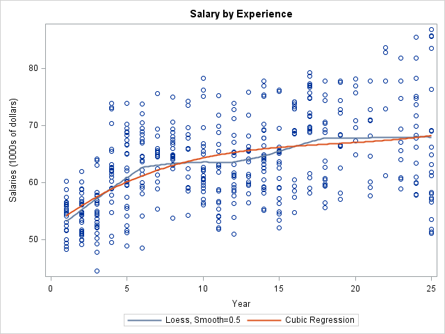
For the loess model, salaries appear to increase with experience for the first six years and for years 12–18; the salaries appear to be flat for the other intervals. For the cubic regression model, the salaries appear to increase gradually, although they increase more quickly for the first 10 years.
These regression curves smooth the data. For a parametric model, you can sometimes interpret the parameters of the model in terms of physical quantities. Do you believe that the mean salary of a professor depends smoothly on the number of years of service? These models reflect that assumption.
Now think for a moment about what we did not do. We did not compute the sample mean for each year and "connect the dots." That would result in a jagged line, which does not smooth the data. "Connecting the dots" is not a model; it does not provide insight into the relationship between salary and years of service, not does it accomodate random errors in the data.
Moving from means to quantiles
Given the number of years of service, each of the previous curves predicts the mean salary. Statistically speaking, the regression curves model the "conditional mean" of the response variable. However, you can also design a regression procedure to model the conditional median of the response. In fact, you can model other quantiles, such as the upper quartile (75th percentile), the lower decile (10th percentile), or other values.
A model for a conditional quantile is known as quantile regression. In SAS, quantile regression is computed by using the QUANTREG procedure, the QUANTSELECT procedure (which supports variable selection), or the QUANTLIFE procedure (which support censored observations).
What is quantile regression?
There have been several introductory papers written on quantile regression:
- Koenker and Hallock (2001), "Quantile Regression" gives an overview of the method and several examples of its application.
- Chen (2005), "An Introduction to Quantile Regression and the QUANTREG Procedure" shows how to use an early version of the SAS/STAT QUANTREG procedure. The SAS/STAT 9.3 version of the QUANTREG procedure is more powerful and makes it easier to perform several of the analyses in the paper. See the QUANTREG documentation.
- Cade and Noon (2003), "A gentle introduction to quantile regression for ecologists" discuss how quantile regression provides "a more complete view of possible causal relationships between variables."
I don't intend to duplicate these papers. Instead, let's use PROC QUANTREG to compute a quantile regression and compare it with the binned quantile plot:
title "Quantile Regression of Salary vs. Year"; ods graphics on; proc quantreg data=salary ci=sparsity; model salaries = year year*year year*year*year / quantile=0.25 0.5 0.75 plot=fitplot(showlimits); run; |
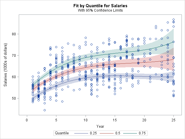
For these data, the model for the lower quartile increases for about 10 years, then levels off. The model for the conditional median is qualitatively similar to the cubic model for the conditional mean. The model for the upper quartile indicates a higher growth rate that for the median quartile. The quantile curves enable you to estimate how the inter-quartile range (the gap between the upper and lower quartiles) grows with time. For newly hired professors, only about $7,000 separates the relatively high salaries from the relatively low salaries. However, for professors with twenty or more years of experience, that gap has widened to more than $10,000.
When compared with the binned quantile plot at the beginning of this article, this quantile regression plot has several advantages:
- The curves smooth the data. Given the number of years of service, you can read off the predicted quartiles of salary from the plot.
- You can use the CI= option on the PROC QUANTREG statement to obtain confidence intervals (shown as shaded bands) for the predicted quartiles. See the PROC QUANTREG documentation for details.
- For parametric models (especially linear models), you might be able to interpret the parameters to gain insight into the process that generates the data. You can also compute nonparametric models by using the EFFECT statement to create spline effects.
- Quantile regression extends easily to multiple explanatory variables, whereas binning data gets harder as the dimension increases, and you often get bins for which there are no data.
So reach for quantile regression when you want to investigate how quartiles, quintiles, or deciles of the response variable change with covariates. The QUANTREG procedure is easy to run, and the results are superior to ad-hoc methods such as binning the data and connecting the sample quantiles.

11 Comments
Quantile regression is cool. I think it should be more widely used. I even wrote a NESUG presentation about it; it's also on my blog here: http://www.statisticalanalysisconsulting.com/wp-content/uploads/2011/06/SA04.pdf
Nice post. It's odd, your posts are so often very timely. I've been reading Mostly Harmless Econometrics and just this week started the chapter on quantile regression. I also just ran across the SAS GF 2013 Pharma paper 163-2013 related to quantile regression.
Great post. I love QR it needs to be better known because often there are subgroups hiding in real data and normal regression methods jsut cover them up.
Some questions on the data ;-)
After 15 years the distributons look bimodal…
Are there two groups here?
Tenure/non-tenure perhaps?
Ivy-league vs state colleges...
I think there are at many groups: male vs. female, "stars" vs. "laggards," research vs. teaching institutions, public vs. private, and so on.
I have a SAS Programming Problem that you may have already solved and implemented in IML?:
My Data Set contains three sets of continuous variables:
DQ01 - DQ59 DE01 - DE59 & DL01 - DL59.
( 177 variables ) Each standardised with Mean = 50 and Variance = 100
1. I want to bin each continuous variable using deciles or semi-deciles
that have been computed using PROC Univariate / Summary.
2. Compute and output the Percentiles for each Variable.
3. For each variable compare the observed values with the Percentile
Cut-Points and then allocate that observation to a Decile Bin.
4. Optimise the Bin Allocation based on a metric such as the GINI.
5. Apply a Robust WOE Transformation to each Binned Variable.
subject to the following constraints:
a. The % frequency within each bin > 5%
b. The WOE transformation is Monotonic
6. Fit a Binary Logistic Regression Model to the WOE-Transformed Variables.
If you have any advice or suggestions w.r.t. the above please let me know.
Regards
You can use the QNTL subroutine and the BIN function in SAS/IML to carry out Steps 1-3. Then program 4-5 in SAS/IML and output the WOE-transformed variables to a data set. Then use PROC LOGISTIC to carry out the regression. I see that you have already asked this question on the SAS Support Communities, and that is the best place to ask for help.
Pingback: Overlay plots on a box plot in SAS: Continuous X axis - The DO Loop
This is an excellent article, assumptions, and explanation are really so good, All your contributions are very useful for professionals and non-professionals. Thanks a lot for sharing an awesome article, Keep on posting.
Pingback: The conditional distribution of a response variable - The DO Loop
Thank you very much for the good introduction of the quantile regression and comparison in these different figures. I'm also curious how the quantile regression curves have been determine in SAS and how much the difference between quantile regression with the second quantile and the cubic spline regression. Thank you very much.
They are completely different. Median regression estimates the conditional median of the response as a function of the independent variables. Cubic spline regression is a way to capture nonlinearities by using spline basis functions, but you are estimating the conditional mean of the response.