Robert Allison posted a map that shows the average commute times for major US cities, along with the proportion of the commute that is attributed to traffic jams and other congestion. The data are from a CEOs for Cities report (Driven Apart, 2010, p. 45).
Robert use SAS/GRAPH software to improve upon a somewhat confusing graph in the report. I can't resist using the same data to create two other visualizations of the same data. Like Robert, I have included the complete SAS program that creates the graphs in this post.
First graph: A tall bar chart
The following bar chart (click to enlarge) shows the mean commute time for the cities (in hours per year), sorted by the commute time. You can see that the commute times in Chicago and New Orleans are short, on average, whereas cities like Nashville and Oklahoma City (and my own Raleigh!) are longer. The median of the 45 cities is about 200 hours per year, and is represented by a vertical line.
Overlaid on the graph is a second bar chart that shows the proportion of the commute that is attributed to congestion. In some sense, this is the "wasted" portion of the commute. The median wasted time is 39 hours per year. You can identify cities with low congestion (Buffalo, Kansas City) as well as those with high congestion (Los Angeles, Washington, DC).
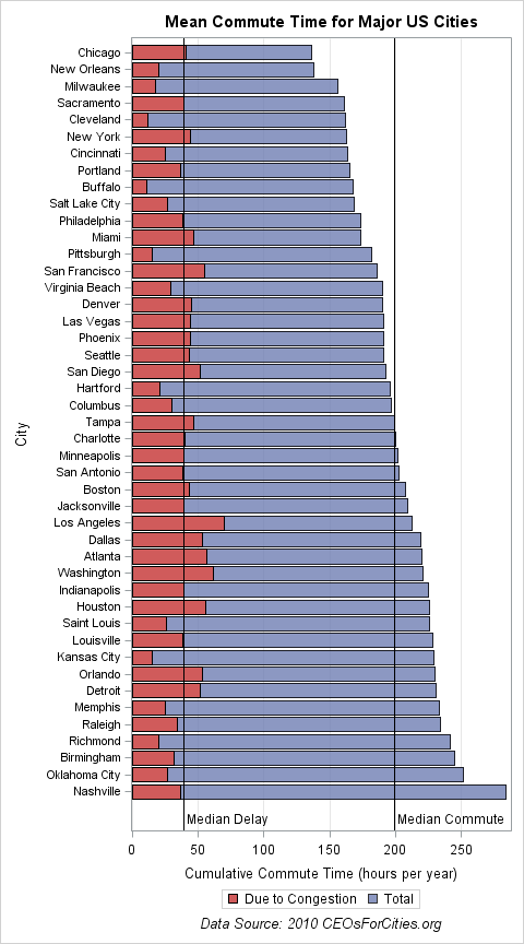
The plot was created by using the SGPLOT procedure. The ODS GRAPHICS statement is used to set the dimensions of the plot so that all of the vertical labels show, and the vertical axis is offset to make room for the labels for the reference lines. Thanks to Sanjay Matange who told me about the NOSCALE option, which enables you to change the size of a graph without changing the size of the fonts.
ods graphics / height=9in width=5in noscale; /* make a tall graph */ title "Mean Commute Time for Major US Cities"; footnote "Data Source: 2010 CEOsForCities.org"; proc sgplot data=traffic; hbar City / response=total_hours CategoryOrder=RespAsc transparency=0.2 name="total" legendlabel="Total"; hbar City / response=hours_of_delay name="delay" legendlabel="Due to Congestion"; keylegend "delay" "total"; xaxis grid label="Cumulative Commute Time (hours per year)"; yaxis ValueAttrs=(size=8) offsetmax=0.05; /* make room for labels */ refline 39 199 / axis=x label=("Median Delay" "Median Commute") lineattrs=(color=black) labelloc=inside; run; |
Second graph: A scatter plot
Although the previous graph is probably the one that I would choose for a report that is intended for general readers, you can use a scatter plot to create a more statistical presentation of the same data.
In the bar chart, it is hard to compare cities. For example, I might want to compare the average commute and congestion in multiple cities. Because the cities might be far apart on the bar chart, it is difficult to compare them. An alternative visualization is to create a scatter plot of the commute time versus the time spent in traffic for the 45 cities. In the scatter plot, you can see that Nashville and Oklahoma City have moderate congestion, even though their mean commute times are large (presumably due to long commutes). In contrast, the congestion in cities such as Los Angeles, Washington, and Atlanta are evident.
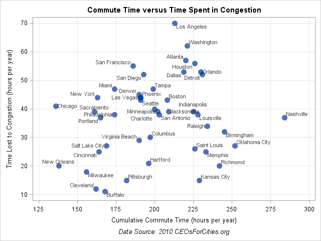
The plot was created by using the SGPLOT procedure. The DATALABEL= option is used to label each marker by the name of the city.
ods graphics / reset; /* reset graphs to default size */ title "Commute Time versus Time Spent in Congestion"; proc sgplot data=traffic; scatter x=total_hours y=hours_of_delay / MarkerAttrs=(size=12 symbol=CircleFilled) transparency=0.3 datalabel=City datalabelattrs=(size=8); xaxis grid label="Cumulative Commute Time (hours per year)" values=(125 to 300 by 25); yaxis grid label="Time Lost to Congestion (hours per year)"; run; |
For me, the surprising aspect of this data (and Rob's graph) is that the average commute times are more similar than I expected. Another interesting aspect is that my notion of "cities with bad commutes" seems to be based on congestion (the cities that are near the top of the scatter plot) rather than on long commutes (the cities to the right of the scatter plot).
What aspects of these data do you find interesting?

5 Comments
Interesting analyses!
I feel lucky that my commute to work is only 2.5 miles! :-)
I noticed that the top 6 cities for commute time are all cities in the southeast of the US. Perhaps the New South spurred its growth by offering large lots and "uncongested" neighborhoods and that paradoxically led to lots of people driving a long way to get to work - pure speculation.
refline 39 199 / axis=x label=("Median Delay" "Median Commute")
lineattrs=(color=black) labelloc=inside;
Did you calculate the means outside this code, and then just coded them on this line?
Yes. Thought about including the code that puts these values into macro variables automatically, but the post was getting a little long, so I hard-coded the values to keep it simple.
Longest commute times in the US:
http://www.towncharts.com/Top-500-Cities-in-the-US-for-Average-Commute-Time.html