I have previously written about how to create funnel plots in SAS software. A funnel plot is a way to compare the aggregated performance of many groups without ranking them. The groups can be states, counties, schools, hospitals, doctors, airlines, and so forth. A funnel plot graphs a performance metric versus a measure of uncertainty (often the size of each sample) and overlays "control limits" that enable you to assess whether extreme values are "unusual" or whether they fall within the realm of statistical variation.
When the performance metric is normally distributed, the funnel chart is similar to the analysis of means plot. However, you can also create funnel charts for quantities such as rates, proportions, and ratios of proportions. All of these variations are discussed in Spiegelhalter's 2005 paper on funnel plots.
This article describes how to construct a funnel plot for proportions in SAS. Spiegelhalter lays out four steps for creating the funnel plot of the proportion of cases that satisfy some condition for multiple groups (see Appendix A.1.1):
- Compute the proportion for each category.
- Compute the overall proportion.
- Compute control limits by using quantiles of the binomial distribution. This step is tricky. The binomial distribution is a discrete distribution, which means that you have to use an interpolation scheme in order to produce smooth control limits. (If your sample sizes are large, you might prefer to use a normal approximation to the binomial limits.)
- Plot the proportion for each category against the sample size and overlay the control limits.
Step 3 is very interesting. However, this post does not discuss the details of Step 3.
The proportion of children placed into adoption within 12 months
A recent post on Spiegelhalter's blog gives data and produces a funnel plot for the proportion of children that are placed with adoptive parents within 12 months. The data is aggregated for various regions in England, which are called "local authorities." (You can download the data in a CSV file.) To give you some idea of the data, one authority (Kent) placed 162 out of 235 children (69%) with adoptive parents within 12 months. Another (Chesire East) handled only 15 cases and placed 10 of the children (67%).
A funnel plot (shown below) is a way to compare the proportion of children that are placed within 12 months for each of 143 regions. The horizontal line shows the nationwide proportion of children that are placed within 12 months. The funnel-shaped curves are the 95% and 99.8% quantile curves under the assumption that proportions are sampled from a binomial distribution for which the probability of "success" (placing a child) equals the national average. Because a statistic computed on a small sample has larger variability that the same statistic computed on a large sample, the two funnel-shaped curves for these data are wide to the left and narrow to the right.
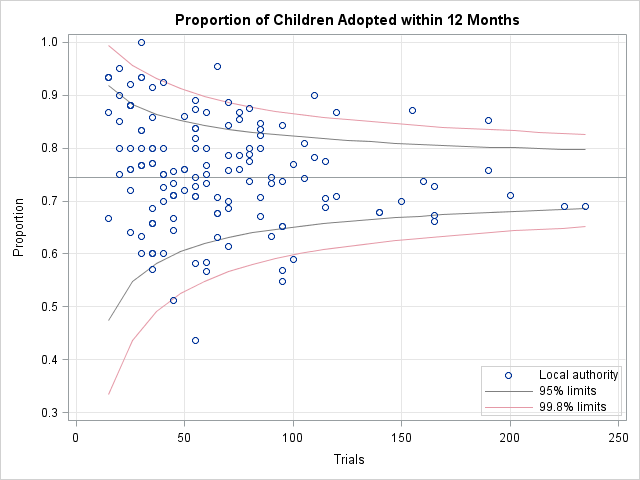
Only those local authorities that are above the funnel-shaped curves can be considered "above average" at placing children into adoption. Similarly, only the handful of local authorities that are below the curves can be considered "below average." The authorities that are between the innermost curves are all "average," and you should avoid saying that one is "better" that another, even though one has placed 85% of their children whereas another has placed only 65%.
You can download the SAS program that creates the funnel plot. The remainder of this post describes each of the four main steps that are used to construct the plot.
Compute the proportion for each category
The Adoptions data set contains 143 observations and three variables. Each observation is for a local authority (the Authority variable). The Trials variable contains the number of children that are available for adoption. The Events variable contains the number of children placed into adoptive homes within 12 months.
The following statements read the data into SAS/IML vectors and compute the proportion of children that were placed:
proc iml;
use Adoptions;
read all var {Events Trials};
close Adoptions;

Proportion = Events/ Trials;
theta = sum(Events) / sum(Trials);
Expected = theta * Trials; |
Compute the overall proportion
The following statements compute the proportion of children (theta) nationwide that were placed within 12 months. This overall proportion is used to compute the expected number of children that would be placed if each local authority had a success rate of theta in placing children. The observed and expected values are written to a SAS data set, and the overall proportion is stored in a macro variable for later use:
/* write theta to macro to use as reference line */
call symputx("AvgProp", theta);

/* write results to data set */
results = Proportion || Expected;
labels = {"Proportion" "Expected"};
create Stats from results[colname=labels];
append from results;
close; |
Compute control limits
The following statements compute the control limits by using the formulas in Appendix A.1.1. Notice that the control limits do not depend on the data, only on the national proportion. In this example, the control limits are plotted at equally spaced values between the minimum and maximum sample sizes. The 95% and 99.8% control limits are computed and saved to a SAS data set for graphing.
/* plot limits at equally spaced points between min & max */
minN = min(Trials); maxN = max(Trials);
n = T( do(minN, maxN, (maxN-minN)/20) );
n = round(n); /* binomial parameter must be integer */
p = {0.001 0.025 0.975 0.999}; /* lower/upper limits */
/* compute matrix with four columns, one for each CL */
limits = j(nrow(n), ncol(p));
do i = 1 to ncol(p);
   r = quantile("Binomial", p[i], theta, n);
   /* adjust quantiles according to method in Appendix A.1.1
      Spiegelhalter (2005) p. 1197 */
   numer = cdf("Binomial", r  , theta, n) - p[i];
   denom = cdf("Binomial", r  , theta, n) - cdf("Binomial", r-1, theta, n);
   alpha = numer / denom;
   limits[,i] = (r-alpha)/n;
end;

/* write these control limits to data set */
results = n || limits;
labels = {"N" "L3sd" "L2sd" "U2sd" "U3sd"};
create Limits from results[colname=labels];
append from results;
close;
quit; |
If you want to compute the control limits for each local authority (for example, to flag those that are outside of the 99.8 control limits), you can set n = Trials instead of using evenly spaced values of n.
Create the funnel plot
There are now three data sets: the original data, the observed and expected proportions, and the control limits. The first and second data sets can be merged, but the third has a different number of observations. The following DATA steps combine the data into a single data set. The SGPLOT procedure then creates the funnel plot.
/* merge data with proportions */
data Adoptions; merge Adoptions Stats; run;
/* append control limits */
data Funnel; set Adoptions Limits; run;

/* Plot proportions versus sample size. Overlay control limits */
proc sgplot data=Funnel;
band x=N lower=L3sd upper=U3sd / nofill lineattrs=(color=lipk)
     legendlabel="99.8% limits" name="band99";
band x=N lower=L2sd upper=U2sd / nofill lineattrs=(color=gray)
     legendlabel="95% limits" name="band95";
refline &AvgProp / axis=y;
scatter x=Trials y=Proportion;
keylegend "band95" "band99" / location=inside
     position=bottomright;
yaxis grid values=(0.3 to 1 by 0.1); xaxis grid;
run; |
There are five local authorities who are "below average" in placing children into adoptive homes within a 12-month time frame. The graph indicates that Hackney (44%; 24 out of 55 cases), Brent (51%; 23 out of 45 cases), Nottinghamshire (55%, 52 out of 95 cases), Derby (57%; 54 out of 95 cases), and Nottingham (59%; 59 out of 100 cases) might need additional support and resources to better handle their caseloads in a timely fashion.
If desired, you can use the technique that I described in a previous post to label the observations that are beyond the control limits.

23 Comments
Pingback: Readers’ choice 2011: The DO Loop’s 10 most popular posts - The DO Loop
I am not able to use the sgplot with SAS 9.1 although the proc IML appears to work. How can I et around the problem of not having sgplot?
Many thanks,
charles
I'm not sure. This sounds like a good question for the experts at the SAS/GRAPH Discussion Forum: http://communities.sas.com/community/sas_graph_and_ods_graphics
Hi Rick,
Thanks for this very useful post! I have a large cohort of patients. How do I change the code for the control limits to use the approx normal distribution as you suggest?
I have tried modifying the section below without success.
r = quantile("Binomial", p[i], theta, n);
/* adjust quantiles according to method in Appendix A.1.1
Spiegelhalter (2005) p. 1197 */
numer = cdf("Binomial", r , theta, n) - p[i];
denom = cdf("Binomial", r , theta, n) - cdf("Binomial", r-1, theta, n);
thanks for your help,
John
To answer your question, try the following (untested!):
mu = n*theta;
stddev = sqrt(n*theta*(1-theta));
limits[,i] = quantile("normal", p[i], mu, stddev);
This should work because the mean of a binomial distribution is n*theta and the variance is n*theta*(1-theta).
If you have SAS/QC software, you might want to compare your funnel plot with the PCHART statement in PROC ANOM. See http://blogs.sas.com/content/iml/2011/04/22/comparing-funnel-plots-to-an-analysis-of-means-plot/
Pingback: Quantiles of discrete distributions - The DO Loop
Hi Rick,
Why aren't the control limits perfectly symmetrical?
Thanks,
John
Because they are based on quantiles of the discrete binomial distribution. See http://blogs.sas.com/content/iml/2012/03/07/quantiles-of-discrete-distributions/
Based on article Funnel plots for proportions - the overall proportion is calculated but what is the calculation for the overall variance ?
It's not needed for this computation. However, the variance of a Bernoulli variable is p*(1-p), where p is the probability of success. For this data, the variable Proportion is an estimate of p.
I notice that the funnel plot code does not quite work for very small sample sizes (<5) ? The upper CI especially instead of gradually decreasing in values show a small spike and then decreases in values as expected.
1) Can we correct for this ?
2) Should we worry about even doing a funnel plot for SS < 5 ?
Good questions. Spiegelhalter already corrects for small sample sizes by using a more complicated formula to interpolate the binomial quantiles. See my article on "The Normal Approximation to the Binomial Distribution."
I suspect that most people try not to use subjects (doctors, hospitals, schools,...) that have fewer than 5 observations. The variance of the proportion is too large in those cases. Suppose you are investigating the mortality rate of patients treated by doctors. If a doctor treats three patients and two die, is that incompetance or bad luck? Better to get more data. For example, collect data over several years instead of using the past month.
For a different approach, See Rodriguez and Lewellen (2004), Example 10, which uses logistic regression to adjust and estimate proportions. Note, however, that even in that paper they exclude doctors with fewer than 10 patients.
How would a ratio plot compare? x-axis would be exposure, the Y-axis would be the observed divided by the expected exposure adjusted rates, i.e. Ratio. Any insights on this ? I have done some reading and it appears that we would use poisson exact control limits. Is there SAS code out there that does this?
I don't know, but you could try asking on the SAS Support Community.
Pingback: Graph Makeover: Where same-sex couples live in the US
Hi Rick! I'm just learning about funnel plots as part of a case costing project I'm working on, and I've copied / pasted your code to SAS but getting ERROR: (execution) Module not loaded, operation not available at the call symputx("AvgProp", theta); line.
Any thoughts? I've copied the code both from the body of the article and the txt file you link to, and getting the same error for both.
Any thoughts? I have SAS IML (use it frequently) but not familiar enough with it to debug the error.
Thanks and chat soon!
Chris
That message means that the theta variable is not defined. Use the txt file and it should work. It looks like when SAS adopted the WordPress blogging platform in 2011 that there was a hiccup that caused the definition of theta be dropped from the displayed text. I've put it back. Thanks for letting me know.
Hi Rick - Yup, that fixed it - thanks so much! (Very cool article, by the way - I'd read the Spiegelhalter article first and then searched on how to do them in SAS, so excited to start using them for our case costing!)
Chat soon
Chris
Is it also possible to calculate the Control limits in SAS Base? I'm not familiar with SAS IML and I'm struggeling with getting it right. Our trials are rather big (10.000 patients and more) so I guess normal approximation would do just fine?
Thank you
Everything's possible, but it will require more effort.
Yes, a normal approximation should suffice. Read the second comment and my response.
I guess I'm doing something wrong because my normal approx. is really bad...
Is it correct to calculate the sample variance and to use this to calculate the limits?
We are are working with rates (per 10.000 patients).
I'm doing something like this:
DATA std;
SET CDIF_HOSP_SUMMARY(WHERE=(MS_HOS_SURV_PAT NE .)) END=EOF;
RETAIN sumdif count 0;
count = count +1;
sumdif = sum(sumdif,(MS_HA_PAT-&AvgProp.)**2);
IF eof THEN DO;
std = sqrt(sumdif/count);
call symput('std_overall',std);
END;
RUN;
%PUT &std_overall.;
/*** we nemen de standard normale verdeling ***/
DATA limieten;
/* 0.001 0.025 0.975 0.999 */
p1 = quantile("normal", 0.001);
p2 = quantile("normal", 0.025);
p3 = quantile("normal", 0.975);
p4 = quantile("normal", 0.999);
DO vz = &minN TO &maxN by 20;
p2sigmaL = &AvgProp. + (&std_overall./sqrt(vz))*p1;
p3sigmaL = &AvgProp. + (&std_overall./sqrt(vz))*p2;
p2sigmaH = &AvgProp. + (&std_overall./sqrt(vz))*p3;
p3sigmaH = &AvgProp. + (&std_overall./sqrt(vz))*p4;
output;
END;
RUN;
Seems that I'm doing something wrong?!
The comments of a blog are not suitable for having an extended technical discussion like this. You can post your problem to the SAS Support Communities. Since you don't want to use SAS/IML, post to the Community for Base SAS Programming.
Pingback: Compute and visualize binomial proportions in SAS - The DO Loop