Jittering. To a statistician, it is more than what happens when you drink too much coffee.
Jittering is the act of adding random noise to data in order to prevent overplotting in statistical graphs. Overplotting can occur when a continuous measurement is rounded to some convenient unit. This has the effect of changing a continuous variable into a discrete ordinal variable. For example, age is measured in years and body weight is measured in pounds or kilograms. If you construct a scatter plot of weight versus age for a sufficiently large sample of people, there might be many people recorded as, say, 29 years and 70 kg, and therefore many markers plotted at the point (29, 70).
To alleviate overplotting, you can add small random noise to the data. The size of the noise is often chosen to be the width of the measurement unit. For example, to the value 70 kg you might add the quantity u, where u is a uniform random variable in the interval [-0.5, 0.5]. You can justify jittering by assuming that the true weight of a 70 kg person is equally likely to be anywhere in the interval [69.5, 70.5].
The context of the data is important when deciding how to jitter. For example, ages are typically rounded down: a 29-year-old person might be celebrating her 29th birthday today, or might be turning 30 tomorrow, but she is still recorded as 29 years old. Therefore you might jitter an age by adding the quantity v, where v is a uniform random variable in the interval [0,1]. (We ignore the statistically significant case of women who remain 29 for many years!)
There are other reasons that markers are overplotted in scatter plots, including having many thousands of data points. Jittering does not prevent this kind of overplotting, but you can use transparency to help alleviate overplotting in large data sets.
Plotting Data That Are Rounded to the Nearest Unit
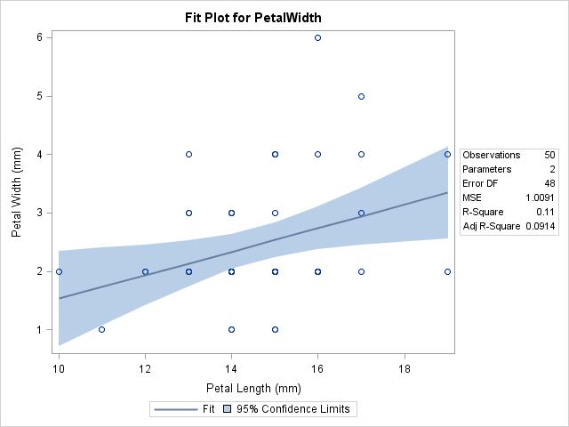
The SASHELP.Iris data set, which is distributed as part of SAS 9.2, illustrates the problem of overplotting and was used by Chambers, Cleveland, Kleiner, and Tukey (1983, p. 107, Graphical Methods for Data Analysis) to discuss jittering. The following graph shows the width and lengths of the petals for 50 flowers of the species Iris setosa. Also included are a regression line and the 95% confidence band for the mean of the width variable. This graph is created automatically by the REG procedure.
Someone who looks at the graph might ask two questions:
- There are 50 observations. Why are only 22 visible in the scatter plot?
- Why does the regression line appear so low and flat? A casual observer might expect the "tall" points at (16, 6) and (17, 5) to "pull up" the regression line.
Both of these questions are resolved by pointing out that there are repeated measurements in the data, and therefore the graph suffers from overplotting. Yes, there are 50 observations, but only 22 unique pairs of values. Furthermore, most of the duplicate points have values with PetalWidth = 2 mm. These values are below the regression line, which is why the line looks too low.
These questions are less likely to be asked if you jitter the data.
Jittering Data in SAS
There are many techniques and approaches to jittering data. The simplest is to add random uniform noise to each variable, as shown in the following DATA step:
data iris(drop=s); set sashelp.iris(where=(Species="Setosa")); /** add random uniform noise in [-0.5, 0.5] **/ s = 1; /** scale factor **/ jPetalWidth = PetalWidth + s*(ranuni(1)-0.5); jPetalLength = PetalLength + s*(ranuni(1)-0.5); label jPetalWidth = "Petal Width (mm)" jPetalLength= "Petal Length (mm)"; run; proc sgplot data=iris; title "Scatter Plot of Jittered Data"; scatter x=jPetalLength y=jPetalWidth; run; |
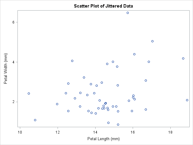
I set the "scale" of this problem to 1 because for these data I can justify adding a random variable in the interval [-0.5, 0.5]. However, you can also prevent overplotting by jittering at a smaller scale. (For example, to visualize clusters in the data, you might want to set s to a value such as 0.2.) You can also use separate scales for the X and Y variables, if necessary.
Jittering creates a fictitious set of petal lengths and widths that, when rounded, agree with the original data. The graph shows that all 50 observations are now visible. (There is a slight overplotting of two points near (15,2).) However, the scatter plot no longer shows the recorded data.
Analyze the Recorded Data; Display the Jittered Data
Jittering is primarily a data visualization technique. If you want to display the result of a statistical analysis (such as the regression analysis shown earlier), you should run the analysis on the original data but overlay the analysis on the jittered data. This type of graph is not created automatically by SAS statistical procedures, but you can create it with the SGPLOT procedure: use a statistical procedure to create an output data set, and use the SGPLOT procedure to overlay the results and the jittered data. For example, the following statements compute the regression analysis on the original data, but display the results on the jittered data:
proc sort data=iris; by PetalLength; run; proc reg data=iris; model PetalWidth = PetalLength; /** orig vars **/ output out=RegOut P=Pred lclm=LCLM uclm=UCLM; run; proc sgplot data=RegOut; title "Scatter Plot of Jittered Data"; title2 "Regression of Non-Jittered Data"; band x=PetalLength lower=LCLM upper=UCLM / legendlabel="95% Confidence Limits"; series x=PetalLength y=Pred / legendlabel="Fit"; scatter x=jPetalLength y=jPetalWidth; run; |
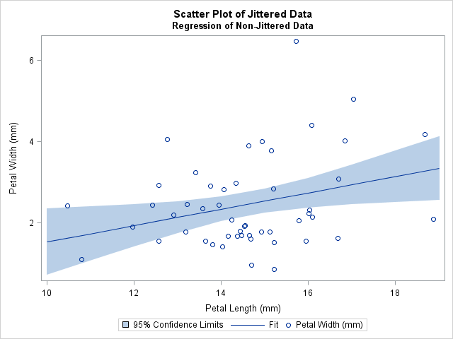
The regression line is exactly the same as in the first graph, but it no longer looks "too low" because it is displayed on top of jittered data.
One-Dimensional Jittering
In addition to jittering scatter plots, it is common to jitter one-dimensional dot plots. For dot plots, sometimes a "systematic jittering," is used. (See Theus and Urbanek (2009), Interactive Graphics for Data Analysis, pp. 31–32. Also Chambers et al. (1983), p. 20.) In systematic jittering, no random noise is used. Instead, repeated values are offset so that all observations are visible. This approach only works for small data sets, but it can be an effective display for teaching statistics because the dot plot can be overlaid on a box plot. Kleinman and Horton show an example of systematic jittering on their SAS and R blog.
Other Approaches to Jittering
For the iris data, I use 1 for the scale factor because that is the rounding unit. Chambers, Cleveland, Kleiner, and Tukey (1983) present a second option for jittering data: they choose a scale that depends on the extent of the data. If R=max(x)–min(x) is the range of x, they use 4% or 10% of R as the scale factor. In their words, "we want the fraction to be big enough to alleviate the overlap but not so big as to seriously corrupt the data."
Another approach that is sometimes used is to let d be the smallest distance between unique values of x, and set the scale to be d/5.
Michael Friendly has a SAS %JITTER macro for which you can specify the units appropriate for each variable.
Is jittering repeated values a good idea? In my next blog post, I discuss some arguments for and against jittering.
Editor's note (11Sep2013): In SAS 9.4, the SCATTER statement in PROC SGPLOT supports the JITTER option, which automatically jitters markers.

13 Comments
Pingback: To jitter or not to jitter: That is the question - The DO Loop
Pingback: Readers’ choice 2011: The DO Loop’s 10 most popular posts - The DO Loop
I just do not understand why SAS does not just do the jittering automatically if asked, maybe with an option or with a jitter statement - it is a standard technique (i know not all people agree but still common). I hope this is at least planned for a future release
The idea that I have to go through my dataset and create jittered data is absurd, and also why would one use jittered data for the regression line, only for the display of the points. Using it for the regression line is not providing the real regression line, we may want to visualize it better, but we can't change the data
On the Graphically Speaking blog, Sanjay recently revealed that jittering is a feature in PROC SGPLOT in SAS 9.4 and promised "more on this topic soon."
I think the idea that a process such as jitter should be automatic is unwise. Jittering needs to be a normative decision. Data should be plotted by default in it's original form.
I agree. For more discussion see the article "To jitter or not to jitter?"
I actually think that letting you to do the job is much better than letting the program to decide how to jitter for you, because you have more control on your data and you know better which is the good way and which is not. For example, the program won't know your variable is actually "age" even you call it "age", but apparently, you're not going to jitter "age" by adding the noise from -0.5 to 0.5. This will affect your later inference. Sometimes, even a small decimal counts.
Thanks for the comment. I want to emphasize that this article does not use the jittered data for analysis or inferences. The jittering applies only to visualization. There is a related idea called the smooth bootstrap, in which you add random variation to the data as part of an inferential analysis.
Pingback: Binning data by quantiles? Beware of rounded data - The DO Loop
I would like automatic jittering with options to override the automation when the automation seems unsatisfactory.
The SGPLOT procedure supports the JITTER statment. See the example in this blog post on SAS 9.4 graphics
Thank you for the helpful and interesting article. The sexist joke regarding the age was rather unnecessary though...
OK, thanks for your feedback on this article from 2011. In case you didn't read to the end, the SCATTER statement in PROC SGPLOT has supported the JITTER option for many years, so most people use that when they need a jittered scatter plot.