Using advanced analytics to pinpoint dead stock can reduce your inventory levels dramatically.
How big a portion of your stock is dead. Naturally you’re now thinking about the products or (Stock Keeping Units, SKUs, as they are called in the inventories), which for some reason started to move slowly and finally not at all. However – even on high runners that are picked several times every day, a portion of the stock can be considered dead – or living dead.
An SKU, which has been on inventory for a given period, will have seen Goods Receipts and Goods Issues – resulting in an inventory level, which changes day by day. Looking at a curve for the inventory level will reveal a lot, about how it is planned – and how well it fits to demand.
The lowest level on the graph is the sediment – after the non-moving material at the bottom of a lake. This sediment equals a number of products that could have been giftwrapped and put in a corner of the warehouse with a “do not open” stamp on the side. The sediment is basically dead inventory.
Analyzing the sediment, Order Quantities and Lead time master data can reveal reasons to why inventory has developed as it has.
Example
It is possible to read a lot from the picture below.
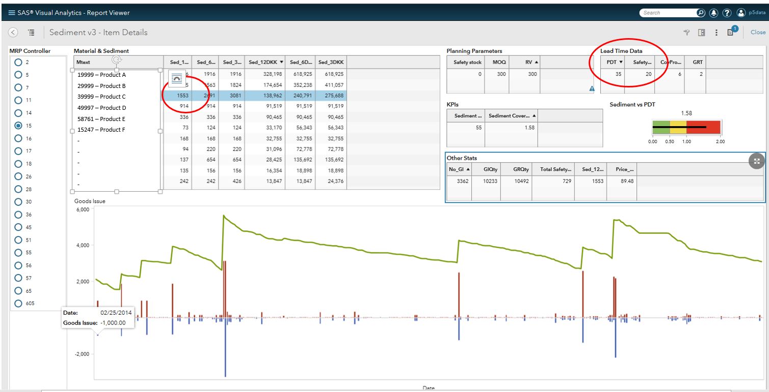
- In the example, the SKU (a raw-material) has a lead-time of 35 days and to deal with supplier performance (delays), 26 safety days have been added to avoid stock outs.
- The sediment is 1553 pc. or approximately twice the safety. This means that the safety stock has not been utilized in the last year. In this case, it would thus be safe to reduce the safety significantly (if not remove it) in order to place purchase orders later and thus reduce inventory.
- The normal demand is nowhere near the sediment (or the safety for that matter). Please keep in mind that the 7-8 long blue goods issue bars are not consumption but stock transfers.
- Further, the visual analysis shows how well the planning parameters fit demand. In this case, actual replenishment orders are much higher than the planning parameters, which causes a higher inventory than necessary. This falls back to the planner who should either update the MOQ or start using the actual settings.
- Lastly, Goods receipts are done at times, where there seems to be no apparent requirements. This indicates that forecasts for these products have been higher than actual demand.
These three things in combination is responsible for a sediment of approximately 18.000 Euro – money that could have been working instead of being tied up in inventory that can be classified as “living dead”.
When we did the above sediment analysis using visual analytical tools we had great success. After preparing the data, we analyzed the SKUs and in one afternoon found a potential for an 8% reduction of the total raw materials stock – only looking at the top 200 materials. The reduction materialized in a few months. If we had taken the entire raw materials stock, we could have reduced even more.
How to get going
The basis for dealing with this living dead inventory is the visual analysis, i.e. the graph in combination with planning parameters from the item master data and a few calculated performance indicators. This will show the size of the sediment, and very often, looking at the master data will reveal, why it appeared – and thus show how to reduce the sediment.
To make such an inventory graph is quite simple and you may even be able to find it in your ERP system. Uncovering the sediment and its reason, however, takes a bit longer, as you also have to look into the master data to find the reasons behind the sediment. Further, the really difficult part is to find out which SKUs to look at, and have the information made available and presentable.
It helps to pull data to a separate data set, which contain multiple SKUs, pull data from several tables and combine them in a visual report like the one in the example. This allows for fast analysis of the products chosen – a huge degree of freedom and easy distribution of the results.
If you have tens of thousands SKUs, it can be difficult to pinpoint the right SKUs to analyze – and just analyzing on your top x materials will not reveal the true inventory reduction potential. Most SKUs have a potential that should be investigated. This requires a solution that is able to
- Automate the collection and transformation of data from your ERP system, calculating a few performance indicators for each SKU – e.g. sediment and sediment value.
- Identify critical components for visual analysis.
- Support visual analysis by combining and presenting data as shown in the example above.
Further, letting the tool analyze the movement and stock graph a little more in detail can reveal risks and opportunities that are hard to come by in the visual analysis. Such analysis can be rule based, e.g. if there are more than x times the inventory is below safety – then you can only pull y% of the sediment. It can also be statistical analysis – e.g. analyzing the variance in demand over time, which will indicate if demand is becoming more or less volatile – and thus improve the decision on how big a part of the sediment can be removed.
Sediment analysis does not replace true Inventory optimization; however, it is a simple way to start reducing the part of the inventory, which is not moving.
Here is more to read about advanced analytics resources.