I’m sure you’ve heard of Blofeld, Goldfinger and Dr No, right? Well these evil villains and adversaries of Her Majesty’s most famous secret agent had one thing in common: their devious plans for world domination, complete with all the facts and figures, always featured on oversized screens.

Even if world domination doesn’t feature in your business model, visualising your plans can still be helpful when on the hunt for new ideas. In fact, this approach works equally well in meetings with colleagues and management alike.
Visualisation is the common language that unites the different roles within a company. Aside from the silver screen, data visualisation is no longer restricted to just the big global players; it requires a strong level of analysis, which even medium-sized companies can use to find trends in their data. In doing so, they are able to uncover new revenue potential, improve their services, anticipate issues and thereby gain a competitive edge.
The advantages of having an edge afforded by digitisation and globalisation include close customer relationships and loyalty. But needless to say, having information available so quickly and readily has made customers more demanding than ever.
Speed and quality are of paramount importance to customer satisfaction, which has been demonstrated in a number of studies. This means that 80% of unsatisfied customers will permanently walk away from a company that doesn’t respond quickly enough.
Information is key to improving customer relationships. It can be provided through a variety of different sources and sectors, including emails, phone calls, social networks and even surveys.
Structured and unstructured text data offers valuable insights if it is focused on a particular outlook or existing activity (such as resignation) in the right context.
Companies are often lacking not only in the analytical tools required to evaluate the available data, but also in the employees capable of using them. Data scientists are expensive and hard to find. With this in mind, an alternative option of providing end users within specialist departments with the necessary power requires an analytical approach. In most cases, they quickly come to the relevant conclusions on their own, and can then work side by side with the existing data scientists.
This is where SAS offers a smart introduction to analysing text data (without any prior changes being made), which can be performed securely and directly in the office environment without the need for statisticians or data scientists.
Not everyone can rely on Q for technical and analytical support, but plenty of people have the intelligence and strong power of deduction to handle this.
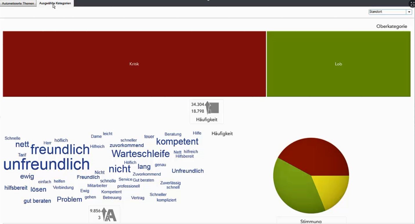
Here’s an example of how text data in Excel can be transformed into a word cloud at the click of a button, highlighting initial trends across the files.
Highlight the text data in Excel …
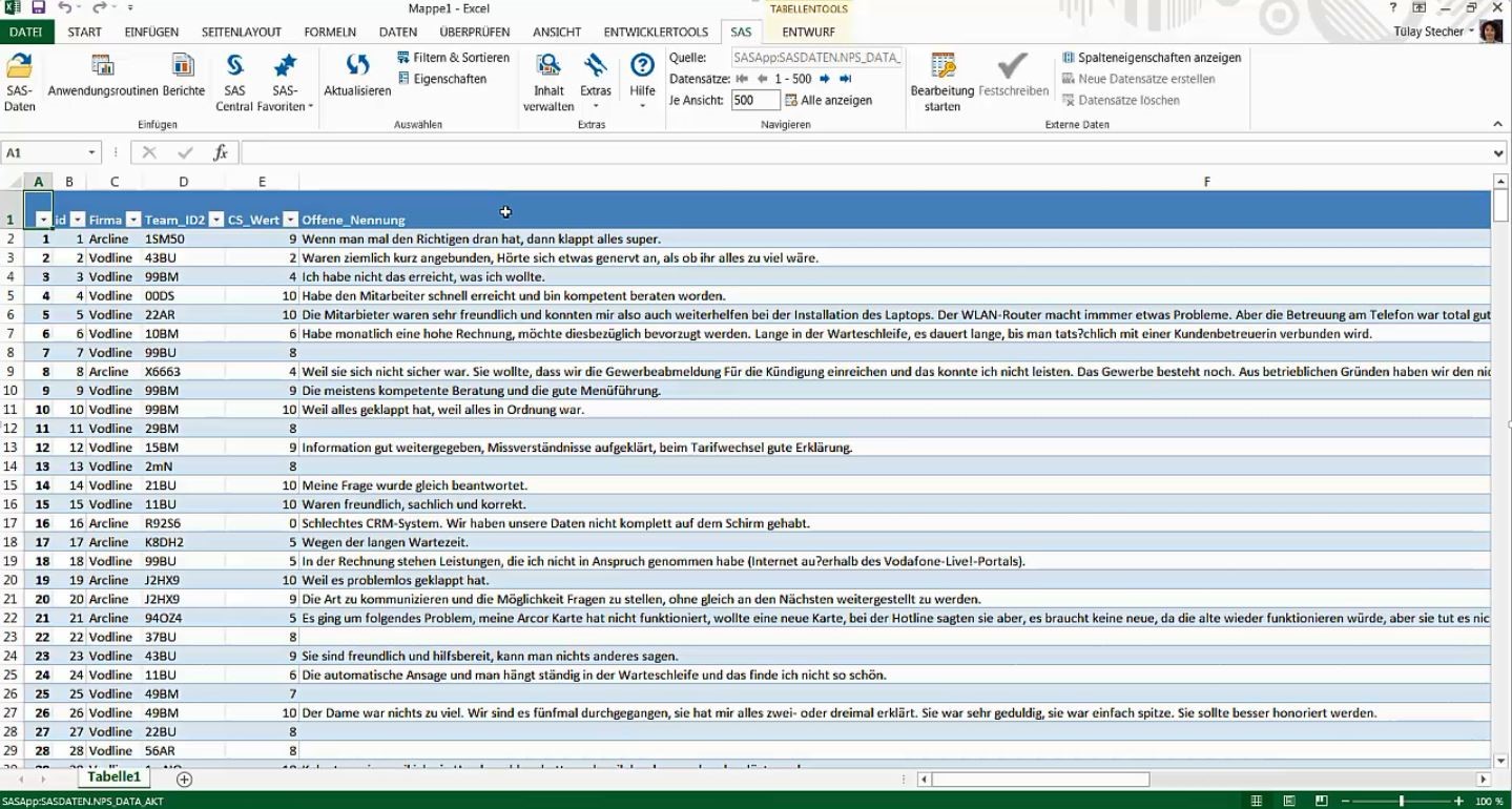
… and generate an initial overview of the content at the touch of a button.
More wonderful and inspiring insights and best practices of data visualization can be found in a new data visualization e-book.
I’d love to hear from you on this blog, so please feel free to leave comments.